Plotting
This module provides a collection of plotting utilities for visualizing protein and peptide abundance data, quality control metrics, and results of statistical analyses. Functions are organized into categories based on their purpose, with paired "plot" and "mark" functions where applicable.
Functions are written to work seamlessly with the pAnnData object structure and metadata conventions in scpviz.
Convenience Plotting Wrappers
get_color: Generate a list of colors, a colormap, or a palette from package defaults.
shift_legend: Reposition an axis legend outside the plot while maintaining figure size.
plot_significance: Add a simple significance bar + label to an axis.
plot_summary: Bar plots summarizing sample-level metadata (e.g. protein counts).
Distribution and Abundance Plots
Functions:
| Name | Description |
|---|---|
plot_cv |
Violin plots of coefficient of variation (CV) across groups. |
plot_abundance |
Violin/box/strip plots of protein or peptide abundance. |
plot_abundance_housekeeping |
Plot abundance of housekeeping proteins. |
plot_abundance_boxgrid |
Multi-panel abundance summary grids (box/bar/violin/line). |
annotate_abundance_boxgrid_significance |
Pairwise test brackets on boxgrid panels. |
plot_abundance_2D |
2D scatter of abundance between two case groups. |
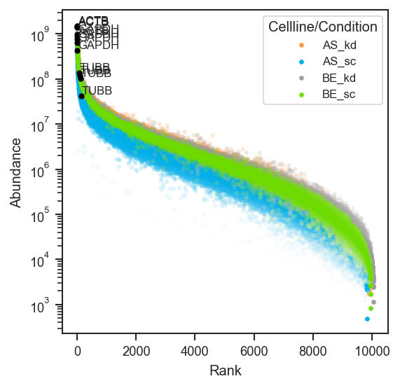
plot_rankquant |
Rank abundance scatter distributions across groups. |
mark_rankquant |
Highlight specific features on a rank abundance plot. |
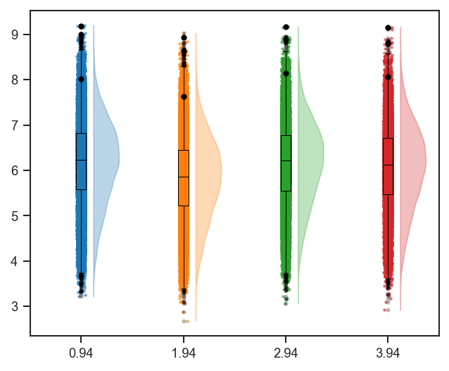
plot_raincloud |
Raincloud plot (violin + box + scatter) of distributions. |
mark_raincloud |
Highlight specific features on a raincloud plot. |
Multivariate Dimension Reduction
Functions:
| Name | Description |
|---|---|
plot_pca |
Principal Component Analysis (PCA) scatter plot. |
plot_pca_scree |
Scree plot of PCA variance explained. |
plot_umap |
UMAP projection for nonlinear dimensionality reduction. |
resolve_plot_colors |
Helper function for resolving PCA/UMAP colors. |
resolve_marker_shapes |
Helper function for resolving marker shapes from categorical groupings. |
PCA overlays (loadings + GSEA)
Functions:
| Name | Description |
|---|---|
plot_pca_gsea_pathway_vectors |
Overlay PCA-GSEA pathways as arrows in PCA space. |
plot_pca_protein_vectors |
Overlay protein PCA loadings as arrows in PCA space. |
plot_pca_gsea_bubble |
Bubble plot summarizing PCA-GSEA NES/FDR across PCs. |
plot_pca_gsea_heatmap |
Heatmap of PCA-GSEA NES across pathways and PCs. |
Clustering and Heatmaps
Functions:
| Name | Description |
|---|---|
plot_clustermap |
Clustered heatmap of proteins/peptides × samples. |
plot_pairwise_correlation |
Group- or sample-level pairwise correlation / distance heatmap with annotation bars. |
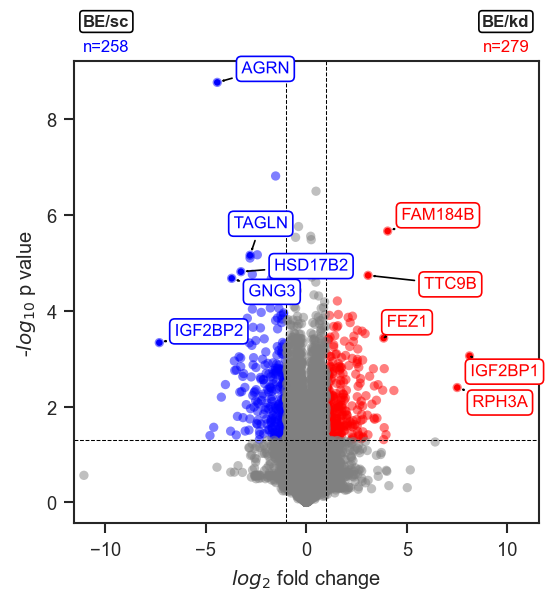
Differential Expression and Volcano Plots
Functions:
| Name | Description |
|---|---|
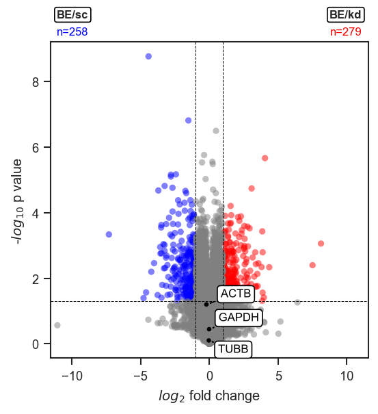
plot_volcano |
Volcano plot of differential expression results. |
plot_volcano_adata |
Same as above, but for AnnData objects. |
mark_volcano |
Highlight specific features on a volcano plot with a specific color. |
mark_volcano_by_significance |
Similar to above, but colored by significance. |
volcano_adjust_and_outline_texts |
Adjust text labels for volcano plots after multiple mark_volcanos. |
add_volcano_legend |
Add standard legend handles for volcano plots. |
Enrichment Plots
Functions:
| Name | Description |
|---|---|
plot_enrichment_svg |
Plot STRING enrichment results (forwarded from |
Set Operations
Functions:
| Name | Description |
|---|---|
plot_venn |
Venn diagrams for 2 to 3 sets. |
plot_upset |
UpSet diagrams for >3 sets. |
Notes and Tips
Tip
- Most functions accept a
matplotlib.axes.Axesas the first argument for flexible subplot integration.axcan be defined as such:
- "Mark" functions are designed to be used following their paired "plot" functions to highlight features of interest.
add_volcano_legend
Add a standard legend for volcano plots.
This function appends a legend to a volcano plot axis, showing handles for upregulated, downregulated, and non-significant features. Colors can be customized, but default to grey, red, and blue.
Parameters:
| Name | Type | Description | Default |
|---|---|---|---|
ax
|
Axes
|
Axis object to which the legend will be added. |
required |
colors
|
dict
|
None
|
Example
Add legend handles for significance categories:
import matplotlib.pyplot as plt
from scpviz import plotting as scplt

fig, ax = plt.subplots(figsize=(3, 2))
scplt.add_volcano_legend(ax)
plt.show()
Returns:
| Type | Description |
|---|---|
None
|
None |
Source code in src/scpviz/plotting/volcano.py
annotate_abundance_boxgrid_significance
annotate_abundance_boxgrid_significance(
    panel_info: list[dict[str, Any]],
    sig_pairs: list[tuple[Any, Any]] | bool,
    *,
    classes: str,
    classes_original: (
        str | list[str] | tuple[str, ...] | None
    ),
    sig_kwargs: dict[str, Any] | None = None
) -> pd.DataFrame
Add pairwise significance brackets to plot_abundance_boxgrid panels.
Called internally by :func:plot_abundance_boxgrid when sig_pairs is set,
or directly on panel_info returned from a prior plotting pass.
Parameters:
| Name | Type | Description | Default |
|---|---|---|---|
panel_info
|
list[dict[str, Any]]
|
Per-gene dicts with keys |
required |
sig_pairs
|
list[tuple[Any, Any]] | bool
|
|
required |
classes
|
str
|
Column in each |
required |
classes_original
|
str | list[str] | tuple[str, ...] | None
|
Original |
required |
sig_kwargs
|
dict[str, Any] | None
|
Optional overrides merged onto defaults. Known keys:
Remaining keys are forwarded to :func: |
None
|
Returns:
| Name | Type | Description |
|---|---|---|
stats_df |
DataFrame
|
One row per gene × comparison with test results and draw status. |
Source code in src/scpviz/plotting/abundance.py
572 573 574 575 576 577 578 579 580 581 582 583 584 585 586 587 588 589 590 591 592 593 594 595 596 597 598 599 600 601 602 603 604 605 606 607 608 609 610 611 612 613 614 615 616 617 618 619 620 621 622 623 624 625 626 627 628 629 630 631 632 633 634 635 636 637 638 639 640 641 642 643 644 645 646 647 648 649 650 651 652 653 654 655 656 657 658 659 660 661 662 663 664 665 666 667 668 669 670 671 672 673 674 675 676 677 678 679 680 681 682 683 684 685 686 687 688 689 690 691 692 693 694 695 696 697 698 699 700 701 702 703 704 705 706 707 708 709 710 711 712 713 714 715 716 717 718 719 720 721 722 723 724 725 726 727 728 729 730 731 732 733 734 735 736 737 738 739 740 741 742 743 744 745 746 747 748 749 750 751 752 753 754 755 756 757 758 759 760 761 762 763 764 765 766 767 768 769 770 771 772 773 774 775 776 777 778 779 780 781 782 783 784 785 786 787 788 789 790 791 792 793 794 | |
get_color
Generate a list of colors, a colormap, or a palette from package defaults.
Parameters:
| Name | Type | Description | Default |
|---|---|---|---|
resource_type
|
str
|
The type of resource to generate. Options are: - 'colors': Return a list of hex color codes. - 'cmap': Return a matplotlib colormap. - 'palette': Return a seaborn palette. - 'show': Display all 7 base colors. |
required |
n
|
int
|
The number of colors or colormaps to generate. Required for 'colors' and 'cmap'. Colors will repeat if n > 7. |
None
|
Returns:
| Name | Type | Description |
|---|---|---|
colors |
list of str
|
If |
cmap |
LinearSegmentedColormap
|
If |
palette |
color_palette
|
If |
None |
Any
|
If |
Default Colors
The following base colors are used (hex codes):
['#FC9744', '#00AEE8', '#9D9D9D', '#6EDC00', '#F4D03F', '#FF0000', '#A454C7']
Example
Get list of 5 colors:
Get default cmap:
Get default palette:
Source code in src/scpviz/plotting/style.py
37 38 39 40 41 42 43 44 45 46 47 48 49 50 51 52 53 54 55 56 57 58 59 60 61 62 63 64 65 66 67 68 69 70 71 72 73 74 75 76 77 78 79 80 81 82 83 84 85 86 87 88 89 90 91 92 93 94 95 96 97 98 99 100 101 102 103 104 105 106 107 108 109 110 111 112 113 114 115 116 117 118 119 120 121 122 123 124 125 126 127 128 129 130 131 132 133 134 135 136 137 138 139 140 141 142 143 144 145 146 147 148 149 150 151 152 153 154 155 156 157 158 159 160 161 162 163 164 165 166 167 168 169 170 171 172 173 174 175 176 | |
mark_raincloud
mark_raincloud(
    plot: "plt.Axes",
    pdata: pAnnData,
    mark_df: DataFrame,
    class_values: list[str],
    layer: str = "X",
    on: str = "protein",
    lowest_index: int = 0,
    color: str = "red",
    s: float = 10,
    alpha: float = 1,
) -> Any
Highlight specific features on a raincloud plot.
This function marks selected proteins or peptides on an existing
raincloud plot, using summary statistics written to .var during
plot_raincloud().
Parameters:
| Name | Type | Description | Default |
|---|---|---|---|
plot
|
Axes
|
Axis containing the raincloud plot. |
required |
pdata
|
pAnnData
|
Input pAnnData object. |
required |
mark_df
|
DataFrame
|
DataFrame containing entries to highlight.
Must include an |
required |
class_values
|
list of str
|
Class values to highlight (must match those
used in |
required |
layer
|
str
|
Data layer to use. Default is |
'X'
|
on
|
str
|
Data level, either |
'protein'
|
lowest_index
|
int
|
Offset for horizontal positioning. Default is 0. |
0
|
color
|
str
|
Marker color. Default is |
'red'
|
s
|
float
|
Marker size. Default is 10. |
10
|
alpha
|
float
|
Marker transparency. Default is 1. |
1
|
Returns:
| Name | Type | Description |
|---|---|---|
ax |
Axes
|
Axis with highlighted features. |
Tip
Works best when paired with plot_raincloud(), which computes and
stores the required statistics in .var.
Example
Highlight proteins on a raincloud after plot_raincloud (same grouping and colors as that plot):
import matplotlib.cm as cm
import matplotlib.pyplot as plt
import pandas as pd
from scpviz import plotting as scplt
from scpviz import utils as scu

classes_2 = ["cellline", "condition"]
class_list = scu.get_classlist(pdata.prot, classes_2)
rain_colors = [cm.tab10(i % 10) for i in range(len(class_list))]

var = pdata.prot.var
want = ["GAPDH", "TUBB", "ACTB"]
if "Genes" not in var.columns:
    acc = list(var.index[:3])
else:
    m = var["Genes"].astype(str).isin(want)
    acc = list(var.index[m][:3])
    if len(acc) < 3:
        acc = list(var.index[:3])
sub = var.loc[acc].copy().reset_index()
id_col = "index" if "index" in sub.columns else sub.columns[0]
mark_df = sub.rename(columns={id_col: "accession"})
if "Genes" in mark_df.columns:
    mark_df = mark_df.rename(columns={"Genes": "gene_primary"})
mark_df = mark_df[[c for c in ("accession", "gene_primary") if c in mark_df.columns]]

fig, ax = plt.subplots(figsize=(5, 4))
scplt.plot_raincloud(ax, pdata, classes=classes_2, color=rain_colors)
scplt.mark_raincloud(
    ax,
    pdata,
    mark_df=mark_df,
    class_values=class_list[: min(4, len(class_list))],
    color="black",
)
plt.show()
See Also
plot_raincloud: Generate raincloud plots with distributions per group.
plot_rankquant: Alternative distribution visualization using rank abundance.
Source code in src/scpviz/plotting/abundance.py
2084 2085 2086 2087 2088 2089 2090 2091 2092 2093 2094 2095 2096 2097 2098 2099 2100 2101 2102 2103 2104 2105 2106 2107 2108 2109 2110 2111 2112 2113 2114 2115 2116 2117 2118 2119 2120 2121 2122 2123 2124 2125 2126 2127 2128 2129 2130 2131 2132 2133 2134 2135 2136 2137 2138 2139 2140 2141 2142 2143 2144 2145 2146 2147 2148 2149 2150 2151 2152 2153 2154 2155 2156 2157 2158 2159 2160 2161 2162 2163 2164 2165 2166 2167 2168 2169 2170 2171 2172 2173 2174 2175 2176 2177 2178 2179 2180 2181 2182 2183 2184 2185 2186 2187 2188 2189 2190 2191 2192 2193 | |
mark_rankquant
mark_rankquant(
    plot: "plt.Axes",
    pdata: pAnnData,
    mark_df: DataFrame,
    class_values: list[str],
    layer: str = "X",
    on: str = "protein",
    color: str = "red",
    s: float = 10,
    alpha: float = 1,
    show_label: bool = True,
    label_type: str = "accession",
) -> Any
Highlight specific features on a rank abundance plot.
This function marks selected proteins or peptides on an existing rank
abundance plot, optionally adding labels. It uses statistics stored in
.var during plot_rankquant().
Parameters:
| Name | Type | Description | Default |
|---|---|---|---|
plot
|
Axes
|
Axis containing the rank abundance plot. |
required |
pdata
|
pAnnData
|
Input pAnnData object. |
required |
mark_df
|
DataFrame
|
Features to highlight.
|
required |
class_values
|
list of str
|
Class values to highlight (must match those
used in |
required |
layer
|
str
|
Data layer to use. Default is |
'X'
|
on
|
str
|
Data level, either |
'protein'
|
color
|
str
|
Marker color. Default is |
'red'
|
s
|
float
|
Marker size. Default is 10. |
10
|
alpha
|
float
|
Marker transparency. Default is 1. |
1
|
show_label
|
bool
|
Whether to display labels for highlighted features. Default is True. |
True
|
label_type
|
str
|
Label type. Options:
- |
'accession'
|
Returns:
| Name | Type | Description |
|---|---|---|
ax |
Axes
|
Axis with highlighted features. |
Tip
Works best when paired with plot_rankquant(), which stores Average,
Stdev, and Rank statistics in .var. Call plot_rankquant() first
to generate these values, then use mark_rankquant() to overlay
highlights.
Example
Overlay markers after a bulk rank-quant plot:
import matplotlib.pyplot as plt
import pandas as pd
from scpviz import plotting as scplt
from scpviz import utils as scu

classes_2 = ["cellline", "condition"]
class_list = scu.get_classlist(pdata.prot, classes_2)
acc = list(pdata.prot.var_names[:3])
mark_df = pd.DataFrame({"accession": acc})
if "Genes" in pdata.prot.var.columns:
    mark_df["gene_primary"] = pdata.prot.var.loc[acc, "Genes"].astype(str).values

fig, ax = plt.subplots(figsize=(4, 4))
scplt.plot_rankquant(ax, pdata, classes=classes_2)
scplt.mark_rankquant(
    ax,
    pdata,
    mark_df=mark_df,
    class_values=class_list[: min(4, len(class_list))],
    color="black",
    label_type="gene",
)
plt.show()
See Also
plot_rankquant: Generate rank abundance plots with statistics stored in .var.
get_upset_query: Create a DataFrame of proteins based on set intersections (obs membership).
Source code in src/scpviz/plotting/abundance.py
1696 1697 1698 1699 1700 1701 1702 1703 1704 1705 1706 1707 1708 1709 1710 1711 1712 1713 1714 1715 1716 1717 1718 1719 1720 1721 1722 1723 1724 1725 1726 1727 1728 1729 1730 1731 1732 1733 1734 1735 1736 1737 1738 1739 1740 1741 1742 1743 1744 1745 1746 1747 1748 1749 1750 1751 1752 1753 1754 1755 1756 1757 1758 1759 1760 1761 1762 1763 1764 1765 1766 1767 1768 1769 1770 1771 1772 1773 1774 1775 1776 1777 1778 1779 1780 1781 1782 1783 1784 1785 1786 1787 1788 1789 1790 1791 1792 1793 1794 1795 1796 1797 1798 1799 1800 1801 1802 1803 1804 1805 1806 1807 1808 1809 1810 1811 1812 1813 1814 1815 1816 1817 1818 1819 1820 1821 1822 1823 1824 1825 1826 1827 1828 1829 1830 1831 1832 1833 1834 1835 | |
mark_volcano
mark_volcano(
    ax: "plt.Axes",
    volcano_df: DataFrame,
    label: Any,
    label_color: str = "black",
    text_color: str | None = None,
    label_type: str = "Gene",
    s: float = 10,
    alpha: float = 1,
    show_names: bool = True,
    fontsize: int = 8,
    p_col: str | None = None,
    return_texts: bool = False,
) -> Any
Mark a volcano plot with specific proteins or genes.
This function highlights selected features on an existing volcano plot, optionally labeling them with names.
Parameters:
| Name | Type | Description | Default |
|---|---|---|---|
ax
|
Axes
|
Axis on which to plot. |
required |
volcano_df
|
DataFrame
|
DataFrame returned by |
required |
label
|
list
|
Features to highlight. Can also be a nested list, with separate lists of features for different cases. |
required |
label_color
|
str or list
|
Marker color(s). Defaults to |
'black'
|
text_color
|
str
|
Text color. Defaults to the same as label_color if not explicitly provided. |
None
|
label_type
|
str
|
Type of label to display. Default is |
'Gene'
|
s
|
float
|
Marker size. Default is 10. |
10
|
alpha
|
float
|
Marker transparency. Default is 1. |
1
|
show_names
|
bool
|
Whether to show labels for the selected features. Default is True. |
True
|
fontsize
|
int
|
Font size for labels. Default is 8. |
8
|
p_col
|
str or None
|
Column for y-positions: |
None
|
return_texts
|
bool
|
Whether to return the list of created text artists.
This is useful when labeling multiple groups and performing a single
global |
False
|
Returns:
| Name | Type | Description |
|---|---|---|
ax |
Axes
|
Axis with the highlighted volcano plot. |
Example
Highlight specific features on a volcano plot:
import matplotlib.pyplot as plt
from scpviz import plotting as scplt

fig, ax = plt.subplots(figsize=(4, 4))
values = [
    {"cellline": "BE", "condition": "kd"},
    {"cellline": "BE", "condition": "sc"},
]
ax, volcano_df = scplt.plot_volcano(
    ax, pdata_norm, values=values, return_df=True, label=[0, 0]
)
scplt.mark_volcano(ax, volcano_df, label=["GAPDH", "TUBB", "ACTB"])
plt.show()
Note
This function works especially well in combination with
plot_volcano(..., no_marks=True) to render all points in grey,
followed by mark_volcano() to selectively highlight features of interest.
Source code in src/scpviz/plotting/volcano.py
776 777 778 779 780 781 782 783 784 785 786 787 788 789 790 791 792 793 794 795 796 797 798 799 800 801 802 803 804 805 806 807 808 809 810 811 812 813 814 815 816 817 818 819 820 821 822 823 824 825 826 827 828 829 830 831 832 833 834 835 836 837 838 839 840 841 842 843 844 845 846 847 848 849 850 851 852 853 854 855 856 857 858 859 860 861 862 863 864 865 866 867 868 869 870 871 872 873 874 875 876 877 878 879 880 881 882 883 884 885 886 887 888 889 | |
mark_volcano_by_significance
mark_volcano_by_significance(
    ax: "plt.Axes",
    volcano_df: DataFrame,
    label: Any,
    color: Any = None,
    text_color: str | None = None,
    label_type: str = "Gene",
    s: float = 10,
    alpha: float = 1,
    show_names: bool = True,
    fontsize: int = 8,
    p_col: str | None = None,
    return_texts: bool = False,
) -> Any
Mark a volcano plot with specific proteins or genes, colored by significance.
This function highlights selected features on an existing volcano plot,
using the significance column in volcano_df to determine colors
(e.g. "upregulated", "downregulated", "not significant").
Parameters:
| Name | Type | Description | Default |
|---|---|---|---|
ax
|
Axes
|
Axis on which to plot. |
required |
volcano_df
|
DataFrame
|
DataFrame returned by |
required |
label
|
list
|
Features to highlight. Can also be a nested list, with
separate lists of features for different cases. All features are
colored according to their |
required |
color
|
dict
|
Mapping from significance category to color. Defaults to: { "not significant": "grey", "upregulated": "red", "downregulated": "blue", } You can override any of these by passing a dict with the same keys. |
None
|
text_color
|
str
|
Text color. Default is None, which makes each label follow its corresponding marker color.
- If str: all labels use the same text color.
- If dict: mapping from significance category to text color
(e.g. "upregulated", "downregulated", "not significant").
Categories not found in the dict fall back to the |
None
|
label_type
|
str
|
Type of label to display. Default is |
'Gene'
|
s
|
float
|
Marker size. Default is 10. |
10
|
alpha
|
float
|
Marker transparency. Default is 1. |
1
|
show_names
|
bool
|
Whether to show labels for the selected features. Default is True. |
True
|
fontsize
|
int
|
Font size for labels. Default is 8. |
8
|
p_col
|
str or None
|
Column for y-positions: |
None
|
return_texts
|
bool
|
Whether to return the list of created text artists.
This is useful when labeling multiple groups and performing a single
global |
False
|
Returns:
| Name | Type | Description |
|---|---|---|
Any
|
matplotlib.axes.Axes: Axis with highlighted points if |
|
tuple |
(Axes, list)
|
Returned if |
Example
Highlight specific features on a volcano plot using significance colors;
label is required. This example marks the top up- and down-regulated
features by significance_score:
import matplotlib.pyplot as plt
from scpviz import plotting as scplt

fig, ax = plt.subplots(figsize=(4, 4))
values = [
    {"cellline": "BE", "condition": "kd"},
    {"cellline": "BE", "condition": "sc"},
]
ax, volcano_df = scplt.plot_volcano(
    ax, pdata_norm, values=values, return_df=True, label=[0, 0]
)
up_ids = (
    volcano_df[volcano_df["significance"] == "upregulated"]
    .sort_values("significance_score", ascending=False)
    .head(5)
    .index.tolist()
)
down_ids = (
    volcano_df[volcano_df["significance"] == "downregulated"]
    .sort_values("significance_score", ascending=True)
    .head(5)
    .index.tolist()
)
scplt.mark_volcano_by_significance(ax, volcano_df, label=up_ids + down_ids)
plt.show()
Note
This function is designed to work seamlessly with
plot_volcano(..., no_marks=True) for workflows where you first plot
all points in grey and then selectively highlight features of interest.
Source code in src/scpviz/plotting/volcano.py
891 892 893 894 895 896 897 898 899 900 901 902 903 904 905 906 907 908 909 910 911 912 913 914 915 916 917 918 919 920 921 922 923 924 925 926 927 928 929 930 931 932 933 934 935 936 937 938 939 940 941 942 943 944 945 946 947 948 949 950 951 952 953 954 955 956 957 958 959 960 961 962 963 964 965 966 967 968 969 970 971 972 973 974 975 976 977 978 979 980 981 982 983 984 985 986 987 988 989 990 991 992 993 994 995 996 997 998 999 1000 1001 1002 1003 1004 1005 1006 1007 1008 1009 1010 1011 1012 1013 1014 1015 1016 1017 1018 1019 1020 1021 1022 1023 1024 1025 1026 1027 1028 1029 1030 1031 1032 1033 1034 1035 1036 1037 1038 1039 1040 1041 1042 1043 1044 1045 1046 1047 1048 1049 1050 1051 1052 1053 1054 1055 1056 1057 1058 1059 1060 1061 1062 1063 1064 1065 1066 1067 1068 1069 1070 1071 1072 1073 1074 1075 1076 1077 1078 1079 1080 1081 1082 1083 1084 1085 1086 1087 1088 1089 1090 1091 | |
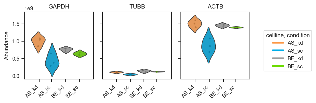
plot_abundance
plot_abundance(
    ax: "plt.Axes | None",
    pdata: pAnnData,
    namelist: list[str] | None = None,
    layer: str = "X",
    on: str = "protein",
    classes=None,
    return_df=False,
    order=None,
    palette=None,
    log=False,
    facet=None,
    height=4,
    aspect=0.5,
    plot_points=True,
    x_label="gene",
    kind="auto",
    **kwargs: Any
)
Plot abundance of proteins or peptides across samples.
This function visualizes expression values for selected proteins or peptides using violin + box + strip plots, or bar plots when the number of replicates per group is small. Supports grouping, faceting, and custom ordering.
Important default behavior:
- Abundances are not log-transformed by default (log=False)
- The plotted abundance values remain raw
- The y-axis is transformed to log10 scale, so the plot displays
log10(abundance) even when raw abundances are used.
Parameters:
| Name | Type | Description | Default |
|---|---|---|---|
ax
|
Axes
|
Axis to plot on. Ignored if |
required |
pdata
|
pAnnData
|
Input pAnnData object. |
required |
namelist
|
list of str
|
List of accessions or gene names to plot. If None, all available features are considered. |
None
|
layer
|
str
|
Data layer to use for abundance values. Default is |
'X'
|
on
|
str
|
Data level to plot, either |
'protein'
|
classes
|
str or list of str
|
|
None
|
return_df
|
bool
|
If True, returns the DataFrame of replicate and summary values. |
False
|
order
|
dict or list
|
Custom order of classes. For dictionary input,
keys are class names and values are the ordered categories. |
None
|
palette
|
list or dict
|
Color palette mapping groups to colors. |
None
|
log
|
bool
|
If True, apply log2 transformation to abundance values. Default is False (raw values used; y-axis log10-scaled instead). |
False
|
facet
|
str
|
|
None
|
height
|
float
|
Height of each facet plot. Default is 4. |
4
|
aspect
|
float
|
Aspect ratio of each facet plot. Default is 0.5. |
0.5
|
plot_points
|
bool
|
Whether to overlay stripplot of individual samples. |
True
|
x_label
|
str
|
Label for the x-axis, either |
'gene'
|
kind
|
str
|
Type of plot. Options:
|
'auto'
|
**kwargs
|
Any
|
Additional keyword arguments passed to seaborn plotting functions. |
{}
|
Returns:
| Name | Type | Description |
|---|---|---|
ax |
Axes or FacetGrid
|
The axis or facet grid containing the plot. |
df |
(DataFrame, optional)
|
Returned if |
Example
Plot abundance of selected marker proteins grouped by cell line and condition:
import matplotlib.pyplot as plt
from scpviz import plotting as scplt

fig, ax = plt.subplots(figsize=(4, 4))
scplt.plot_abundance(
    ax, pdata, namelist=["GAPDH", "TUBB", "ACTB"], classes=["cellline", "condition"]
)
plt.show()
Source code in src/scpviz/plotting/abundance.py
314 315 316 317 318 319 320 321 322 323 324 325 326 327 328 329 330 331 332 333 334 335 336 337 338 339 340 341 342 343 344 345 346 347 348 349 350 351 352 353 354 355 356 357 358 359 360 361 362 363 364 365 366 367 368 369 370 371 372 373 374 375 376 377 378 379 380 381 382 383 384 385 386 387 388 389 390 391 392 393 394 395 396 397 398 399 400 401 402 403 404 405 406 407 408 409 410 411 412 413 414 415 416 417 418 419 420 421 422 423 424 425 426 427 428 429 430 431 432 433 434 435 436 437 438 439 440 441 442 443 444 445 446 447 448 449 450 451 452 453 454 455 456 457 458 459 460 461 462 463 464 465 466 467 468 469 470 471 472 473 474 475 476 477 478 479 480 481 482 483 484 485 486 487 488 489 490 491 492 493 494 495 496 497 498 499 500 501 502 503 504 505 506 507 508 509 510 511 512 513 514 515 | |
plot_abundance_2D
plot_abundance_2D(
    ax: "plt.Axes",
    data: DataFrame,
    cases: list[list[str]],
    genes: str | list[str] = "all",
    cmap: str = "Blues",
    color: list[str] = ["blue"],
    s: float = 20,
    alpha: list[float] = [0.2, 1],
    calpha: float = 1,
) -> "plt.Axes"
Plot a 2D abundance scatter between two case groups.
This helper computes mean abundance per feature for each case group (from columns matching
"Abundance: " + case tokens), then plots a log-log scatter of case1 vs case2. If genes
is a list, only those genes are highlighted (matched against data["Gene Symbol"]).
Parameters:
| Name | Type | Description | Default |
|---|---|---|---|
ax
|
Axes
|
Axis on which to plot. |
required |
data
|
DataFrame
|
Long-ish feature table containing abundance columns and a
|
required |
cases
|
list[list[str]]
|
Exactly two case definitions. Each case is a list of tokens used to match abundance columns (joined by underscores). |
required |
genes
|
str or list[str]
|
Either |
'all'
|
cmap
|
str
|
Colormap name used for the background scatter. |
'Blues'
|
color
|
list[str]
|
Colors for highlights/background points (legacy behavior). |
['blue']
|
s
|
float
|
Scatter marker size. |
20
|
alpha
|
list[float]
|
Alpha for background scatter and highlight points. |
[0.2, 1]
|
calpha
|
float
|
Legacy parameter (currently unused). |
1
|
Returns:
| Type | Description |
|---|---|
'plt.Axes'
|
matplotlib.axes.Axes: Axis containing the plot. |
Note
This function assumes the input table uses scpviz-style abundance column naming. It is retained for backwards compatibility and ad-hoc exploratory plots.
Source code in src/scpviz/plotting/abundance.py
1837 1838 1839 1840 1841 1842 1843 1844 1845 1846 1847 1848 1849 1850 1851 1852 1853 1854 1855 1856 1857 1858 1859 1860 1861 1862 1863 1864 1865 1866 1867 1868 1869 1870 1871 1872 1873 1874 1875 1876 1877 1878 1879 1880 1881 1882 1883 1884 1885 1886 1887 1888 1889 1890 1891 1892 1893 1894 1895 1896 1897 1898 1899 1900 1901 1902 1903 1904 1905 1906 1907 1908 1909 1910 1911 1912 1913 1914 1915 1916 1917 1918 1919 1920 1921 1922 1923 1924 1925 1926 1927 1928 1929 1930 1931 1932 1933 1934 | |
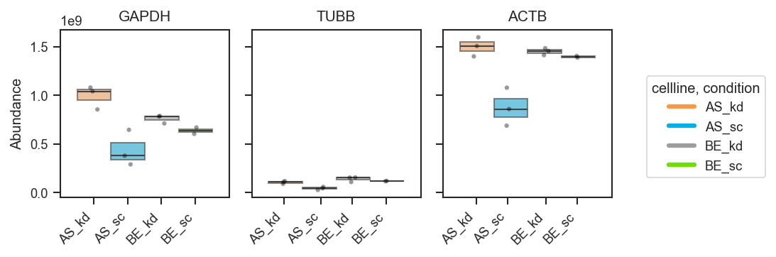
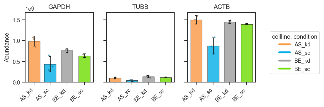
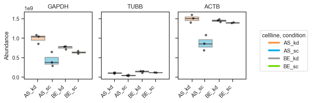
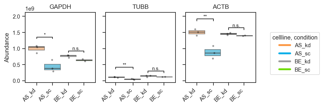
plot_abundance_boxgrid
plot_abundance_boxgrid(
    pdata: pAnnData,
    namelist: list[str] | None = None,
    ax: Any = None,
    layer: str = "X",
    on: str = "protein",
    classes: str | list[str] | None = None,
    return_df: bool = False,
    order=None,
    plot_type="box",
    log_scale=False,
    figsize=(2, 2.5),
    palette=None,
    y_min=None,
    y_max=None,
    label_x=True,
    show_n=False,
    global_legend=True,
    box_kwargs=None,
    hline_kwargs=None,
    bar_kwargs=None,
    bar_error="sd",
    violin_kwargs=None,
    text_kwargs=None,
    strip_kwargs=None,
    sig_pairs: list[tuple[Any, Any]] | bool | None = None,
    sig_kwargs: dict[str, Any] | None = None,
    nd_kwargs: dict[str, Any] | None = None,
)
Plot abundance values in a one-row panel of boxplots, mean-lines, bars, or violins.
This function generates a clean horizontal panel, with one subplot per gene,
using plot_type to select boxplots (default), mean-lines, bar plots, or
violin plots. If log_scale=True, abundance values are visualized in
log10 units (with zero or negative values clipped to 0 before transformation).
The layout is optimized for compact manuscript figure panels and supports
custom global legends, count annotations, and flexible formatting via keyword
dictionaries.
Parameters:
| Name | Type | Description | Default |
|---|---|---|---|
pdata
|
pAnnData
|
Input pAnnData object. |
required |
namelist
|
list of str
|
List of accessions or gene names to plot. If None, all available features are considered. |
None
|
ax
|
Axes
|
Axis to plot on. Generates a new axis if None. |
None
|
layer
|
str
|
Data layer to use for abundance values. Default is |
'X'
|
on
|
str
|
Data level to plot, either |
'protein'
|
return_df
|
bool
|
If True, returns the DataFrame of replicate and summary values. |
False
|
order
|
list of str
|
Ordered list to plot by. If None, plots by given dataframe order. |
None
|
classes
|
str
|
Column in |
None
|
plot_type
|
str
|
Type of plot, select from one of {"box", "line", "bar", "violin"}. Defaults to "box". |
'box'
|
log_scale
|
bool
|
If True, plot log10-transformed abundances on a linear axis. If False (default), plot raw abundance values on a linear axis. |
False
|
figsize
|
tuple
|
Figure size as (width, height) in inches. |
(2, 2.5)
|
palette
|
dict or list
|
Color palette for grouping categories.
Defaults to |
None
|
y_min
|
float or None
|
Lower y-axis limit in plotting units. If |
None
|
y_max
|
float or None
|
Upper y-axis limit in plotting units. If |
None
|
label_x
|
bool
|
Whether to display x tick labels inside each subplot. |
True
|
show_n
|
bool
|
Whether to annotate each subplot with sample counts. |
False
|
global_legend
|
bool
|
Whether to display a single global legend. |
True
|
box_kwargs
|
dict
|
Additional arguments passed to |
None
|
hline_kwargs
|
dict
|
Styling for mean segments when |
None
|
bar_kwargs
|
dict
|
Passed to |
None
|
bar_error
|
str
|
Error bar for bar plot. Select from one of
{"sd", "sem", None, |
'sd'
|
violin_kwargs
|
dict
|
Additional arguments passed to |
None
|
text_kwargs
|
dict
|
Keyword arguments for count labels (e.g., fontsize, offset). |
None
|
strip_kwargs
|
dict
|
Keyword arguments for strip (raw points),
e.g. |
None
|
sig_pairs
|
list, bool, or None
|
Pairwise comparisons for significance brackets.
|
None
|
sig_kwargs
|
dict
|
Significance options merged onto defaults
|
None
|
nd_kwargs
|
dict
|
Not-detected annotation options merged onto defaults
|
None
|
Returns:
| Name | Type | Description |
|---|---|---|
fig |
Figure
|
The generated figure. |
axes |
list of matplotlib.axes.Axes
|
One axis per gene. |
df |
(DataFrame, optional)
|
Returned if |
stats_df |
(DataFrame, optional)
|
Returned if |
Note
Default customizations for keyword dictionaries:
Boxplot styling (used when plot_type="box"):
box_kwargs = {
    "showcaps": False,
    "whiskerprops": {"visible": False},
    "showfliers": False,
    "boxprops": {"alpha": 0.6, "linewidth": 1},
    "linewidth": 1,
    "dodge": True,
}
Mean-line styling (used when plot_type="line"):
half_width is in x-axis units; lower it when several classes are dodged
and mean segments would cross.
Bar styling (used when plot_type="bar"):
bar_kwargs = {
    "alpha": 0.8,
    "edgecolor": "black",
    "linewidth": 0.6,
    "width": 0.3,
    "capsize": 2,
    "zorder": 3,
}
width is passed to Axes.bar (x-axis units); use a smaller value when
bars from neighboring hue levels overlap.
Violin styling (used when plot_type="violin"):
Strip styling (raw points; used for all plot types):
Text annotation styling (used when show_n=True):
Example
Basic usage (grouped boxplots):
fig, axes = pdata.plot_abundance_boxgrid(
    namelist=["GAPDH", "TUBB", "ACTB"],
    classes=["cellline", "condition"],
    plot_type="box",
    figsize=(2, 2.5),
)
plt.show()
Bar plots with error bars:
fig, axes = pdata.plot_abundance_boxgrid(
    namelist=["GAPDH", "TUBB", "ACTB"],
    classes=["cellline", "condition"],
    plot_type="bar",
    bar_error="sd",  # "sd", "sem", None, or callable
    bar_kwargs={"width": 0.14},  # narrower bars when many groups dodge
    figsize=(2, 2.5),
)
plt.show()
Mean-lines with count annotations:
fig, axes = pdata.plot_abundance_boxgrid(
    namelist=["GAPDH", "TUBB", "ACTB"],
    classes=["cellline", "condition"],
    plot_type="line",
    show_n=True,
    hline_kwargs={"half_width": 0.08},  # shorter segments when groups dodge
    figsize=(2, 2.5),
)
plt.show()
Violin plots (distribution-focused):
fig, axes = pdata.plot_abundance_boxgrid(
    namelist=["GAPDH", "TUBB", "ACTB"],
    classes=["cellline", "condition"],
    plot_type="violin",
    figsize=(2, 2.5),
)
plt.show()
Customizing appearance (palette, order, and styling):
fig, axes = pdata.plot_abundance_boxgrid(
    namelist=["GAPDH", "TUBB", "ACTB"],
    classes=["cellline", "condition"],
    plot_type="box",
    box_kwargs={"boxprops": {"alpha": 0.45}, "linewidth": 1.2},
    strip_kwargs={"size": 4, "alpha": 0.6},
    figsize=(2, 2.5),
)
plt.show()
Return the plotting DataFrame for downstream checks:
fig, axes, df = pdata.plot_abundance_boxgrid(
    namelist=["GAPDH", "TUBB", "ACTB"],
    classes=["cellline", "condition"],
    plot_type="box",
    return_df=True,
)

display(df.head())
plt.show()
Significance brackets (explicit pairs, volcano-style dicts):
fig, axes, df, stats = pdata.plot_abundance_boxgrid(
    namelist=["GAPDH", "TUBB", "ACTB"],
    classes=["cellline", "condition"],
    sig_pairs=[
        ({"cellline": "BE", "condition": "sc"}, {"cellline": "BE", "condition": "kd"}),
        ({"cellline": "AS", "condition": "sc"}, {"cellline": "AS", "condition": "kd"}),
    ],
    sig_kwargs={"fontsize": 8},
    return_df=True,
)
plt.show()
Multiple comparisons with a shared group (same group may appear in more than one pair):
fig, axes = pdata.plot_abundance_boxgrid(
    namelist=["GAPDH", "TUBB", "ACTB"],
    classes=["cellline", "condition"],
    sig_pairs=[
        ({"cellline": "BE", "condition": "sc"}, {"cellline": "BE", "condition": "kd"}),
        ({"cellline": "BE", "condition": "kd"}, {"cellline": "AS", "condition": "kd"}),
    ],
    sig_kwargs={"fontsize": 8},
)
plt.show()

Two hue groups only — auto comparison:
Source code in src/scpviz/plotting/abundance.py
797 798 799 800 801 802 803 804 805 806 807 808 809 810 811 812 813 814 815 816 817 818 819 820 821 822 823 824 825 826 827 828 829 830 831 832 833 834 835 836 837 838 839 840 841 842 843 844 845 846 847 848 849 850 851 852 853 854 855 856 857 858 859 860 861 862 863 864 865 866 867 868 869 870 871 872 873 874 875 876 877 878 879 880 881 882 883 884 885 886 887 888 889 890 891 892 893 894 895 896 897 898 899 900 901 902 903 904 905 906 907 908 909 910 911 912 913 914 915 916 917 918 919 920 921 922 923 924 925 926 927 928 929 930 931 932 933 934 935 936 937 938 939 940 941 942 943 944 945 946 947 948 949 950 951 952 953 954 955 956 957 958 959 960 961 962 963 964 965 966 967 968 969 970 971 972 973 974 975 976 977 978 979 980 981 982 983 984 985 986 987 988 989 990 991 992 993 994 995 996 997 998 999 1000 1001 1002 1003 1004 1005 1006 1007 1008 1009 1010 1011 1012 1013 1014 1015 1016 1017 1018 1019 1020 1021 1022 1023 1024 1025 1026 1027 1028 1029 1030 1031 1032 1033 1034 1035 1036 1037 1038 1039 1040 1041 1042 1043 1044 1045 1046 1047 1048 1049 1050 1051 1052 1053 1054 1055 1056 1057 1058 1059 1060 1061 1062 1063 1064 1065 1066 1067 1068 1069 1070 1071 1072 1073 1074 1075 1076 1077 1078 1079 1080 1081 1082 1083 1084 1085 1086 1087 1088 1089 1090 1091 1092 1093 1094 1095 1096 1097 1098 1099 1100 1101 1102 1103 1104 1105 1106 1107 1108 1109 1110 1111 1112 1113 1114 1115 1116 1117 1118 1119 1120 1121 1122 1123 1124 1125 1126 1127 1128 1129 1130 1131 1132 1133 1134 1135 1136 1137 1138 1139 1140 1141 1142 1143 1144 1145 1146 1147 1148 1149 1150 1151 1152 1153 1154 1155 1156 1157 1158 1159 1160 1161 1162 1163 1164 1165 1166 1167 1168 1169 1170 1171 1172 1173 1174 1175 1176 1177 1178 1179 1180 1181 1182 1183 1184 1185 1186 1187 1188 1189 1190 1191 1192 1193 1194 1195 1196 1197 1198 1199 1200 1201 1202 1203 1204 1205 1206 1207 1208 1209 1210 1211 1212 1213 1214 1215 1216 1217 1218 1219 1220 1221 1222 1223 1224 1225 1226 1227 1228 1229 1230 1231 1232 1233 1234 1235 1236 1237 1238 1239 1240 1241 1242 1243 1244 1245 1246 1247 1248 1249 1250 1251 1252 1253 1254 1255 1256 1257 1258 1259 1260 1261 1262 1263 1264 1265 1266 1267 1268 1269 1270 1271 1272 1273 1274 1275 1276 1277 1278 1279 1280 1281 1282 1283 1284 1285 1286 1287 1288 1289 1290 1291 1292 1293 1294 1295 1296 1297 1298 1299 1300 1301 1302 1303 1304 1305 1306 1307 1308 1309 1310 1311 1312 1313 1314 1315 1316 1317 1318 1319 1320 1321 1322 1323 1324 1325 1326 1327 1328 1329 1330 1331 1332 1333 1334 1335 1336 1337 1338 1339 1340 1341 1342 1343 1344 1345 1346 1347 1348 1349 1350 1351 1352 1353 1354 1355 1356 1357 1358 1359 1360 1361 1362 1363 1364 1365 1366 1367 1368 1369 1370 1371 1372 1373 1374 1375 1376 1377 1378 1379 1380 1381 1382 1383 1384 1385 1386 1387 1388 1389 1390 1391 1392 1393 1394 1395 1396 1397 1398 1399 1400 1401 1402 1403 1404 1405 1406 1407 1408 1409 1410 1411 1412 1413 1414 1415 1416 1417 1418 1419 1420 1421 1422 1423 1424 1425 1426 1427 1428 1429 1430 1431 1432 1433 1434 1435 1436 1437 1438 1439 1440 1441 1442 1443 1444 1445 1446 1447 1448 1449 1450 1451 1452 1453 1454 1455 1456 1457 1458 1459 1460 1461 1462 1463 1464 1465 1466 1467 1468 1469 1470 1471 1472 1473 1474 1475 1476 1477 1478 1479 1480 1481 1482 1483 1484 1485 1486 1487 1488 1489 1490 1491 1492 1493 1494 1495 1496 1497 1498 1499 1500 1501 1502 1503 1504 1505 1506 1507 1508 1509 1510 1511 1512 1513 1514 1515 1516 1517 1518 1519 1520 1521 1522 1523 1524 1525 1526 1527 1528 1529 1530 1531 1532 1533 1534 1535 1536 1537 1538 1539 1540 1541 1542 1543 1544 1545 1546 1547 1548 1549 1550 1551 1552 | |
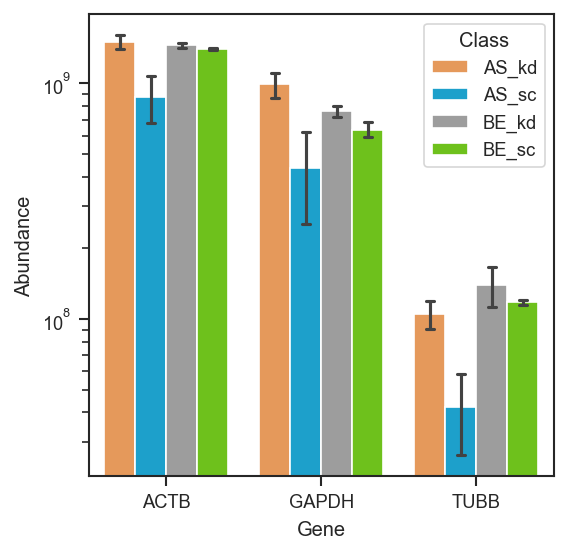
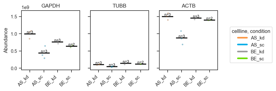
plot_abundance_housekeeping
plot_abundance_housekeeping(
    ax: "plt.Axes",
    pdata: pAnnData,
    classes: str | list[str] | None = None,
    loading_control: str = "all",
    **kwargs: Any
) -> Any
Plot abundance of housekeeping proteins.
This function visualizes the abundance of canonical housekeeping proteins as loading controls, grouped by sample-level metadata if specified. Different sets of proteins are supported depending on the chosen loading control type.
Parameters:
| Name | Type | Description | Default |
|---|---|---|---|
ax
|
matplotlib.axes.Axes or list of matplotlib.axes.Axes
|
Axis or list of axes to plot on.
If |
required |
pdata
|
pAnnData
|
Input pAnnData object. |
required |
classes
|
str or list of str
|
One or more |
None
|
loading_control
|
str
|
Type of housekeeping controls to plot. Options:
|
'all'
|
**kwargs
|
Any
|
Additional keyword arguments passed to seaborn plotting functions. |
{}
|
Returns:
| Name | Type | Description |
|---|---|---|
ax |
matplotlib.axes.Axes or list of matplotlib.axes.Axes
|
Axis or list of axes with the plotted protein abundances. |
Note:
This function assumes that the specified housekeeping proteins are annotated in .prot.var['Genes']. Missing proteins will be skipped during plotting and may result in empty or partially filled plots.
Example
Plot housekeeping protein abundance for whole cell controls:
from scpviz import plotting as scplt
fig, ax = plt.subplots(figsize=(6,4))
scplt.plot_abundance_housekeeping(ax, pdata, loading_control='whole cell', classes='condition')
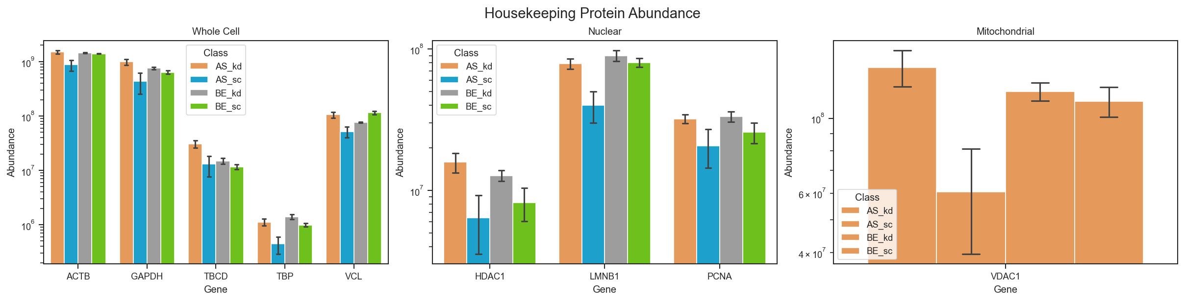
Source code in src/scpviz/plotting/abundance.py
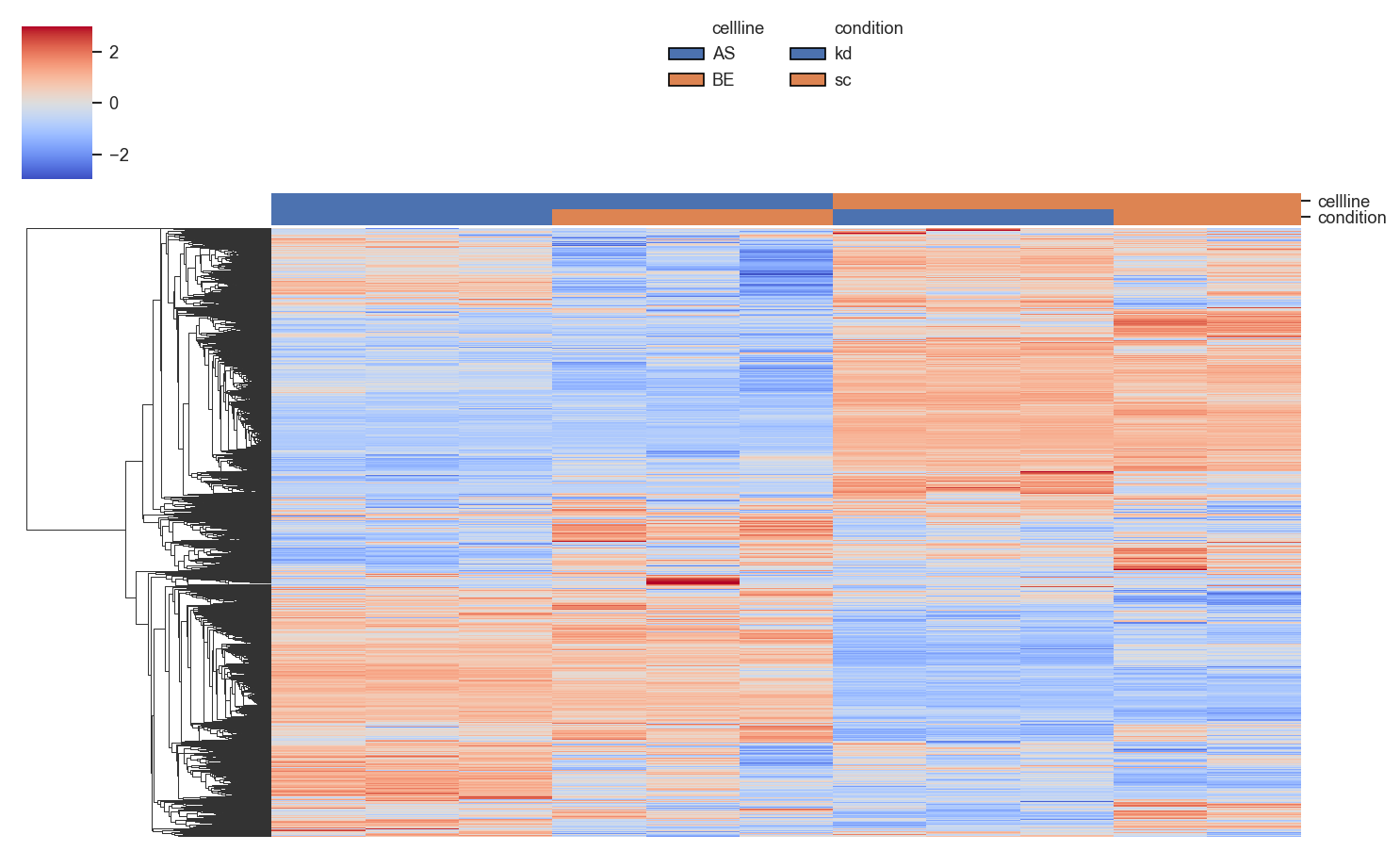
plot_clustermap
plot_clustermap(
    ax: "plt.Axes",
    pdata: pAnnData,
    on: str = "prot",
    classes: str | list[str] | None = None,
    layer: str = "X",
    x_label: str = "accession",
    namelist: list[str] | None = None,
    lut: dict | None = None,
    log2: bool = True,
    cmap: str = "coolwarm",
    figsize: tuple[float, float] = (6, 10),
    force: bool = False,
    impute: str | None = None,
    order: dict | None = None,
    **kwargs: Any
) -> Any
Plot a clustered heatmap of proteins or peptides by samples.
This function creates a hierarchical clustered heatmap (features × samples) with optional column annotations from sample-level metadata. Supports custom annotation colors, log2 transformation, and missing value imputation.
Parameters:
| Name | Type | Description | Default |
|---|---|---|---|
ax
|
Axes
|
Unused; included for API compatibility. |
required |
pdata
|
pAnnData
|
Input pAnnData object. |
required |
on
|
str
|
Data level to plot, either |
'prot'
|
classes
|
str or list of str
|
One or more |
None
|
layer
|
str
|
Data layer to use. Defaults to |
'X'
|
x_label
|
str
|
Row label mode, either |
'accession'
|
namelist
|
list of str
|
Subset of accessions or gene names to plot. If None, all rows are included. |
None
|
lut
|
dict
|
Nested dictionary of |
None
|
log2
|
bool
|
Whether to log2-transform the abundance matrix. Default is True. |
True
|
cmap
|
str
|
Colormap for heatmap. Default is |
'coolwarm'
|
figsize
|
tuple
|
Figure size in inches. Default is |
(6, 10)
|
force
|
bool
|
If True, imputes missing values instead of dropping rows with NaNs. |
False
|
impute
|
str
|
Imputation strategy used when
|
None
|
order
|
dict
|
Custom order for categorical annotations.
Example: |
None
|
**kwargs
|
Any
|
Additional keyword arguments passed to Common options include:
|
{}
|
Returns:
| Name | Type | Description |
|---|---|---|
g |
ClusterGrid
|
The seaborn clustermap object. |
Note
Function is currently under development, may not produce publication quality graphs yet. User discretion for formatting plots is encouraged.
lut example
Example of a custom lookup table for annotation colors:
Example
Clustered heatmap with sample annotations:
import matplotlib.pyplot as plt
from scpviz import plotting as scplt

fig, ax = plt.subplots(figsize=(1, 1))
g = scplt.plot_clustermap(
    ax,
    pdata_norm,
    on="prot",
    classes=["cellline", "condition"],
    force=True,
    impute="row_min",
    z_score=0,
    center=0,
    linewidth=0,
    figsize=(10, 6),
)
plt.show()
Provide a custom LUT for annotation colors:
import seaborn as sns

paired = sns.color_palette("Paired", 6)

lut = {
    "timepoint": {
        "1mo": paired[1],
        "3mo": paired[3],
        "6mo": paired[5],
    },
    "aggregate": {
        "aggN": "#4d4d4d",
        "aggY": "#bdbdbd",
    },
}

fig, ax = plt.subplots(figsize=(6, 4))
scplt.plot_clustermap(
    ax,
    pdata,
    classes=["timepoint", "aggregate"],
    force=True,
    impute="zero",
    z_score=0,
    center=0,
    lut=lut,
)
Source code in src/scpviz/plotting/correlation.py
628 629 630 631 632 633 634 635 636 637 638 639 640 641 642 643 644 645 646 647 648 649 650 651 652 653 654 655 656 657 658 659 660 661 662 663 664 665 666 667 668 669 670 671 672 673 674 675 676 677 678 679 680 681 682 683 684 685 686 687 688 689 690 691 692 693 694 695 696 697 698 699 700 701 702 703 704 705 706 707 708 709 710 711 712 713 714 715 716 717 718 719 720 721 722 723 724 725 726 727 728 729 730 731 732 733 734 735 736 737 738 739 740 741 742 743 744 745 746 747 748 749 750 751 752 753 754 755 756 757 758 759 760 761 762 763 764 765 766 767 768 769 770 771 772 773 774 775 776 777 778 779 780 781 782 783 784 785 786 787 788 789 790 791 792 793 794 795 796 797 798 799 800 801 802 803 804 805 806 807 808 809 810 811 812 813 814 815 816 817 818 819 820 821 822 823 824 825 826 827 828 829 830 831 832 833 834 835 836 837 838 839 840 841 842 843 844 845 846 847 848 849 850 851 852 853 854 855 856 857 858 859 860 861 862 863 864 865 866 867 868 869 870 871 872 873 874 875 876 877 878 879 880 881 882 883 884 885 886 887 888 889 890 891 892 893 894 895 896 897 898 899 900 901 902 903 904 905 906 907 908 909 910 911 912 913 914 915 916 917 918 919 920 921 922 923 924 925 | |
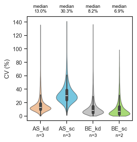
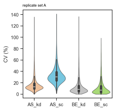
plot_cv
plot_cv(
    ax: "plt.Axes",
    pdata: pAnnData,
    classes: str | list[str] | None = None,
    layer: str = "X",
    on: str = "protein",
    order: list[str] | None = None,
    palette: Any = None,
    return_df: bool = False,
    extra_cols: list[str] = ["Accession", "Genes"],
    show_n: bool = False,
    annotate: str | dict[str, str] | None = None,
    n_kwargs: dict[str, Any] | None = None,
    annotate_kwargs: dict[str, Any] | None = None,
    **kwargs: Any
) -> Any
Plot coefficient of variation (CV) distributions as violins.
This function computes CV values across proteins or peptides, grouped by
sample-level classes, and visualizes their distribution. CV is stored as a
ratio in pdata.var; the plot and CV_pct column use percent
(ratio × 100).
Parameters:
| Name | Type | Description | Default |
|---|---|---|---|
ax
|
Axes
|
Axis on which to plot. |
required |
pdata
|
pAnnData
|
Input pAnnData object containing protein or peptide data. |
required |
classes
|
str or list of str
|
One or more |
None
|
layer
|
str
|
Data layer to use for CV calculation. Default is |
'X'
|
on
|
str
|
Data level to compute CV on, either |
'protein'
|
order
|
list
|
Custom order of classes for plotting. If None, defaults to alphabetical order. |
None
|
palette
|
dict or list
|
Custom color palette for class groups.
If None, defaults to |
None
|
return_df
|
bool
|
If True, returns the underlying DataFrame used for plotting. |
False
|
extra_cols
|
list
|
Additional columns to include in returned dataframe. |
['Accession', 'Genes']
|
show_n
|
bool
|
If True, annotate each violin with the total sample count
in that group ( |
False
|
annotate
|
str or dict
|
Per-violin annotations along the top of
the plotting area (just above the upper axis spine).
- |
None
|
n_kwargs
|
dict
|
Styling for |
None
|
annotate_kwargs
|
dict
|
Styling for |
None
|
**kwargs
|
Any
|
Additional keyword arguments passed to seaborn plotting functions. |
{}
|
Returns:
| Name | Type | Description |
|---|---|---|
ax |
Axes
|
The axis with the plotted CV distribution. |
cv_df |
DataFrame
|
Optional, returned if |
Example
Basic CV violins grouped by cell line and condition:
import matplotlib.pyplot as plt
from scpviz import plotting as scplt

fig, ax = plt.subplots(figsize=(3, 3))
scplt.plot_cv(ax, pdata, classes=["cellline", "condition"])
plt.show()
Sample counts below each violin and median CV above the plot:
fig, ax = plt.subplots(figsize=(3, 3))
scplt.plot_cv(
    ax, pdata, classes=["cellline", "condition"],
    show_n=True,
    annotate="median",
    annotate_kwargs={"fontsize": 7},
)
plt.show()
Custom per-group labels:
fig, ax = plt.subplots(figsize=(3, 3))
scplt.plot_cv(
    ax, pdata, classes=["cellline", "condition"],
    annotate={"AS_kd": "replicate set A"},
)
plt.show()
Export the underlying table (CV ratio and CV_pct percent columns):
Source code in src/scpviz/plotting/abundance.py
29 30 31 32 33 34 35 36 37 38 39 40 41 42 43 44 45 46 47 48 49 50 51 52 53 54 55 56 57 58 59 60 61 62 63 64 65 66 67 68 69 70 71 72 73 74 75 76 77 78 79 80 81 82 83 84 85 86 87 88 89 90 91 92 93 94 95 96 97 98 99 100 101 102 103 104 105 106 107 108 109 110 111 112 113 114 115 116 117 118 119 120 121 122 123 124 125 126 127 128 129 130 131 132 133 134 135 136 137 138 139 140 141 142 143 144 145 146 147 148 149 150 151 152 153 154 155 156 157 158 159 160 161 162 163 164 165 166 167 168 169 170 171 172 173 174 175 176 177 178 179 180 181 182 183 184 185 186 187 188 189 190 191 192 193 194 195 196 197 198 199 200 201 202 203 204 205 206 207 208 209 210 211 212 213 214 215 216 217 218 219 220 221 222 223 224 225 226 227 228 229 230 231 232 233 234 235 236 237 238 239 240 241 242 | |
plot_enrichment_svg
Plot STRING enrichment results as an SVG figure.
This is a wrapper that redirects to the implementation in enrichment.py
for convenience and discoverability.
Parameters:
| Name | Type | Description | Default |
|---|---|---|---|
*args
|
Any
|
Positional arguments passed to |
()
|
**kwargs
|
Any
|
Keyword arguments passed to |
{}
|
Returns:
| Name | Type | Description |
|---|---|---|
svg |
SVG
|
SVG figure object. |
See Also
scpviz.enrichment.plot_enrichment_svg
Source code in src/scpviz/plotting/enrichment.py
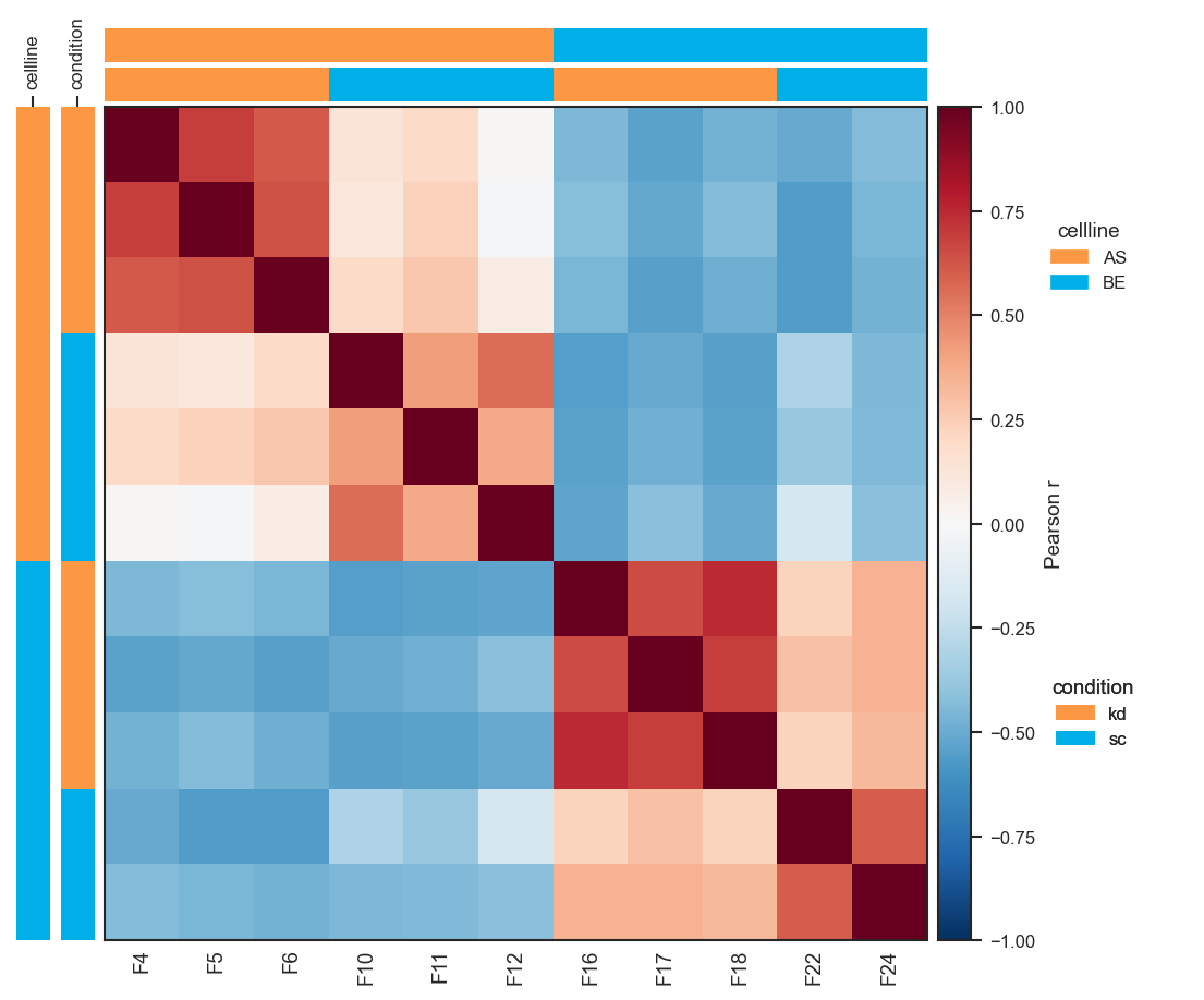
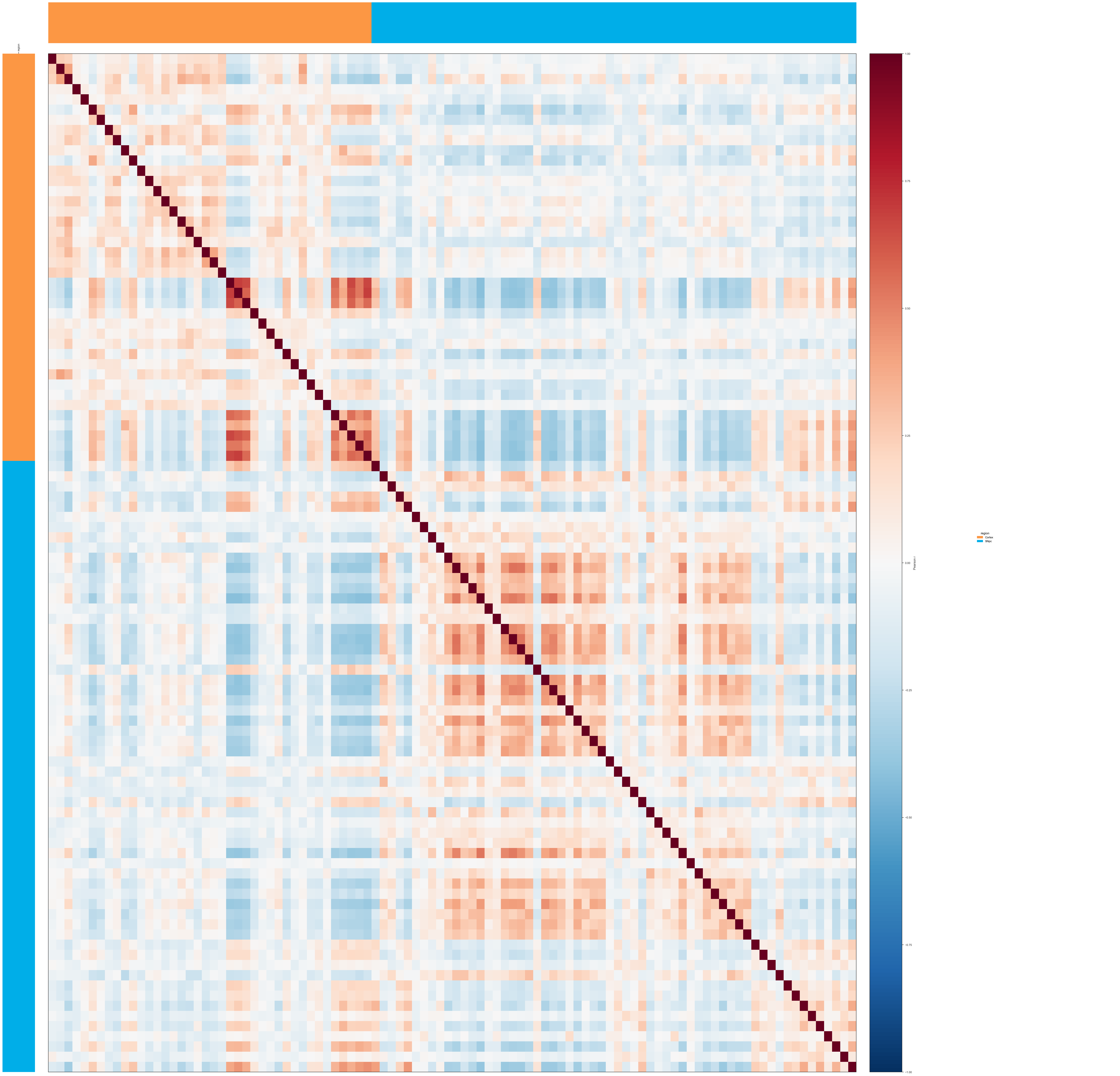
plot_pairwise_correlation
plot_pairwise_correlation(
    pdata: pAnnData,
    classes: str | list[str],
    on: str = "protein",
    layer: str = "X",
    method: str = "pearson",
    order: list | None = None,
    show_samples: bool = False,
    cmap: str = "RdBu_r",
    vmin: float | None = None,
    vmax: float | None = None,
    annotation_cmap: str | dict | list = "default",
    figsize: tuple | None = None,
    text_size: int = 9,
    colorbar_label: str | None = None,
    annot: bool = False,
    annot_fmt: str = ".2f",
    annot_size: int = 7,
    title: str | None = None,
    force: bool = False,
    subset_mask: ndarray | Series | list | None = None,
    show_annotation_legend: bool = True,
    legend_anchor_x: float = 0.3,
    show_ticklabels: bool | None = None,
    ticklabels_auto_max_samples: int = 20,
) -> "tuple[Figure, plt.Axes]"
noqa: D401
Plot a pairwise protein/peptide abundance correlation heatmap across groups or samples in .obs.
Automatically runs :meth:~scpviz.pAnnData.pAnnData.pairwise_correlation if
results are not already cached (or if force=True). The figure is created
internally; no ax argument is needed.
Cached analysis results are reused when classes, method, layer, and
subset_mask (via the same key as pairwise_correlation) match. If
show_samples=True but the cache lacks a sample matrix, analysis is rerun with
compute_sample_matrix=True. Group-level plots may reuse a cache that already
includes a sample matrix (nothing is stripped). Display order is applied only
when drawing and does not require recomputation.
Parameters:
| Name | Type | Description | Default |
|---|---|---|---|
pdata
|
pAnnData
|
Input pAnnData object. |
required |
classes
|
str | list[str]
|
|
required |
on
|
str
|
|
'protein'
|
layer
|
str
|
Data layer (default |
'X'
|
method
|
str
|
|
'pearson'
|
order
|
list | None
|
Optional row/column order. Must match the matrix being plotted:
If |
None
|
show_samples
|
bool
|
If False (default), plot the group × group matrix. If True,
plot the sample × sample matrix (requires |
False
|
cmap
|
str
|
Matplotlib colormap for the heatmap. |
'RdBu_r'
|
vmin
|
float | None
|
Colormap lower limit; correlation methods default to |
None
|
vmax
|
float | None
|
Colormap upper limit; correlation methods default to |
None
|
annotation_cmap
|
str | dict | list
|
|
'default'
|
figsize
|
tuple | None
|
|
None
|
text_size
|
int
|
Base font size for ticks, colorbar, and legends. |
9
|
colorbar_label
|
str | None
|
Override colorbar label. |
None
|
annot
|
bool
|
If True, write numeric values in each cell. |
False
|
annot_fmt
|
str
|
Format string for cell annotations (e.g. |
'.2f'
|
annot_size
|
int
|
Font size for cell annotations. |
7
|
title
|
str | None
|
Optional figure suptitle. |
None
|
force
|
bool
|
If True, recompute |
False
|
subset_mask
|
ndarray | Series | list | None
|
Boolean mask or boolean |
None
|
show_annotation_legend
|
bool
|
If True (default), draw one legend per annotation track in a dedicated GridSpec column right of the colorbar (obs column names also appear on the left vertical bar axes; top bars stay unlabeled). |
True
|
legend_anchor_x
|
float
|
Horizontal anchor for annotation legends inside the legend
column, in axes coordinates ( |
0.3
|
show_ticklabels
|
bool | None
|
When |
None
|
ticklabels_auto_max_samples
|
int
|
When |
20
|
Returns:
| Type | Description |
|---|---|
'tuple[Figure, plt.Axes]'
|
|
Note
Heatmap row (y) tick labels are always omitted (symmetric matrix; x-axis labels
carry sample or group names as applicable).
tight_layout may warn on some backends; layout is non-fatal if it fails.
Raises:
| Type | Description |
|---|---|
ValueError
|
If |
Example
Sample × sample Pearson correlation on a per-protein z-score layer (X_pw_zscore):
import matplotlib.pyplot as plt
import numpy as np
from scpviz import plotting as scplt
from scpviz import utils as scu

adata = scu.get_adata(pdata_norm, "protein")
X = np.asarray(scu.get_adata_layer(adata, "X"), dtype=float)
mu = np.nanmean(X, axis=0, keepdims=True)
sig = np.nanstd(X, axis=0, keepdims=True)
sig = np.where(np.isfinite(sig) & (sig > 0), sig, 1.0)
adata.layers["X_pw_zscore"] = (X - mu) / sig

fig, ax = scplt.plot_pairwise_correlation(
    pdata_norm,
    classes=["cellline", "condition"],
    method="pearson",
    show_samples=True,
    layer="X_pw_zscore",
    force=True,
)
plt.show()
Same approach on single-cell protein data (classes aligned with UMAP, e.g. region):
import matplotlib.pyplot as plt
import numpy as np
from scpviz import plotting as scplt
from scpviz import utils as scu

adata = scu.get_adata(pdata_sc, "protein")
X = np.asarray(scu.get_adata_layer(adata, "X"), dtype=float)
mu = np.nanmean(X, axis=0, keepdims=True)
sig = np.nanstd(X, axis=0, keepdims=True)
sig = np.where(np.isfinite(sig) & (sig > 0), sig, 1.0)
adata.layers["X_pw_zscore"] = (X - mu) / sig

fig, ax = scplt.plot_pairwise_correlation(
    pdata_sc,
    classes=["region"],
    method="pearson",
    show_samples=True,
    layer="X_pw_zscore",
    force=True,
)
plt.show()
Imports and group-level heatmap (show_samples=False, default). Uses cached
pairwise_correlation results when parameters match; pass force=True to
recompute after changing .X or normalization:
from scpviz import plotting as scplt

fig, ax = scplt.plot_pairwise_correlation(pdata, classes="cellline", method="pearson")
Sample × sample heatmap (show_samples=True). Triggers or reuses analysis with
compute_sample_matrix=True. Euclidean distances use NaN-aware geometry on raw
abundance rows; pick a sequential cmap (e.g. viridis) for distances:
fig, ax = scplt.plot_pairwise_correlation(
    pdata,
    classes=["cellline", "treatment"],
    show_samples=True,
    method="euclidean",
    cmap="viridis",
)
Force sample names on the x-axis when there are many samples (auto-hide uses
ticklabels_auto_max_samples when show_ticklabels=None):
fig, ax = scplt.plot_pairwise_correlation(
    pdata,
    classes="cellline",
    show_samples=True,
    show_ticklabels=True,
)
annotation_cmap — "default" (omit or pass explicitly): independent
categorical palette per .obs column, built from sorted unique values:
fig, ax = scplt.plot_pairwise_correlation(
    pdata, classes=["cellline", "treatment"], annotation_cmap="default"
)
annotation_cmap — dict mapping stringified .obs levels to colors; the
same dict is reused for every annotation column (cover all levels that appear):
ann = {"AS": "#E41A1C", "BE": "#377EB8", "kd": "#4DAF4A", "sc": "#984EA3"}
fig, ax = scplt.plot_pairwise_correlation(
    pdata, classes=["cellline", "treatment"], annotation_cmap=ann
)
annotation_cmap — list of colors, assigned in sorted-level order within
each obs column (cycles if there are more levels than colors):
fig, ax = scplt.plot_pairwise_correlation(
    pdata, classes="cellline", annotation_cmap=["#FC9744", "#00AEE8", "#9D9D9D"]
)
annotation_cmap — matplotlib colormap name: evenly spaced colors for each column's sorted uniques:
Custom row/column order without recomputing (labels must exist in the matrix).
For group heatmaps, use combined strings when classes is a list (e.g.
"AS, kd"):
fig, ax = scplt.plot_pairwise_correlation(
    pdata, classes=["cellline", "treatment"],
    order=["AS, kd", "BE, sc", "AS, sc", "BE, kd"],
)
For sample heatmaps, order must be observation names (same strings as
pdata.prot.obs_names), not "AS, kd" group tokens — for example reverse
or subset the index:
names = list(pdata.prot.obs_names)
fig, ax = scplt.plot_pairwise_correlation(
    pdata,
    classes=["cellline", "treatment"],
    show_samples=True,
    order=list(reversed(names)),
)
Subset of samples (boolean mask or Series aligned to adata.obs_names) and
no annotation legends:
mask = pdata.prot.obs["cellline"].eq("AS").to_numpy()
fig, ax = scplt.plot_pairwise_correlation(
    pdata, classes="treatment", subset_mask=mask, show_annotation_legend=False
)
Small matrices — show numeric values in cells; adjust legend horizontal position if it overlaps the colorbar:
Source code in src/scpviz/plotting/correlation.py
36 37 38 39 40 41 42 43 44 45 46 47 48 49 50 51 52 53 54 55 56 57 58 59 60 61 62 63 64 65 66 67 68 69 70 71 72 73 74 75 76 77 78 79 80 81 82 83 84 85 86 87 88 89 90 91 92 93 94 95 96 97 98 99 100 101 102 103 104 105 106 107 108 109 110 111 112 113 114 115 116 117 118 119 120 121 122 123 124 125 126 127 128 129 130 131 132 133 134 135 136 137 138 139 140 141 142 143 144 145 146 147 148 149 150 151 152 153 154 155 156 157 158 159 160 161 162 163 164 165 166 167 168 169 170 171 172 173 174 175 176 177 178 179 180 181 182 183 184 185 186 187 188 189 190 191 192 193 194 195 196 197 198 199 200 201 202 203 204 205 206 207 208 209 210 211 212 213 214 215 216 217 218 219 220 221 222 223 224 225 226 227 228 229 230 231 232 233 234 235 236 237 238 239 240 241 242 243 244 245 246 247 248 249 250 251 252 253 254 255 256 257 258 259 260 261 262 263 264 265 266 267 268 269 270 271 272 273 274 275 276 277 278 279 280 281 282 283 284 285 286 287 288 289 290 291 292 293 294 295 296 297 298 299 300 301 302 303 304 305 306 307 308 309 310 311 312 313 314 315 316 317 318 319 320 321 322 323 324 325 326 327 328 329 330 331 332 333 334 335 336 337 338 339 340 341 342 343 344 345 346 347 348 349 350 351 352 353 354 355 356 357 358 359 360 361 362 363 364 365 366 367 368 369 370 371 372 373 374 375 376 377 378 379 380 381 382 383 384 385 386 387 388 389 390 391 392 393 394 395 396 397 398 399 400 401 402 403 404 405 406 407 408 409 410 411 412 413 414 415 416 417 418 419 420 421 422 423 424 425 426 427 428 429 430 431 432 433 434 435 436 437 438 439 440 441 442 443 444 445 446 447 448 449 450 451 452 453 454 455 456 457 458 459 460 461 462 463 464 465 466 467 468 469 470 471 472 473 474 475 476 477 478 479 480 481 482 483 484 485 486 487 488 489 490 491 492 493 494 495 496 497 498 499 500 501 502 503 504 505 506 507 508 509 510 511 512 513 514 515 516 517 518 519 520 521 522 523 524 525 526 527 528 529 530 531 532 533 534 535 536 537 538 539 540 541 542 543 544 545 546 547 548 549 550 551 552 553 554 555 556 557 558 559 560 561 562 563 564 565 566 567 568 569 570 571 572 573 574 575 576 577 578 579 580 581 582 583 584 585 586 587 588 589 590 591 592 593 594 595 596 597 598 599 600 601 602 603 604 605 606 607 608 609 610 611 612 613 614 615 616 617 618 619 620 621 622 623 624 625 626 | |
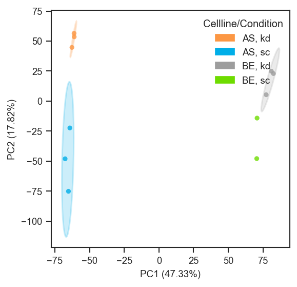
plot_pca
plot_pca(
    ax: "plt.Axes",
    pdata: pAnnData,
    color=None,
    edge_color=None,
    marker_shape=None,
    classes=None,
    layer="X",
    on="protein",
    cmap="default",
    edge_cmap="default",
    shape_cmap="default",
    edge_lw=0.8,
    s=20,
    alpha=0.8,
    plot_pc=[1, 2],
    pca_params=None,
    subset_mask=None,
    force=False,
    basis="X_pca",
    text_size=9,
    show_labels=False,
    label_column=None,
    add_ellipses=False,
    ellipse_group=None,
    ellipse_cmap="default",
    ellipse_kwargs=None,
    return_fit=False,
    mapping_keys=None,
    mapping=None,
    mapping_on_missing: str = "warn",
    colorbar_norm: Any = None,
    nan_color: str = "lightgrey",
    colorbar_label: str | None = None,
    **kwargs: Any
) -> "plt.Axes | tuple[plt.Axes, dict[str, Any]]"
Plot principal component analysis (PCA) of protein or peptide abundance.
Computes (or reuses) PCA coordinates and plots samples in 2D or 3D, with
flexible styling via face color (color), edge color (edge_color), marker
shapes (marker_shape), labels, and optional confidence ellipses.
Parameters:
| Name | Type | Description | Default |
|---|---|---|---|
ax
|
Axes
|
Axis to plot on. Must be 3D if plotting 3 PCs. |
required |
pdata
|
pAnnData
|
Input pAnnData object with |
required |
color
|
str or list of str or None
|
Face coloring for points.
|
None
|
edge_color
|
str or list of str or None
|
Edge coloring for points (categorical only).
|
None
|
marker_shape
|
str or list of str or None
|
Marker shapes for points (categorical only).
|
None
|
classes
|
str or list of str or None
|
Deprecated alias for
|
None
|
layer
|
str
|
Data layer to use (default: |
'X'
|
on
|
str
|
Data level to plot, either |
'protein'
|
cmap
|
str, list, or dict
|
Palette/colormap for face coloring (
|
'default'
|
edge_cmap
|
str, list, or dict
|
Palette for edge coloring (
|
'default'
|
shape_cmap
|
str, list, or dict
|
Marker mapping for
|
'default'
|
edge_lw
|
float
|
Edge linewidth when |
0.8
|
s
|
float
|
Marker size (default: 20). |
20
|
alpha
|
float
|
Marker opacity (default: 0.8). |
0.8
|
plot_pc
|
list of int
|
Principal components to plot, e.g. |
[1, 2]
|
pca_params
|
dict
|
Additional parameters for the PCA computation. |
None
|
subset_mask
|
array - like or Series
|
Boolean mask to subset samples.
If a Series is provided, it will be aligned to |
None
|
force
|
bool
|
If True, recompute PCA even if cached. |
False
|
basis
|
str
|
PCA basis in |
'X_pca'
|
text_size
|
int
|
Font size for axis labels and legends (default: 9). |
9
|
show_labels
|
bool or list
|
Whether to label points.
|
False
|
label_column
|
str
|
Column in |
None
|
add_ellipses
|
bool
|
If True, overlay confidence ellipses per group (2D only). |
False
|
ellipse_group
|
str or list of str
|
Explicit
|
None
|
ellipse_cmap
|
str, list, or dict
|
Ellipse color mapping.
|
'default'
|
ellipse_kwargs
|
dict
|
Extra keyword arguments passed to the ellipse patch
(e.g., |
None
|
mapping_keys
|
list of str
|
|
None
|
mapping
|
dict
|
Keys are tuples matching observed metadata combinations; values
are dicts with optional |
None
|
mapping_on_missing
|
str
|
|
'warn'
|
colorbar_norm
|
None, str, or matplotlib.colors.Normalize
|
Scaling for abundance face coloring
(protein/peptide |
None
|
nan_color
|
str
|
Face color for zero, NaN, and negative abundances (default |
'lightgrey'
|
colorbar_label
|
str or None
|
Override the abundance colorbar axis label. When |
None
|
return_fit
|
bool
|
If True, also return the fitted PCA object. |
False
|
**kwargs
|
Any
|
Extra keyword arguments passed to |
{}
|
Returns:
| Name | Type | Description |
|---|---|---|
ax |
Axes
|
Axis containing the PCA scatter plot. |
pca |
PCA
|
The fitted PCA object (only if |
Raises:
| Type | Description |
|---|---|
AssertionError
|
If 3 PCs are requested and |
ValueError
|
If |
ValueError
|
If |
ValueError
|
If |
Note
edge_colorandmarker_shapeare categorical only.- If
coloris continuous (abundance), a colorbar is shown automatically. - Use
classes=only for backwards compatibility; prefercolor=. - PCA results are cached in
pdata.uns["pca"]and reused across plotting calls. - To force recalculation (e.g., after filtering or normalization), set
force=True.
Example
PCA on normalized protein data with ellipses, grouped by cell line and condition:
import matplotlib.pyplot as plt
from scpviz import plotting as scplt

fig, ax = plt.subplots(figsize=(4, 4))
pdata_norm.pca(on="protein")
scplt.plot_pca(ax, pdata_norm, classes=["cellline", "condition"], add_ellipses=True)
plt.show()
PCA on single-cell protein data after directlfq (example uses region; use condition or other .obs columns as in your object):
import matplotlib.pyplot as plt
from scpviz import plotting as scplt
fig, ax = plt.subplots(figsize=(4, 4))
pdata_sc.pca(on="protein")
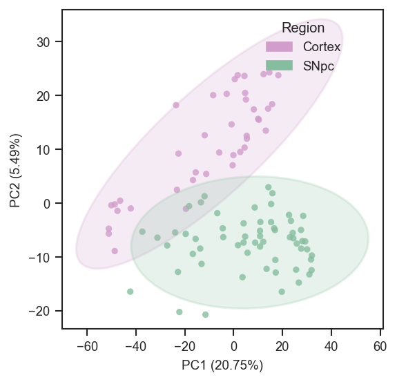
scplt.plot_pca(
ax,
pdata_sc,
color=["region"],
cmap={"Cortex": "#D19DCB", "SNpc": "#85BE9E"},
add_ellipses=True,
)
plt.show()
Basic usage in grey:
Face color by a categorical .obs key:
Combine multiple .obs keys into one categorical label:
Face color by gene/protein abundance (continuous) with a matplotlib colormap:
Log-scale abundance coloring with undetected cells in grey (log10 or log2):
Log-scale with explicit LogNorm limits (common for sparse single-cell data):
import matplotlib.colors as mcolors

plot_pca(
    ax, pdata, color="UBE4B", cmap="plasma",
    colorbar_norm=mcolors.LogNorm(vmin=1, vmax=1e7),
    nan_color="black",
)
Custom colormap and linear range:
from matplotlib.colors import LinearSegmentedColormap, Normalize

cmap = LinearSegmentedColormap.from_list(
    "expr", ["#ffffff", "#fee090", "#d73027"]
)
plot_pca(
    ax, pdata, color="UBE4B", cmap=cmap,
    colorbar_norm=Normalize(vmin=0, vmax=100), nan_color="grey",
)
Face color and edge color by different categorical keys with a custom palette:
edge_palette = {"A": "#3627E0", "B": "#F61B0F"}
plot_pca(ax, pdata, color="condition", edge_color="group", edge_cmap=edge_palette, edge_lw=1.5)
Marker shapes by a categorical key:
shape_map = {"WT": "o", "MUT": "s"}
plot_pca(ax, pdata, color="treatment", marker_shape="genotype", shape_cmap=shape_map)
Add ellipses (auto-grouping by categorical color):
Add ellipses grouped explicitly (and force ellipse colors):
ellipse_colors = {"WT": "#000000", "MUT": "#377EB8"}
plot_pca(
    ax, pdata,
    color="UBE4B", cmap="viridis",
    marker_shape="genotype",
    add_ellipses=True,
    ellipse_group="genotype",
    ellipse_cmap=ellipse_colors,
    ellipse_kwargs={"alpha": 0.10, "lw": 1.5},
)
Label all samples (using a custom label column if present):
Tuple-key mapping (literal face + edge per combination of .obs columns):
mapping_keys = ["cellline", "condition"]
mapping = {
    ("A", "ctrl"): {"color": "white", "edge_color": "black"},
    ("A", "treat"): {"color": "white", "edge_color": "blue"},
    ("B", "ctrl"): {"color": "lightgrey", "edge_color": "black"},
    ("B", "treat"): {"color": "lightgrey", "edge_color": "blue"},
}
plot_pca(ax, pdata, mapping_keys=mapping_keys, mapping=mapping, force=True)
Global abundance face color with per-combination edges (mapping must not set color):
mapping_keys = ["cellline", "condition"]
mapping = {
    ("A", "ctrl"): {"edge_color": "black"},
    ("A", "treat"): {"edge_color": "steelblue"},
    ("B", "ctrl"): {"edge_color": "black"},
    ("B", "treat"): {"edge_color": "steelblue"},
}
plot_pca(ax, pdata, color="UBE4B", cmap="plasma", mapping_keys=mapping_keys, mapping=mapping)
Sequential overlays on the same axes (same embedding, using different subset_mask; order matters).
Replace column names and palettes with your metadata:
line = "LineA"
cell_line_color = {"LineA": "#4C72B0", "LineB": "#DD8452"}
cell_line_color_6h = {"LineA": "#9fb8d9", "LineB": "#e8b896"}

mask_dark = (
    (pdata.summary["treatment"] == "Drug")
    & (pdata.summary["cell_line"] == line)
    & (pdata.summary["duration"] == "24hr")
)
mask_light = (
    (pdata.summary["treatment"] == "Drug")
    & (pdata.summary["cell_line"] == line)
    & (pdata.summary["duration"] == "6hr")
)
mask_ctrl = (
    (pdata.summary["treatment"] == "Vehicle")
    & (pdata.summary["cell_line"] == line)
)

fig = plt.figure(figsize=(4, 4))
ax = fig.add_subplot(111, projection="3d")

ax, _ = plot_pca(
    ax,
    pdata,
    color="cell_line",
    cmap=cell_line_color,
    edge_color="duration",
    edge_cmap={"6hr": "grey", "24hr": "black"},
    plot_pc=[1, 2, 3],
    subset_mask=mask_dark,
    return_fit=True,
    force=True,
)
ax, _ = plot_pca(
    ax,
    pdata,
    color="cell_line",
    cmap=cell_line_color_6h,
    edge_color="duration",
    edge_cmap={"6hr": "grey", "24hr": "black"},
    plot_pc=[1, 2, 3],
    subset_mask=mask_light,
    return_fit=True,
)
plot_pca(
    ax,
    pdata,
    color="cell_line",
    cmap={k: "white" for k in cell_line_color},
    plot_pc=[1, 2, 3],
    edge_color="cell_line",
    edge_cmap=cell_line_color,
    edge_lw=1.2,
    subset_mask=mask_ctrl,
    force=False,
)
Source code in src/scpviz/plotting/dimreduc.py
47 48 49 50 51 52 53 54 55 56 57 58 59 60 61 62 63 64 65 66 67 68 69 70 71 72 73 74 75 76 77 78 79 80 81 82 83 84 85 86 87 88 89 90 91 92 93 94 95 96 97 98 99 100 101 102 103 104 105 106 107 108 109 110 111 112 113 114 115 116 117 118 119 120 121 122 123 124 125 126 127 128 129 130 131 132 133 134 135 136 137 138 139 140 141 142 143 144 145 146 147 148 149 150 151 152 153 154 155 156 157 158 159 160 161 162 163 164 165 166 167 168 169 170 171 172 173 174 175 176 177 178 179 180 181 182 183 184 185 186 187 188 189 190 191 192 193 194 195 196 197 198 199 200 201 202 203 204 205 206 207 208 209 210 211 212 213 214 215 216 217 218 219 220 221 222 223 224 225 226 227 228 229 230 231 232 233 234 235 236 237 238 239 240 241 242 243 244 245 246 247 248 249 250 251 252 253 254 255 256 257 258 259 260 261 262 263 264 265 266 267 268 269 270 271 272 273 274 275 276 277 278 279 280 281 282 283 284 285 286 287 288 289 290 291 292 293 294 295 296 297 298 299 300 301 302 303 304 305 306 307 308 309 310 311 312 313 314 315 316 317 318 319 320 321 322 323 324 325 326 327 328 329 330 331 332 333 334 335 336 337 338 339 340 341 342 343 344 345 346 347 348 349 350 351 352 353 354 355 356 357 358 359 360 361 362 363 364 365 366 367 368 369 370 371 372 373 374 375 376 377 378 379 380 381 382 383 384 385 386 387 388 389 390 391 392 393 394 395 396 397 398 399 400 401 402 403 404 405 406 407 408 409 410 411 412 413 414 415 416 417 418 419 420 421 422 423 424 425 426 427 428 429 430 431 432 433 434 435 436 437 438 439 440 441 442 443 444 445 446 447 448 449 450 451 452 453 454 455 456 457 458 459 460 461 462 463 464 465 466 467 468 469 470 471 472 473 474 475 476 477 478 479 480 481 482 483 484 485 486 487 488 | |
plot_pca_gsea_bubble
plot_pca_gsea_bubble(
    ax,
    pdata: pAnnData,
    on="protein",
    key_added="pca_gsea",
    pcs=None,
    top_n=20,
    fdr_cutoff=0.1,
    size_scale=120.0,
    cmap="coolwarm",
    title_case_labels=True,
    force=False,
    gsea_kwargs=None,
    top_n_mode="balanced",
    include_pathways=None,
    exclude_pathways=None,
    return_df=False,
) -> Any
Plot PCA-GSEA results as a bubble chart (principal component versus pathway).
Bubble color encodes NES; bubble area reflects significance (-log10(FDR)). Rows and columns
are ordered by pathway and PC. If pcs is omitted, all PCs present in stored results are used.
Parameters:
| Name | Type | Description | Default |
|---|---|---|---|
ax
|
Axes
|
Target axis. |
required |
pdata
|
pAnnData
|
Input object. |
required |
on
|
str
|
Data level, |
'protein'
|
key_added
|
str
|
|
'pca_gsea'
|
pcs
|
list of int or None
|
1-based PCs to include; |
None
|
top_n
|
int
|
Cap on distinct pathways after ranking; must be >= 1 (required). |
20
|
fdr_cutoff
|
float or None
|
Same meaning as in |
0.1
|
size_scale
|
float
|
Multiplier for bubble area from |
120.0
|
cmap
|
str or Colormap
|
Colormap for NES-centered coloring. |
'coolwarm'
|
title_case_labels
|
bool
|
If True, format pathway tick labels for display. |
True
|
force
|
bool
|
If True, re-run |
False
|
gsea_kwargs
|
dict or None
|
Forwarded to |
None
|
top_n_mode
|
str
|
|
'balanced'
|
include_pathways
|
str, iterable, or None
|
Keep only pathways matching these names. |
None
|
exclude_pathways
|
str, iterable, or None
|
Remove pathways matching these names. |
None
|
return_df
|
bool
|
If True, return |
False
|
Returns:
| Type | Description |
|---|---|
Any
|
matplotlib.axes.Axes, or |
Example
Bubble chart for the first three PCs, top 25 pathways by ranking, and return the table used for the plot:
import matplotlib.pyplot as plt
from scpviz import plotting as scplt

fig, ax = plt.subplots(figsize=(6, 8))
ax, df = scplt.plot_pca_gsea_bubble(
    ax,
    pdata,
    pcs=[1, 2, 3],
    top_n=25,
    return_df=True,
)
Stricter FDR cutoff (0.05) and title-case pathway labels on the y-axis:
Source code in src/scpviz/plotting/dimreduc.py
2844 2845 2846 2847 2848 2849 2850 2851 2852 2853 2854 2855 2856 2857 2858 2859 2860 2861 2862 2863 2864 2865 2866 2867 2868 2869 2870 2871 2872 2873 2874 2875 2876 2877 2878 2879 2880 2881 2882 2883 2884 2885 2886 2887 2888 2889 2890 2891 2892 2893 2894 2895 2896 2897 2898 2899 2900 2901 2902 2903 2904 2905 2906 2907 2908 2909 2910 2911 2912 2913 2914 2915 2916 2917 2918 2919 2920 2921 2922 2923 2924 2925 2926 2927 2928 2929 2930 2931 2932 2933 2934 2935 2936 2937 2938 2939 2940 2941 2942 2943 2944 2945 2946 2947 2948 2949 2950 2951 2952 2953 2954 2955 2956 2957 2958 2959 2960 2961 2962 2963 2964 2965 2966 2967 2968 2969 2970 2971 2972 2973 2974 2975 2976 2977 2978 2979 2980 2981 2982 2983 2984 2985 2986 2987 2988 2989 2990 2991 2992 2993 2994 2995 2996 2997 2998 2999 3000 3001 3002 3003 3004 3005 3006 3007 3008 3009 3010 3011 3012 3013 3014 3015 3016 3017 3018 3019 3020 | |
plot_pca_gsea_heatmap
plot_pca_gsea_heatmap(
    ax,
    pdata: pAnnData,
    on="protein",
    key_added="pca_gsea",
    pcs=None,
    top_n=30,
    fdr_cutoff=0.1,
    cmap="coolwarm",
    title_case_labels=True,
    force=False,
    gsea_kwargs=None,
    top_n_mode="balanced",
    include_pathways=None,
    exclude_pathways=None,
    return_df=False,
) -> Any
Plot a pathway-by-principal-component heatmap of PCA-GSEA NES values.
Cell color is NES; optional top_n trimming uses the same FDR-aware scoring as the bubble plot.
Missing PCs in stored results produce NaN columns and a warning.
Parameters:
| Name | Type | Description | Default |
|---|---|---|---|
ax
|
Axes
|
Target axis. |
required |
pdata
|
pAnnData
|
Input object. |
required |
on
|
str
|
Data level, |
'protein'
|
key_added
|
str
|
|
'pca_gsea'
|
pcs
|
list of int or None
|
1-based PCs as columns; |
None
|
top_n
|
int
|
Maximum pathways to retain after ranking; must be >= 1 (required). |
30
|
fdr_cutoff
|
float or None
|
Same meaning as in |
0.1
|
cmap
|
str or Colormap
|
Heatmap colormap (diverging around zero is typical). |
'coolwarm'
|
title_case_labels
|
bool
|
If True, format pathway labels on the axis. |
True
|
force
|
bool
|
If True, re-run |
False
|
gsea_kwargs
|
dict or None
|
Forwarded to |
None
|
top_n_mode
|
str
|
|
'balanced'
|
include_pathways
|
str, iterable, or None
|
Keep only pathways matching these names. |
None
|
exclude_pathways
|
str, iterable, or None
|
Remove pathways matching these names. |
None
|
return_df
|
bool
|
If True, return |
False
|
Returns:
| Type | Description |
|---|---|
Any
|
matplotlib.axes.Axes, or |
Example
Heatmap of NES for four PCs and the 40 top-ranked pathways:
import matplotlib.pyplot as plt
from scpviz import plotting as scplt

fig, ax = plt.subplots(figsize=(5, 10))
scplt.plot_pca_gsea_heatmap(ax, pdata, pcs=[1, 2, 3, 4], top_n=40)
Diverging colormap with formatted pathway names on rows:
Source code in src/scpviz/plotting/dimreduc.py
3022 3023 3024 3025 3026 3027 3028 3029 3030 3031 3032 3033 3034 3035 3036 3037 3038 3039 3040 3041 3042 3043 3044 3045 3046 3047 3048 3049 3050 3051 3052 3053 3054 3055 3056 3057 3058 3059 3060 3061 3062 3063 3064 3065 3066 3067 3068 3069 3070 3071 3072 3073 3074 3075 3076 3077 3078 3079 3080 3081 3082 3083 3084 3085 3086 3087 3088 3089 3090 3091 3092 3093 3094 3095 3096 3097 3098 3099 3100 3101 3102 3103 3104 3105 3106 3107 3108 3109 3110 3111 3112 3113 3114 3115 3116 3117 3118 3119 3120 3121 3122 3123 3124 3125 3126 3127 3128 3129 3130 3131 3132 3133 3134 3135 3136 3137 3138 3139 3140 3141 3142 3143 3144 3145 | |
plot_pca_gsea_pathway_vectors
plot_pca_gsea_pathway_vectors(
    ax,
    pdata: pAnnData,
    on="protein",
    key_added="pca_gsea",
    plot_pc=[1, 2],
    n_vectors=N_VECTORS_UNSET,
    fdr_cutoff=0.1,
    arrow_scale=0.25,
    pca_kwargs=None,
    show_samples=True,
    title_case_labels=True,
    force=False,
    gsea_kwargs=None,
    adjust_labels=True,
    adjust_text_kwargs=None,
    text_positions=None,
    lock_text_positions=False,
    top_n_mode="balanced",
    exclude_pathways=None,
    namelist=None,
    cmap=None,
    xlim=None,
    ylim=None,
    return_df=False,
) -> Any
Overlay PCA-GSEA pathways as arrows in a two-dimensional PCA sample space.
Each arrow encodes normalized enrichment scores (NES) on two principal components taken from
adata.uns[key_added]['results'] (from pca_gsea). Arrow endpoints are rescaled using the
current axis limits so pathways remain visible; they are not plotted in the same numeric units as
sample coordinates. When show_samples is True, the sample PCA scatter is drawn first via
plot_pca.
Parameters:
| Name | Type | Description | Default |
|---|---|---|---|
ax
|
Axes
|
Target axis (2D). |
required |
pdata
|
pAnnData
|
Input object. |
required |
on
|
str
|
Data level, |
'protein'
|
key_added
|
str
|
|
'pca_gsea'
|
plot_pc
|
list of int
|
Exactly two 1-based PCs, e.g. |
[1, 2]
|
n_vectors
|
int, sequence, ``None``, or unset
|
Caps auto-selected pathways (after |
N_VECTORS_UNSET
|
fdr_cutoff
|
float or None
|
For auto-selected rows: pathway-level FDR filtering (keep if any plotted
PC has FDR ≤ cutoff) and score gating in |
0.1
|
arrow_scale
|
float
|
Scale factor for arrow length relative to axis span. |
0.25
|
pca_kwargs
|
dict or None
|
Additional arguments passed to |
None
|
show_samples
|
bool
|
If True, plot samples first; if False, draw only axes, grid lines, and arrows. |
True
|
title_case_labels
|
bool
|
If True, format pathway labels for display (e.g. title case). |
True
|
force
|
bool
|
If True, re-run |
False
|
gsea_kwargs
|
dict or None
|
Forwarded to |
None
|
adjust_labels
|
bool
|
If True, run |
True
|
adjust_text_kwargs
|
dict or None
|
Extra keyword arguments for |
None
|
text_positions
|
dict or None
|
Optional manual label positions; keys are pathway raw or display
strings, values are |
None
|
lock_text_positions
|
bool
|
If True, labels with entries in |
False
|
top_n_mode
|
str
|
|
'balanced'
|
exclude_pathways
|
str, iterable, or None
|
Remove pathways matching these names (raw Term, short pathway, or library), same as before. |
None
|
namelist
|
list of str or None
|
Pathways to always include first (matches |
None
|
cmap
|
dict or None
|
Per-pathway colors; lookup raw |
None
|
xlim
|
tuple or None
|
Applied after scatter / empty axes, before arrow scaling (with |
None
|
ylim
|
tuple or None
|
Same as |
None
|
return_df
|
bool
|
If True, also return a DataFrame with NES, FDR, and label positions. |
False
|
Returns:
| Type | Description |
|---|---|
Any
|
matplotlib.axes.Axes, or |
Note
May attach payload["pathway_loadings"] for reuse in the same session.
TODO
Add explicit FDR visual encoding on vector arrows (e.g., color or alpha by FDR).
Example
Default overlay on PC1 vs PC2 with label de-cluttering and return coordinates for a second pass:
import matplotlib.pyplot as plt
from scpviz import plotting as scplt

fig, ax = plt.subplots()
ax, vec_df = scplt.plot_pca_gsea_pathway_vectors(
    ax,
    pdata,
    plot_pc=[1, 2],
    adjust_text_kwargs={"expand": (1.3, 1.3)},
    return_df=True,
)
Reuse label positions from a previous run (e.g. after editing coordinates in vec_df):
Source code in src/scpviz/plotting/dimreduc.py
2089 2090 2091 2092 2093 2094 2095 2096 2097 2098 2099 2100 2101 2102 2103 2104 2105 2106 2107 2108 2109 2110 2111 2112 2113 2114 2115 2116 2117 2118 2119 2120 2121 2122 2123 2124 2125 2126 2127 2128 2129 2130 2131 2132 2133 2134 2135 2136 2137 2138 2139 2140 2141 2142 2143 2144 2145 2146 2147 2148 2149 2150 2151 2152 2153 2154 2155 2156 2157 2158 2159 2160 2161 2162 2163 2164 2165 2166 2167 2168 2169 2170 2171 2172 2173 2174 2175 2176 2177 2178 2179 2180 2181 2182 2183 2184 2185 2186 2187 2188 2189 2190 2191 2192 2193 2194 2195 2196 2197 2198 2199 2200 2201 2202 2203 2204 2205 2206 2207 2208 2209 2210 2211 2212 2213 2214 2215 2216 2217 2218 2219 2220 2221 2222 2223 2224 2225 2226 2227 2228 2229 2230 2231 2232 2233 2234 2235 2236 2237 2238 2239 2240 2241 2242 2243 2244 2245 2246 2247 2248 2249 2250 2251 2252 2253 2254 2255 2256 2257 2258 2259 2260 2261 2262 2263 2264 2265 2266 2267 2268 2269 2270 2271 2272 2273 2274 2275 2276 2277 2278 2279 2280 2281 2282 2283 2284 2285 2286 2287 2288 2289 2290 2291 2292 2293 2294 2295 2296 2297 2298 2299 2300 2301 2302 2303 2304 2305 2306 2307 2308 2309 2310 2311 2312 2313 2314 2315 2316 2317 2318 2319 2320 2321 2322 2323 2324 2325 2326 2327 2328 2329 2330 2331 2332 2333 2334 2335 2336 2337 2338 2339 2340 2341 2342 2343 2344 2345 2346 2347 2348 2349 2350 2351 2352 2353 2354 2355 2356 2357 2358 2359 2360 2361 2362 2363 2364 2365 2366 2367 2368 2369 2370 2371 2372 2373 2374 2375 2376 2377 2378 2379 2380 2381 2382 2383 2384 2385 2386 2387 2388 2389 2390 2391 2392 2393 2394 2395 2396 2397 2398 2399 2400 2401 2402 2403 2404 2405 2406 2407 2408 2409 2410 2411 2412 2413 2414 2415 2416 2417 2418 2419 2420 2421 2422 2423 2424 2425 2426 2427 2428 2429 2430 2431 2432 | |
plot_pca_protein_vectors
plot_pca_protein_vectors(
    ax,
    pdata: pAnnData,
    on="protein",
    plot_pc=(1, 2),
    gene_col="Genes",
    n_vectors=N_VECTORS_UNSET,
    arrow_scale=0.25,
    pca_kwargs=None,
    show_samples=True,
    title_case_labels=False,
    adjust_labels=True,
    adjust_text_kwargs=None,
    text_positions=None,
    lock_text_positions=False,
    min_abs_loading_for_top_n=None,
    top_n_mode="balanced",
    exclude_genes=None,
    namelist=None,
    cmap=None,
    xlim=None,
    ylim=None,
    return_df=False,
) -> Any
Overlay protein PCA loadings as arrows in a two-dimensional sample PCA space.
Arrows use feature loadings from adata.uns['pca']['PCs'] (from pAnnData.pca), not GSEA NES.
Geometry matches plot_pca_gsea_pathway_vectors: each arrow runs from the origin in the direction
(loading_on_PCx, loading_on_PCy), with length rescaled from the current axis limits for visibility.
Labels default to the gene_col column in .var when present, otherwise .var_names.
Parameters:
| Name | Type | Description | Default |
|---|---|---|---|
ax
|
Axes
|
Target axis (2D). |
required |
pdata
|
pAnnData
|
Input object. |
required |
on
|
str
|
Data level, |
'protein'
|
plot_pc
|
tuple or list of int
|
Exactly two 1-based PCs. |
(1, 2)
|
gene_col
|
str
|
Column in |
'Genes'
|
n_vectors
|
int, sequence, ``None``, or unset
|
Caps auto-selected proteins (rows not already taken
by |
N_VECTORS_UNSET
|
arrow_scale
|
float
|
Scale factor for arrow length relative to axis span. |
0.25
|
pca_kwargs
|
dict or None
|
Forwarded to |
None
|
show_samples
|
bool
|
If True, draw the sample PCA scatter first; if False, only axes and arrows. |
True
|
title_case_labels
|
bool
|
If True, lightly format gene text (underscores to spaces, title case). |
False
|
adjust_labels
|
bool
|
If True, run |
True
|
adjust_text_kwargs
|
dict or None
|
Extra keyword arguments for |
None
|
text_positions
|
dict or None
|
Manual label positions keyed by gene or formatted label. |
None
|
lock_text_positions
|
bool
|
If True, manual positions are excluded from |
False
|
min_abs_loading_for_top_n
|
float or None
|
If set, ranking scores on a PC are zero when
|
None
|
top_n_mode
|
str
|
|
'balanced'
|
exclude_genes
|
str, iterable, or None
|
Remove genes/features matching these strings (gene label or
|
None
|
namelist
|
list of str or None
|
Gene labels (matrix row index, exact |
None
|
cmap
|
dict or None
|
Map gene label (as in matrix or after |
None
|
xlim
|
tuple or None
|
If set, applied with |
None
|
ylim
|
tuple or None
|
If set, |
None
|
return_df
|
bool
|
If True, return |
False
|
Returns:
| Type | Description |
|---|---|
Any
|
matplotlib.axes.Axes, or |
Example
Show top protein loadings on PC1 vs PC2 on sample PCA scatter:
import matplotlib.pyplot as plt
from scpviz import plotting as scplt

fig, ax = plt.subplots(figsize=(4, 4))
pdata_norm.pca(on="protein")
scplt.plot_pca_protein_vectors(ax, pdata_norm, n_vectors=10)
plt.show()
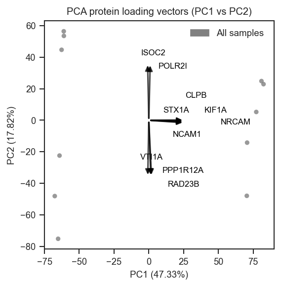
Top-loading genes on PC1 vs PC2 over the sample PCA scatter, returning arrow and text coordinates:
import matplotlib.pyplot as plt
from scpviz import plotting as scplt

fig, ax = plt.subplots()
ax, vec = scplt.plot_pca_protein_vectors(
    ax,
    pdata,
    plot_pc=[1, 2],
    n_vectors=25,
    return_df=True,
)
Split-axis selection: top loadings on PC1 and PC3 separately, then union:
fig, ax = plt.subplots()
scplt.plot_pca_protein_vectors(
    ax,
    pdata,
    plot_pc=[1, 3],
    n_vectors=[5, 3],
    adjust_labels=False,
)
Explicit genes with colors and axis limits:
fig, ax = plt.subplots()
scplt.plot_pca_protein_vectors(
    ax,
    pdata,
    plot_pc=[1, 2],
    namelist=["TP53", "EGFR"],
    cmap={"TP53": "crimson", "egfr": "steelblue"},
    xlim=(-6, 6),
    ylim=(-5, 5),
)
Loading arrows only (no sample points) for a compact biplot-style panel:
Source code in src/scpviz/plotting/dimreduc.py
2434 2435 2436 2437 2438 2439 2440 2441 2442 2443 2444 2445 2446 2447 2448 2449 2450 2451 2452 2453 2454 2455 2456 2457 2458 2459 2460 2461 2462 2463 2464 2465 2466 2467 2468 2469 2470 2471 2472 2473 2474 2475 2476 2477 2478 2479 2480 2481 2482 2483 2484 2485 2486 2487 2488 2489 2490 2491 2492 2493 2494 2495 2496 2497 2498 2499 2500 2501 2502 2503 2504 2505 2506 2507 2508 2509 2510 2511 2512 2513 2514 2515 2516 2517 2518 2519 2520 2521 2522 2523 2524 2525 2526 2527 2528 2529 2530 2531 2532 2533 2534 2535 2536 2537 2538 2539 2540 2541 2542 2543 2544 2545 2546 2547 2548 2549 2550 2551 2552 2553 2554 2555 2556 2557 2558 2559 2560 2561 2562 2563 2564 2565 2566 2567 2568 2569 2570 2571 2572 2573 2574 2575 2576 2577 2578 2579 2580 2581 2582 2583 2584 2585 2586 2587 2588 2589 2590 2591 2592 2593 2594 2595 2596 2597 2598 2599 2600 2601 2602 2603 2604 2605 2606 2607 2608 2609 2610 2611 2612 2613 2614 2615 2616 2617 2618 2619 2620 2621 2622 2623 2624 2625 2626 2627 2628 2629 2630 2631 2632 2633 2634 2635 2636 2637 2638 2639 2640 2641 2642 2643 2644 2645 2646 2647 2648 2649 2650 2651 2652 2653 2654 2655 2656 2657 2658 2659 2660 2661 2662 2663 2664 2665 2666 2667 2668 2669 2670 2671 2672 2673 2674 2675 2676 2677 2678 2679 2680 2681 2682 2683 2684 2685 2686 2687 2688 2689 2690 2691 2692 2693 2694 2695 2696 2697 2698 2699 2700 2701 2702 2703 2704 2705 2706 2707 2708 2709 2710 2711 2712 2713 2714 2715 2716 2717 2718 2719 2720 2721 2722 2723 2724 2725 2726 2727 2728 2729 2730 2731 2732 2733 2734 2735 2736 2737 2738 2739 2740 2741 2742 2743 2744 2745 2746 2747 2748 2749 2750 2751 2752 2753 2754 2755 2756 2757 2758 2759 2760 2761 2762 2763 2764 2765 2766 2767 2768 2769 2770 2771 2772 2773 2774 2775 2776 2777 2778 2779 2780 2781 2782 2783 2784 2785 2786 2787 2788 2789 2790 2791 2792 2793 2794 2795 2796 2797 2798 2799 2800 2801 2802 2803 2804 2805 2806 2807 2808 2809 2810 2811 2812 2813 2814 2815 2816 2817 2818 2819 2820 2821 2822 2823 2824 2825 2826 2827 2828 2829 2830 2831 2832 2833 2834 2835 2836 2837 2838 2839 2840 2841 2842 | |
plot_pca_scree
Plot a scree plot of explained variance from PCA.
This function visualizes the proportion of variance explained by each principal component as a bar chart, helping to assess how many PCs are meaningful.
Parameters:
| Name | Type | Description | Default |
|---|---|---|---|
ax
|
Axes
|
Axis on which to plot the scree plot. |
required |
pca
|
PCA or dict
|
The fitted PCA object, or a
dictionary from |
required |
Returns:
| Name | Type | Description |
|---|---|---|
ax |
Axes
|
Axis containing the scree plot. |
Example
Basic usage with PCA results from .uns:
import matplotlib.pyplot as plt
from scpviz import plotting as scplt

fig, ax = plt.subplots(figsize=(4, 3))
pdata_norm.pca(on="protein")
scplt.plot_pca_scree(ax, pdata_norm.prot.uns["pca"])
plt.show()
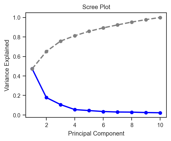
Source code in src/scpviz/plotting/dimreduc.py
plot_raincloud
plot_raincloud(
    ax: "plt.Axes",
    pdata: pAnnData,
    classes: str | list[str] | None = None,
    layer: str = "X",
    on: str = "protein",
    order: Any = None,
    color: list[str] = ["blue"],
    boxcolor: str = "black",
    linewidth: float = 0.5,
    debug: bool = False,
) -> Any
Plot raincloud distributions of protein or peptide abundances.
This function generates a raincloud plot (violin + boxplot + scatter)
to visualize abundance distributions across groups. Summary statistics
(average, standard deviation, rank) are written into .var for downstream
use with mark_raincloud().
Parameters:
| Name | Type | Description | Default |
|---|---|---|---|
ax
|
Axes
|
Axis on which to plot. |
required |
pdata
|
pAnnData
|
Input pAnnData object. |
required |
classes
|
str or list of str
|
One or more |
None
|
layer
|
str
|
Data layer to use. Default is |
'X'
|
on
|
str
|
Data level, either |
'protein'
|
order
|
list of str
|
Custom order of class categories. If None, categories appear in data order. |
None
|
color
|
list of str
|
Colors for each class distribution. Default is |
['blue']
|
boxcolor
|
str
|
Color for boxplot outlines. Default is |
'black'
|
linewidth
|
float
|
Line width for box/whisker elements. Default is 0.5. |
0.5
|
debug
|
bool
|
If True, return both axis and computed data arrays. |
False
|
Returns:
| Name | Type | Description |
|---|---|---|
ax |
Axes
|
If |
tuple |
matplotlib.axes.Axes, list of np.ndarray
|
If |
Note
Statistics (Average, Stdev, Rank) are stored in .var and can be
used with mark_raincloud() to highlight specific features.
Example
Plot raincloud distributions by cell line and condition (one color per combined class):
import matplotlib.cm as cm
import matplotlib.pyplot as plt
from scpviz import plotting as scplt
from scpviz import utils as scu

classes_2 = ["cellline", "condition"]
rain_colors = [cm.tab10(i % 10) for i in range(len(scu.get_classlist(pdata.prot, classes_2)))]

fig, ax = plt.subplots(figsize=(5, 4))
scplt.plot_raincloud(ax, pdata, classes=classes_2, color=rain_colors)
plt.show()

Same pattern on single-cell protein data after directlfq (classes aligned with UMAP, e.g. region):
import matplotlib.cm as cm
import matplotlib.pyplot as plt
from scpviz import plotting as scplt
from scpviz import utils as scu

classes_sc = ["region"]
rain_colors = [cm.tab10(i % 10) for i in range(len(scu.get_classlist(pdata_sc.prot, classes_sc)))]

fig, ax = plt.subplots(figsize=(5, 4))
scplt.plot_raincloud(ax, pdata_sc, classes=classes_sc, color=rain_colors)
plt.show()
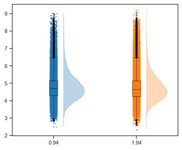
See Also
mark_raincloud: Highlight specific features on a raincloud plot.
plot_rankquant: Alternative distribution visualization using rank abundance.
Source code in src/scpviz/plotting/abundance.py
1936 1937 1938 1939 1940 1941 1942 1943 1944 1945 1946 1947 1948 1949 1950 1951 1952 1953 1954 1955 1956 1957 1958 1959 1960 1961 1962 1963 1964 1965 1966 1967 1968 1969 1970 1971 1972 1973 1974 1975 1976 1977 1978 1979 1980 1981 1982 1983 1984 1985 1986 1987 1988 1989 1990 1991 1992 1993 1994 1995 1996 1997 1998 1999 2000 2001 2002 2003 2004 2005 2006 2007 2008 2009 2010 2011 2012 2013 2014 2015 2016 2017 2018 2019 2020 2021 2022 2023 2024 2025 2026 2027 2028 2029 2030 2031 2032 2033 2034 2035 2036 2037 2038 2039 2040 2041 2042 2043 2044 2045 2046 2047 2048 2049 2050 2051 2052 2053 2054 2055 2056 2057 2058 2059 2060 2061 2062 2063 2064 2065 2066 2067 2068 2069 2070 2071 2072 2073 2074 2075 2076 2077 2078 2079 2080 2081 2082 | |
plot_rankquant
plot_rankquant(
    ax: "plt.Axes",
    pdata: pAnnData,
    classes: str | list[str] | None = None,
    layer: str = "X",
    on: str = "protein",
    cmap: Any = ["Blues"],
    color: Any = ["blue"],
    order: Any = None,
    s: float = 20,
    alpha: float = 0.2,
    calpha: float = 1,
    exp_alpha: float = 70,
    debug: bool = False,
) -> Any
Plot rank abundance distributions across samples or groups.
This function visualizes rank abundance of proteins or peptides, optionally
grouped by sample-level classes. Distributions are drawn as scatter plots
with adjustable opacity and color schemes. Mean, standard deviation, and
rank statistics are written to .var for downstream annotation.
Parameters:
| Name | Type | Description | Default |
|---|---|---|---|
ax
|
Axes
|
Axis on which to plot. |
required |
pdata
|
pAnnData
|
Input pAnnData object. |
required |
classes
|
str or list of str
|
One or more |
None
|
layer
|
str
|
Data layer to use. Default is |
'X'
|
on
|
str
|
Data level to plot, either |
'protein'
|
cmap
|
str or list of str
|
Colormap(s) used for scatter distributions.
Default is |
['Blues']
|
color
|
list of str
|
List of colors used for scatter distributions.
Defaults to |
['blue']
|
order
|
list of str
|
Custom order of class categories. If None, categories appear in data order. |
None
|
s
|
float
|
Marker size. Default is 20. |
20
|
alpha
|
float
|
Marker transparency for distributions. Default is 0.2. |
0.2
|
calpha
|
float
|
Marker transparency for class means. Default is 1. |
1
|
exp_alpha
|
float
|
Exponent for scaling probability density values by average abundance. Default is 70. |
70
|
debug
|
bool
|
If True, print debug information during computation. |
False
|
Returns:
| Name | Type | Description |
|---|---|---|
ax |
Axes
|
Axis containing the rank abundance plot. |
Example
Plot rank abundance grouped by cell line and condition:
import matplotlib.pyplot as plt
from scpviz import plotting as scplt

fig, ax = plt.subplots(figsize=(4, 4))
scplt.plot_rankquant(ax, pdata, classes=["cellline", "condition"])
plt.show()
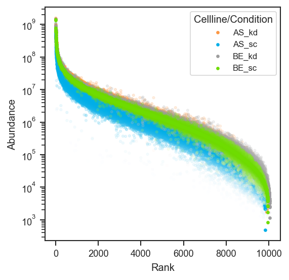
Plot rank abundance on single-cell protein data (use the same classes you use for UMAP, e.g. region):
import matplotlib.pyplot as plt
from scpviz import plotting as scplt

fig, ax = plt.subplots(figsize=(4, 4))
scplt.plot_rankquant(ax, pdata_sc, classes=["region"])
plt.show()
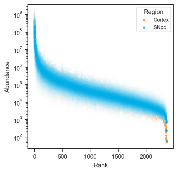
See Also
mark_rankquant: Highlight specific proteins or genes on a rank abundance plot.
Source code in src/scpviz/plotting/abundance.py
1554 1555 1556 1557 1558 1559 1560 1561 1562 1563 1564 1565 1566 1567 1568 1569 1570 1571 1572 1573 1574 1575 1576 1577 1578 1579 1580 1581 1582 1583 1584 1585 1586 1587 1588 1589 1590 1591 1592 1593 1594 1595 1596 1597 1598 1599 1600 1601 1602 1603 1604 1605 1606 1607 1608 1609 1610 1611 1612 1613 1614 1615 1616 1617 1618 1619 1620 1621 1622 1623 1624 1625 1626 1627 1628 1629 1630 1631 1632 1633 1634 1635 1636 1637 1638 1639 1640 1641 1642 1643 1644 1645 1646 1647 1648 1649 1650 1651 1652 1653 1654 1655 1656 1657 1658 1659 1660 1661 1662 1663 1664 1665 1666 1667 1668 1669 1670 1671 1672 1673 1674 1675 1676 1677 1678 1679 1680 1681 1682 1683 1684 1685 1686 1687 1688 1689 1690 1691 1692 1693 1694 | |
plot_significance
plot_significance(
    ax: "plt.Axes",
    y: float,
    h: float,
    x1: float = 0,
    x2: float = 1,
    col: str = "k",
    pval: float | str = "n.s.",
    fontsize: int = 12,
) -> None
Plot significance bars on a matplotlib axis.
This function draws horizontal significance bars (e.g., for statistical annotations) between two x-positions with a label indicating the p-value or significance level.
Parameters:
| Name | Type | Description | Default |
|---|---|---|---|
ax
|
Axes
|
Axis on which to plot the significance bars. |
required |
y
|
float
|
Vertical coordinate of the top of the bars. |
required |
h
|
float
|
Height of the vertical ticks extending downward from |
required |
x1
|
float
|
X-coordinate of the first bar endpoint. |
0
|
x2
|
float
|
X-coordinate of the second bar endpoint. |
1
|
col
|
str
|
Color of the bars. |
'k'
|
pval
|
float or str
|
P-value or significance label.
|
'n.s.'
|
fontsize
|
int
|
Font size of the significance text. |
12
|
Returns:
| Type | Description |
|---|---|
None
|
None |
Example
Minimal bar comparison with a significance bracket:
import matplotlib.pyplot as plt
from scpviz import plotting as scplt

fig, ax = plt.subplots(figsize=(2, 3))
ax.bar([0, 1], [10, 15])
scplt.plot_significance(ax, 16.0, 1.0, x1=0, x2=1, pval="*")
plt.show()
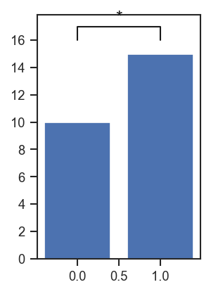
Annotate a swarm + bar plot with a t-test p-value:
import matplotlib.pyplot as plt
import seaborn as sns
from scipy.stats import ttest_ind

fig, ax = plt.subplots(figsize=(1.74, 2.13))
sns.swarmplot(data=summary_df, x="treatment", y="protein_count", ax=ax, color="k")
sns.barplot(
    data=summary_df,
    x="treatment",
    y="protein_count",
    ax=ax,
    errorbar="ci",
    alpha=1,
    palette=color_dict,
)

control = summary_df[summary_df["treatment"] == "Control"]["protein_count"]
treated = summary_df[summary_df["treatment"] == "Treated"]["protein_count"]

scplt.plot_significance(
    ax,
    y=2630,
    h=30,
    pval=ttest_ind(control, treated).pvalue,
    fontsize=8,
)
Source code in src/scpviz/plotting/style.py
249 250 251 252 253 254 255 256 257 258 259 260 261 262 263 264 265 266 267 268 269 270 271 272 273 274 275 276 277 278 279 280 281 282 283 284 285 286 287 288 289 290 291 292 293 294 295 296 297 298 299 300 301 302 303 304 305 306 307 308 309 310 311 312 313 314 315 316 317 318 319 320 321 322 323 324 325 326 327 328 329 330 331 332 333 334 335 336 337 338 339 340 | |
plot_summary
plot_summary(
    ax: "plt.Axes",
    pdata: "pAnnData",
    value: str = "protein_count",
    classes: str | list[str] | None = None,
    plot_mean: bool = True,
    **kwargs: Any
) -> "plt.Axes | list[plt.Axes]"
Plot summary statistics of sample metadata.
This function visualizes values from pdata.summary (e.g., protein count,
peptide count, abundance) as bar plots, optionally grouped by sample-level classes.
It supports both per-sample visualization and mean values across groups.
Parameters:
| Name | Type | Description | Default |
|---|---|---|---|
ax
|
Axes
|
Axis on which to plot. |
required |
pdata
|
pAnnData
|
Input pAnnData object with |
required |
value
|
str
|
Column in |
'protein_count'
|
classes
|
str or list of str
|
Sample-level classes to group by. - If None: plot per-sample values directly.
|
None
|
plot_mean
|
bool
|
Whether to plot mean ± standard deviation by class.
If True, |
True
|
**kwargs
|
Any
|
Additional keyword arguments passed to seaborn plotting functions. |
{}
|
Returns:
| Name | Type | Description |
|---|---|---|
ax |
matplotlib.axes.Axes or list of matplotlib.axes.Axes
|
The axis (or |
'plt.Axes | list[plt.Axes]'
|
list of axes if subplots are created) with the plotted summary. |
Raises:
| Type | Description |
|---|---|
ValueError
|
If |
ValueError
|
If |
Example
Sample count summary by cell line and condition:
import matplotlib.pyplot as plt
from scpviz import plotting as scplt

fig, ax = plt.subplots(figsize=(5, 3))
scplt.plot_summary(ax, pdata, classes=["cellline", "condition"])
plt.show()
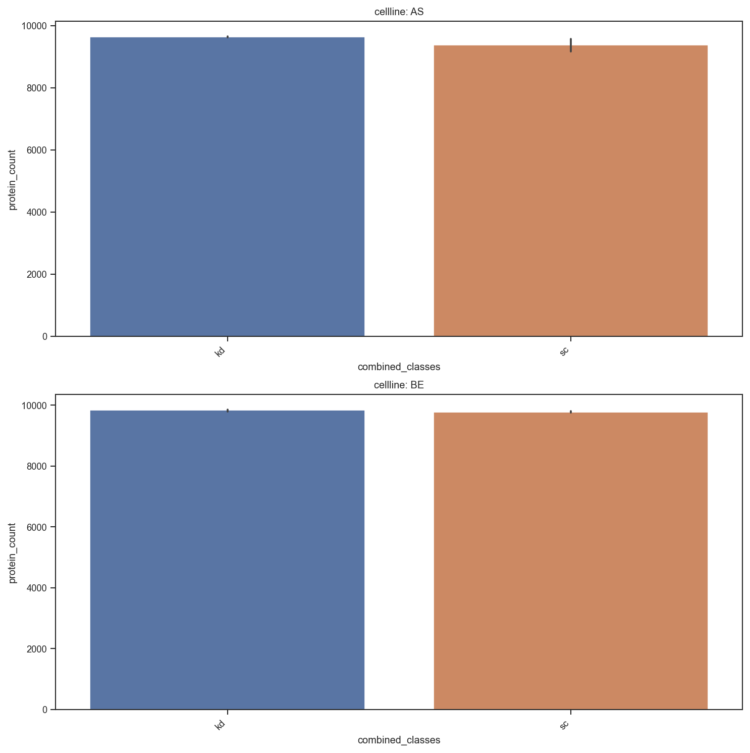
Source code in src/scpviz/plotting/style.py
342 343 344 345 346 347 348 349 350 351 352 353 354 355 356 357 358 359 360 361 362 363 364 365 366 367 368 369 370 371 372 373 374 375 376 377 378 379 380 381 382 383 384 385 386 387 388 389 390 391 392 393 394 395 396 397 398 399 400 401 402 403 404 405 406 407 408 409 410 411 412 413 414 415 416 417 418 419 420 421 422 423 424 425 426 427 428 429 430 431 432 433 434 435 436 437 438 439 440 441 442 443 444 445 446 447 448 449 450 451 452 453 454 455 456 457 458 459 460 | |
plot_umap
plot_umap(
    ax: "plt.Axes",
    pdata: pAnnData,
    color=None,
    edge_color=None,
    marker_shape=None,
    classes=None,
    layer="X",
    on="protein",
    cmap="default",
    edge_cmap="default",
    shape_cmap="default",
    show_labels=False,
    label_column=None,
    s=20,
    alpha=0.8,
    umap_params={},
    text_size=10,
    edge_lw=0.8,
    add_ellipses=False,
    ellipse_group=None,
    ellipse_cmap="default",
    ellipse_kwargs=None,
    force=False,
    return_fit=False,
    subset_mask=None,
    mapping_keys=None,
    mapping=None,
    mapping_on_missing: str = "warn",
    colorbar_norm: Any = None,
    nan_color: str = "lightgrey",
    colorbar_label: str | None = None,
    **kwargs: Any
) -> "plt.Axes | tuple[plt.Axes, dict[str, Any]]"
Plot UMAP projection of protein or peptide abundance data.
Computes (or reuses) a UMAP embedding and visualizes samples in 1D/2D/3D, with
flexible styling via face color (color), edge color (edge_color), marker
shapes (marker_shape), labels, and optional confidence ellipses.
Parameters:
| Name | Type | Description | Default |
|---|---|---|---|
ax
|
Axes
|
Axis to plot on. Must be 3D if |
required |
pdata
|
pAnnData
|
The pAnnData object containing |
required |
color
|
str or list of str or None
|
Face coloring for points.
|
None
|
edge_color
|
str or list of str or None
|
Edge coloring for points (categorical only).
|
None
|
marker_shape
|
str or list of str or None
|
Marker shapes for points (categorical only).
|
None
|
classes
|
str or list of str or None
|
Deprecated alias for
|
None
|
layer
|
str
|
Data layer to use for UMAP input (default: |
'X'
|
on
|
str
|
Whether to use |
'protein'
|
cmap
|
str, list, or dict
|
Palette/colormap for face coloring (
|
'default'
|
edge_cmap
|
str, list, or dict
|
Palette for edge coloring (
|
'default'
|
shape_cmap
|
str, list, or dict
|
Marker mapping for
|
'default'
|
show_labels
|
bool or list
|
Whether to label points.
|
False
|
label_column
|
str
|
Column in |
None
|
s
|
float
|
Marker size (default: 20). |
20
|
alpha
|
float
|
Marker opacity (default: 0.8). |
0.8
|
umap_params
|
dict
|
Parameters for UMAP computation. Common keys:
|
{}
|
subset_mask
|
array - like or Series
|
Boolean mask to subset samples.
If a Series is provided, it will be aligned to |
None
|
text_size
|
int
|
Font size for axis labels and legends (default: 10). |
10
|
edge_lw
|
float
|
Edge linewidth when |
0.8
|
add_ellipses
|
bool
|
If True, overlay confidence ellipses per group (2D only). |
False
|
ellipse_group
|
str or list of str
|
Explicit
|
None
|
ellipse_cmap
|
str, list, or dict
|
Ellipse color mapping.
|
'default'
|
ellipse_kwargs
|
dict
|
Extra keyword arguments passed to the ellipse patch. |
None
|
mapping_keys
|
list of str
|
|
None
|
mapping
|
dict
|
Tuple-keyed style dicts ( |
None
|
mapping_on_missing
|
str
|
|
'warn'
|
colorbar_norm
|
None, str, or matplotlib.colors.Normalize
|
Abundance color scale; see |
None
|
nan_color
|
str
|
Face color for zero, NaN, and negative abundances (default |
'lightgrey'
|
colorbar_label
|
str or None
|
Override the abundance colorbar axis label. |
None
|
force
|
bool
|
If True, recompute UMAP even if cached. |
False
|
return_fit
|
bool
|
If True, return the fitted UMAP object. |
False
|
**kwargs
|
Any
|
Extra keyword arguments passed to |
{}
|
Returns:
| Name | Type | Description |
|---|---|---|
ax |
Axes
|
Axis containing the UMAP plot. |
fit_umap |
UMAP
|
The fitted UMAP object (only if |
Raises:
| Type | Description |
|---|---|
AssertionError
|
If |
ValueError
|
If |
ValueError
|
If |
ValueError
|
If |
Note
- If
coloris continuous (abundance), a colorbar is shown automatically. edge_colorandmarker_shapeare categorical only.- Use
classes=only for backwards compatibility; prefercolor=.
Example
UMAP after pca(on="protein"), colored by sample metadata (example uses region and cohort-specific umap_params):
import matplotlib.pyplot as plt
from scpviz import plotting as scplt

fig, ax = plt.subplots(figsize=(4.5, 4))
pdata_sc.pca(on="protein")
scplt.plot_umap(
    ax,
    pdata_sc,
    color=["region"],
    cmap={"Cortex": "#D19DCB", "SNpc": "#85BE9E"},
    force=True,
    umap_params={"min_dist": 0.3, "n_neighbors": 30, "random_state": 42},
    s=10,
    alpha=0.85,
)
scplt.shift_legend(ax)
plt.show()
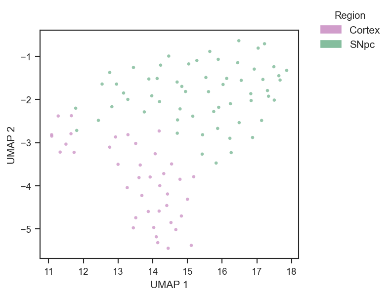
Plot by treatment group with default palette, using custom UMAP parameters:
umap_params = {'n_neighbors': 10, 'min_dist': 0.1}
plot_umap(ax, pdata, color='treatment', umap_params=umap_params)
Plot by protein abundance (continuous coloring):
Log-scale abundance coloring (log10 or log2):
Log-scale with explicit LogNorm limits:
import matplotlib.colors as mcolors

plot_umap(
    ax, pdata, color="GAPDH", cmap="plasma",
    colorbar_norm=mcolors.LogNorm(vmin=1, vmax=1e7),
    nan_color="black",
)
Plot with custom palette:
color_palette = {'ctrl': '#CCCCCC', 'treated': '#E41A1C'}
edge_palette = {'wt': '#000000', 'mut': '#377EB8'}

plot_umap(ax, pdata, color='group', edge_color='treatment', cmap=color_palette, edge_cmap=edge_palette)
Marker shapes by categorical key:
shape_map = {"WT": "o", "MUT": "s"}
plot_umap(ax, pdata, color="treatment", marker_shape="genotype", shape_cmap=shape_map)
Add ellipses grouped explicitly (useful when color is continuous):
ellipse_colors = {"WT": "#000000", "MUT": "#377EB8"}
plot_umap(
    ax, pdata,
    color="UBE4B", cmap="viridis",
    marker_shape="genotype",
    add_ellipses=True,
    ellipse_group="genotype",
    ellipse_cmap=ellipse_colors,
    ellipse_kwargs={"alpha": 0.10, "lw": 1.5},
)
Plot a 3D UMAP:
umap_params = {'n_components':3}
ax = fig.add_subplot(111, projection='3d')
plot_umap(ax, pdata, color='treatment', umap_params=umap_params)
Tuple-key mapping (literal face + edge per combination of .obs columns):
umap_params = {"n_neighbors": 10, "min_dist": 0.1}
mapping_keys = ["cellline", "condition"]
mapping = {
    ("A", "ctrl"): {"color": "white", "edge_color": "black"},
    ("A", "treat"): {"color": "white", "edge_color": "blue"},
    ("B", "ctrl"): {"color": "lightgrey", "edge_color": "black"},
    ("B", "treat"): {"color": "lightgrey", "edge_color": "blue"},
}
plot_umap(
    ax, pdata,
    mapping_keys=mapping_keys,
    mapping=mapping,
    umap_params=umap_params,
    force=True,
)
Global abundance face color with per-combination edges:
umap_params = {"n_neighbors": 10, "min_dist": 0.1}
mapping_keys = ["cellline", "condition"]
mapping = {
    ("A", "ctrl"): {"edge_color": "black"},
    ("A", "treat"): {"edge_color": "steelblue"},
    ("B", "ctrl"): {"edge_color": "black"},
    ("B", "treat"): {"edge_color": "steelblue"},
}
plot_umap(
    ax, pdata,
    color="UBE4B",
    cmap="plasma",
    mapping_keys=mapping_keys,
    mapping=mapping,
    umap_params=umap_params,
)
Sequential overlays on the same axes (same UMAP, different subset_mask). Replace
columns and palettes with your metadata; use matching umap_params and force
so all layers share one embedding:
umap_params = {"n_neighbors": 10, "min_dist": 0.1}
line = "LineA"
cell_line_color = {"LineA": "#4C72B0", "LineB": "#DD8452"}
cell_line_color_6h = {"LineA": "#9fb8d9", "LineB": "#e8b896"}

mask_dark = (
    (pdata.summary["treatment"] == "Drug")
    & (pdata.summary["cell_line"] == line)
    & (pdata.summary["duration"] == "24hr")
)
mask_light = (
    (pdata.summary["treatment"] == "Drug")
    & (pdata.summary["cell_line"] == line)
    & (pdata.summary["duration"] == "6hr")
)
mask_ctrl = (
    (pdata.summary["treatment"] == "Vehicle")
    & (pdata.summary["cell_line"] == line)
)

fig = plt.figure(figsize=(4, 4))
ax = fig.add_subplot(111, projection="3d")

ax, _ = plot_umap(
    ax,
    pdata,
    color="cell_line",
    cmap=cell_line_color,
    edge_color="duration",
    edge_cmap={"6hr": "grey", "24hr": "black"},
    umap_params={**umap_params, "n_components": 3},
    subset_mask=mask_dark,
    return_fit=True,
    force=True,
)
ax, _ = plot_umap(
    ax,
    pdata,
    color="cell_line",
    cmap=cell_line_color_6h,
    edge_color="duration",
    edge_cmap={"6hr": "grey", "24hr": "black"},
    umap_params={**umap_params, "n_components": 3},
    subset_mask=mask_light,
    return_fit=True,
    force=False,
)
plot_umap(
    ax,
    pdata,
    color="cell_line",
    cmap={k: "white" for k in cell_line_color},
    edge_color="cell_line",
    edge_cmap=cell_line_color,
    edge_lw=1.2,
    umap_params={**umap_params, "n_components": 3},
    subset_mask=mask_ctrl,
    force=False,
)
Source code in src/scpviz/plotting/dimreduc.py
1644 1645 1646 1647 1648 1649 1650 1651 1652 1653 1654 1655 1656 1657 1658 1659 1660 1661 1662 1663 1664 1665 1666 1667 1668 1669 1670 1671 1672 1673 1674 1675 1676 1677 1678 1679 1680 1681 1682 1683 1684 1685 1686 1687 1688 1689 1690 1691 1692 1693 1694 1695 1696 1697 1698 1699 1700 1701 1702 1703 1704 1705 1706 1707 1708 1709 1710 1711 1712 1713 1714 1715 1716 1717 1718 1719 1720 1721 1722 1723 1724 1725 1726 1727 1728 1729 1730 1731 1732 1733 1734 1735 1736 1737 1738 1739 1740 1741 1742 1743 1744 1745 1746 1747 1748 1749 1750 1751 1752 1753 1754 1755 1756 1757 1758 1759 1760 1761 1762 1763 1764 1765 1766 1767 1768 1769 1770 1771 1772 1773 1774 1775 1776 1777 1778 1779 1780 1781 1782 1783 1784 1785 1786 1787 1788 1789 1790 1791 1792 1793 1794 1795 1796 1797 1798 1799 1800 1801 1802 1803 1804 1805 1806 1807 1808 1809 1810 1811 1812 1813 1814 1815 1816 1817 1818 1819 1820 1821 1822 1823 1824 1825 1826 1827 1828 1829 1830 1831 1832 1833 1834 1835 1836 1837 1838 1839 1840 1841 1842 1843 1844 1845 1846 1847 1848 1849 1850 1851 1852 1853 1854 1855 1856 1857 1858 1859 1860 1861 1862 1863 1864 1865 1866 1867 1868 1869 1870 1871 1872 1873 1874 1875 1876 1877 1878 1879 1880 1881 1882 1883 1884 1885 1886 1887 1888 1889 1890 1891 1892 1893 1894 1895 1896 1897 1898 1899 1900 1901 1902 1903 1904 1905 1906 1907 1908 1909 1910 1911 1912 1913 1914 1915 1916 1917 1918 1919 1920 1921 1922 1923 1924 1925 1926 1927 1928 1929 1930 1931 1932 1933 1934 1935 1936 1937 1938 1939 1940 1941 1942 1943 1944 1945 1946 1947 1948 1949 1950 1951 1952 1953 1954 1955 1956 1957 1958 1959 1960 1961 1962 1963 1964 1965 1966 1967 1968 1969 1970 1971 1972 1973 1974 1975 1976 1977 1978 1979 1980 1981 1982 1983 1984 1985 1986 1987 1988 1989 1990 1991 1992 1993 1994 1995 1996 1997 1998 1999 2000 2001 2002 2003 2004 2005 2006 2007 2008 2009 2010 2011 2012 2013 2014 2015 2016 2017 2018 2019 2020 2021 2022 2023 2024 2025 2026 2027 2028 2029 2030 2031 2032 2033 2034 2035 2036 2037 2038 | |
plot_upset
Plot an UpSet diagram of shared proteins or peptides across groups.
This function generates an UpSet plot for >2 sets based on presence/absence
data across specified sample-level classes. Uses the upsetplot package
for visualization.
Parameters:
| Name | Type | Description | Default |
|---|---|---|---|
pdata
|
pAnnData
|
Input pAnnData object. |
required |
classes
|
str or list of str
|
Sample-level classes to partition proteins or peptides into sets. |
required |
return_contents
|
bool
|
If True, return both the UpSet object and the underlying set contents used for plotting. |
False
|
**kwargs
|
Any
|
Additional keyword arguments passed to
|
{}
|
Returns:
| Type | Description |
|---|---|
Any
|
The |
Example
UpSet for cellline and condition (show_counts=False can help when saving some PNGs with matplotlib / upsetplot):
import matplotlib.pyplot as plt
from scpviz import plotting as scplt

upplot = scplt.plot_upset(pdata, classes=["cellline", "condition"], show_counts=False)
upplot.plot()
plt.show()
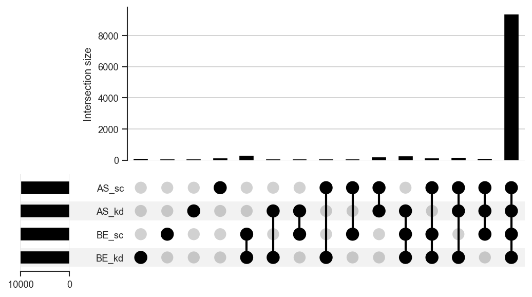
Highlight disjoint subsets (resolve keys with get_upset_contents(..., upsetForm=False)):
import matplotlib.pyplot as plt
from scpviz import plotting as scplt
from scpviz import utils as scu

keys = list(
    scu.get_upset_contents(pdata, classes=["cellline", "condition"], upsetForm=False).keys()
)
be_kd = next((k for k in keys if "BE" in k and "kd" in k), keys[0])
as_sc = next((k for k in keys if "AS" in k and "sc" in k), keys[-1])
others = [k for k in keys if k not in (be_kd, as_sc)]

upplot = scplt.plot_upset(pdata, classes=["cellline", "condition"], show_counts=False)
upplot.style_subsets(
    present=[be_kd],
    absent=others,
    edgecolor="black",
    facecolor="#E59866",
    linewidth=2,
    label="highlight A",
)
upplot.style_subsets(
    present=[as_sc],
    absent=[k for k in keys if k != as_sc],
    edgecolor="black",
    facecolor="#5DADE2",
    linewidth=2,
    label="highlight B",
)
upplot.plot()
plt.show()
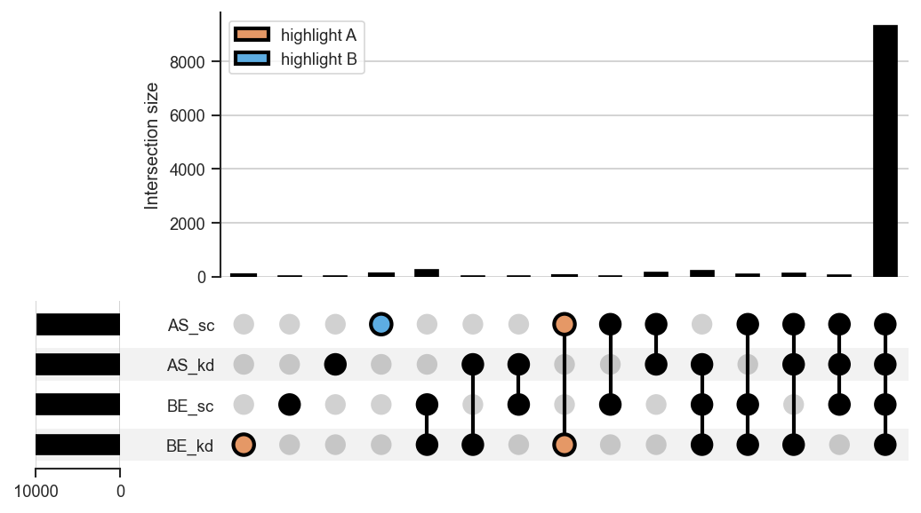
See Also
plot_venn: Plot a Venn diagram for 2 to 3 sets. get_upset_query: Query an intersection and build a mark_df for highlighting. plot_rankquant: Rank-based visualization of protein/peptide distributions.
Source code in src/scpviz/plotting/sets.py
174 175 176 177 178 179 180 181 182 183 184 185 186 187 188 189 190 191 192 193 194 195 196 197 198 199 200 201 202 203 204 205 206 207 208 209 210 211 212 213 214 215 216 217 218 219 220 221 222 223 224 225 226 227 228 229 230 231 232 233 234 235 236 237 238 239 240 241 242 243 244 245 246 247 248 249 250 251 252 253 254 255 256 257 258 259 260 261 262 263 264 265 266 267 268 269 270 271 272 273 274 275 | |
plot_venn
plot_venn(
    ax,
    pdata,
    classes,
    set_colors="default",
    weighted=False,
    return_contents=False,
    label_order=None,
    fixed_subset_sizes=None,
    **kwargs: Any
) -> plt.Axes | tuple[plt.Axes, dict[str, set[str]]]
Plot a Venn diagram of shared proteins or peptides across groups.
This function generates a 2- or 3-set Venn diagram based on presence/absence
data across specified sample-level classes. For more than 3 sets, use
plot_upset() instead.
Parameters:
| Name | Type | Description | Default |
|---|---|---|---|
ax
|
Axes
|
Axis on which to plot. |
required |
pdata
|
pAnnData
|
Input pAnnData object. |
required |
classes
|
str or list of str
|
Sample-level classes to partition proteins or peptides into sets. |
required |
set_colors
|
str or list of str
|
Colors for the sets.
|
'default'
|
weighted
|
bool
|
If True, circle/region areas are proportional to set sizes (area-weighted). If False, draws an unweighted Venn (equal-sized regions). |
False
|
return_contents
|
bool
|
If True, return both the axis and the underlying set contents used for plotting. |
False
|
label_order
|
list of str
|
Custom order of set labels. Must
contain the same elements as |
None
|
**kwargs
|
Any
|
Additional keyword arguments passed to matplotlib-venn functions. |
{}
|
Returns:
| Type | Description |
|---|---|
Axes | tuple[Axes, dict[str, set[str]]]
|
The axes containing the Venn diagram, or |
Raises:
| Type | Description |
|---|---|
ValueError
|
If number of sets is not 2 or 3. |
ValueError
|
If |
ValueError
|
If custom |
Example
Two-set Venn by cell line:
import matplotlib.pyplot as plt
from scpviz import plotting as scplt

fig, ax = plt.subplots(figsize=(3, 3))
scplt.plot_venn(ax, pdata, classes="cellline")
plt.show()
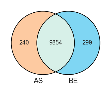
Plot a 2-set Venn diagram of shared proteins:
fig, ax = plt.subplots()
scplt.plot_venn(
    ax, pdata_1mo_snpc, classes="sample",
    set_colors=["#1f77b4", "#ff7f0e"]
)
Plot a weighted set by counts:
fig, ax = plt.subplots(figsize=(3, 3))
scplt.plot_venn(
    ax, pdata, classes='treatment',
    weighted=True)
Plot a weighted set by specifying a fixed subset size:
See Also
plot_upset: Plot an UpSet diagram for >3 sets. get_upset_query: Query an intersection and build a mark_df for highlighting. plot_rankquant: Rank-based visualization of protein/peptide distributions.
Source code in src/scpviz/plotting/sets.py
25 26 27 28 29 30 31 32 33 34 35 36 37 38 39 40 41 42 43 44 45 46 47 48 49 50 51 52 53 54 55 56 57 58 59 60 61 62 63 64 65 66 67 68 69 70 71 72 73 74 75 76 77 78 79 80 81 82 83 84 85 86 87 88 89 90 91 92 93 94 95 96 97 98 99 100 101 102 103 104 105 106 107 108 109 110 111 112 113 114 115 116 117 118 119 120 121 122 123 124 125 126 127 128 129 130 131 132 133 134 135 136 137 138 139 140 141 142 143 144 145 146 147 148 149 150 151 152 153 154 155 156 157 158 159 160 161 162 163 164 165 166 167 168 169 170 171 172 | |
plot_volcano
plot_volcano(
    ax: "plt.Axes",
    pdata: pAnnData | None = None,
    values: Any = None,
    method: str = "ttest",
    fold_change_mode: str = "mean",
    label: Any = 5,
    label_type="Gene",
    color=None,
    alpha=0.5,
    threshold=0.05,
    log2fc=1,
    linewidth=0.5,
    p_col: str | None = None,
    correct_fdr: bool = False,
    equal_var: bool = True,
    pval: float | None = None,
    fontsize=8,
    no_marks=False,
    classes=None,
    de_data=None,
    return_df=False,
    group_annot=True,
    group_annot_kwargs=None,
    group1_kwargs=None,
    group2_kwargs=None,
    up_kwargs=None,
    down_kwargs=None,
    **kwargs: Any
) -> Any
Plot a volcano plot of differential expression results.
This function calculates differential expression (DE) between two groups
and visualizes results as a volcano plot. Alternatively, it can use
pre-computed DE results (e.g. from pdata.de()).
Parameters:
| Name | Type | Description | Default |
|---|---|---|---|
ax
|
Axes
|
Axis on which to plot. |
required |
pdata
|
pAnnData
|
Input pAnnData object. Required if |
None
|
values
|
list or dict
|
Values to compare between groups.
|
None
|
method
|
str
|
Statistical test method. Default is |
'ttest'
|
fold_change_mode
|
str
|
Method for computing fold change.
|
'mean'
|
label
|
int, list, or None
|
Features to highlight.
|
5
|
label_type
|
str
|
Label content type. Currently |
'Gene'
|
color
|
dict
|
Dictionary mapping significance categories to colors. Defaults to grey/red/blue. |
None
|
alpha
|
float
|
Point transparency. Default is 0.5. |
0.5
|
threshold
|
float
|
Significance cutoff for threshold lines and for DE when
computed inline. Matches |
0.05
|
pval
|
float
|
Deprecated alias for |
None
|
log2fc
|
float
|
Log2 fold change threshold for significance. Default is 1. |
1
|
p_col
|
str or None
|
Column for the volcano y-axis: |
None
|
correct_fdr
|
bool
|
Passed to |
False
|
equal_var
|
bool
|
Passed to |
True
|
linewidth
|
float
|
Line width for threshold lines. Default is 0.5. |
0.5
|
fontsize
|
int
|
Font size for feature labels. Default is 8. |
8
|
no_marks
|
bool
|
If True, suppress coloring of significant points and plot all points in grey. Default is False. |
False
|
classes
|
str
|
Sample class column to use for group comparison. |
None
|
de_data
|
DataFrame
|
Pre-computed DE results. Must contain
|
None
|
return_df
|
bool
|
If True, return both the axis and the DataFrame used for plotting. Default is False. |
False
|
group_annot
|
bool
|
If True, annotate group names and differential expression counts (n) at the top of the plot. If False, suppress all group-related annotations. Default is True. |
True
|
group_annot_kwargs
|
dict
|
Global configuration for group annotations. Supported keys include:
|
None
|
group1_kwargs
|
dict
|
Keyword arguments passed to
|
None
|
group2_kwargs
|
dict
|
Keyword arguments passed to
|
None
|
up_kwargs
|
dict
|
Keyword arguments passed to
|
None
|
down_kwargs
|
dict
|
Keyword arguments passed to
|
None
|
**kwargs
|
Any
|
Additional keyword arguments passed to |
{}
|
Returns:
| Name | Type | Description |
|---|---|---|
ax |
Axes
|
Axis with the volcano plot if |
tuple |
(Axes, DataFrame)
|
Returned if |
Usage Tips
mark_volcano: Highlight specific features on an existing volcano plot.
- For selective highlighting, set no_marks=True to render all points
in grey, then call mark_volcano() to add specific features of interest.
add_volcano_legend: Add standard legend handles for volcano plots.
- Use the helper function add_volcano_legend(ax) to add standard
significance legend handles.
Example
Dictionary-style input:
import matplotlib.pyplot as plt
from scpviz import plotting as scplt

fig, ax = plt.subplots(figsize=(4, 4))
values = [
    {"cellline": "BE", "condition": "kd"},
    {"cellline": "BE", "condition": "sc"},
]
ax, df = scplt.plot_volcano(ax, pdata_norm, values=values, return_df=True)
plt.show()
Legacy input:
import matplotlib.pyplot as plt
import seaborn as sns
from scpviz import plotting as scplt

fig, ax = plt.subplots(figsize=(4, 4))
colors = sns.color_palette("Paired")[4:6]
color_dict = dict(zip(["downregulated", "upregulated"], colors))
ax, df = scplt.plot_volcano(
    ax,
    pdata_norm,
    classes="condition",
    values=["kd", "sc"],
    color=color_dict,
    return_df=True,
)
scplt.add_volcano_legend(ax)
plt.show()
Move positions up/down and tweak styling:
```python
values = [
    {"cellline": "BE", "condition": "kd"},
    {"cellline": "BE", "condition": "sc"},
]
scplt.plot_volcano(
    ax, pdata_norm, values=values,
    group_annot_kwargs={"pos": {"group1_xy": (0.98, 1.10), "group2_xy": (0.02, 1.10)}},
    up_kwargs={"fontsize": 9},
    down_kwargs={"fontsize": 9},
)
```
Remove the bbox but keep text:
```python
values = [
    {"cellline": "BE", "condition": "kd"},
    {"cellline": "BE", "condition": "sc"},
]
scplt.plot_volcano(
    ax, pdata_norm, values=values,
    group_annot_kwargs={"bbox": None},
)
```
Turn off all text:
```python
values = [
    {"cellline": "BE", "condition": "kd"},
    {"cellline": "BE", "condition": "sc"},
]
scplt.plot_volcano(ax, pdata_norm, values=values, group_annot=False)
```
Multiple testing correction (Benjamini-Hochberg FDR):
Proteomics DE tests thousands of proteins at once; without correction,
many raw p-values will appear significant by chance. Set correct_fdr=True
to apply Benjamini-Hochberg FDR adjustment: significance labels and the
dashed horizontal threshold use adjusted p-values, and the y-axis defaults
to -log10(adj_p_value) (override with p_col if needed):
```python
import matplotlib.pyplot as plt
from scpviz import plotting as scplt

fig, ax = plt.subplots(figsize=(4, 4))
values = [
    {"cellline": "BE", "condition": "kd"},
    {"cellline": "BE", "condition": "sc"},
]
ax, df = scplt.plot_volcano(
    ax, pdata_norm, values=values,
    correct_fdr=True, threshold=0.05, return_df=True,
)
scplt.add_volcano_legend(ax)
plt.show()
```

With pre-computed DE results from ``pdata.de(correct_fdr=True)``:

```python
de_df = pdata_norm.de(values=values, correct_fdr=True, threshold=0.05)
scplt.plot_volcano(ax, de_data=de_df, correct_fdr=True)
```
Source code in src/scpviz/plotting/volcano.py
78 79 80 81 82 83 84 85 86 87 88 89 90 91 92 93 94 95 96 97 98 99 100 101 102 103 104 105 106 107 108 109 110 111 112 113 114 115 116 117 118 119 120 121 122 123 124 125 126 127 128 129 130 131 132 133 134 135 136 137 138 139 140 141 142 143 144 145 146 147 148 149 150 151 152 153 154 155 156 157 158 159 160 161 162 163 164 165 166 167 168 169 170 171 172 173 174 175 176 177 178 179 180 181 182 183 184 185 186 187 188 189 190 191 192 193 194 195 196 197 198 199 200 201 202 203 204 205 206 207 208 209 210 211 212 213 214 215 216 217 218 219 220 221 222 223 224 225 226 227 228 229 230 231 232 233 234 235 236 237 238 239 240 241 242 243 244 245 246 247 248 249 250 251 252 253 254 255 256 257 258 259 260 261 262 263 264 265 266 267 268 269 270 271 272 273 274 275 276 277 278 279 280 281 282 283 284 285 286 287 288 289 290 291 292 293 294 295 296 297 298 299 300 301 302 303 304 305 306 307 308 309 310 311 312 313 314 315 316 317 318 319 320 321 322 323 324 325 326 327 328 329 330 331 332 333 334 335 336 337 338 339 340 341 342 343 344 345 346 347 348 349 350 351 352 353 354 355 356 357 358 359 360 361 362 363 364 365 366 367 368 369 370 371 372 373 374 375 376 377 378 379 380 381 382 383 384 385 386 387 388 389 390 391 392 393 394 395 396 397 398 399 400 401 402 403 404 405 406 407 408 409 410 411 412 413 414 415 416 417 418 419 420 421 422 423 424 425 426 427 428 429 430 431 432 433 434 435 436 437 438 439 440 441 442 443 444 445 446 447 448 449 450 451 452 453 454 455 456 457 458 459 460 461 462 463 464 465 466 467 468 469 470 471 472 473 474 475 476 477 478 | |
plot_volcano_adata
plot_volcano_adata(
    ax: "plt.Axes",
    adata: Any = None,
    values: Any = None,
    class_type: Any = None,
    de_data: Any = None,
    gene_col=None,
    method="ttest",
    fold_change_mode="mean",
    layer="X",
    label=5,
    fontsize=8,
    alpha=0.5,
    color=None,
    linewidth=0.5,
    threshold=0.05,
    log2fc=1.0,
    p_col: str | None = None,
    correct_fdr: bool = False,
    equal_var: bool = True,
    pval: float | None = None,
    no_marks=False,
    return_df=False,
    **kwargs
) -> Any
Volcano plot for AnnData with the same API behavior as pdata.plot_volcano.
Required
- Either
de_dataOR (adataandvalues). For legacy-stylevalues(group labels or list-of-lists), also passclass_typeas documented in :func:scpviz.utils.stats.de_adata.
Supports
- Dictionary-style values: [{"cellline":"HCT116","tx":"DMSO"}, {...}]
- Legacy-style values: ["A","B"]
- Legacy multi-col values: [["HCT116","DMSO"], ["HCT116","DrugX"]]
Produces: identical volcano to pAnnData version.
Parameters:
| Name | Type | Description | Default |
|---|---|---|---|
correct_fdr
|
bool
|
If True, apply Benjamini-Hochberg FDR correction for
multiple testing when DE is computed inline (via |
False
|
p_col
|
str or None
|
|
None
|
pval
|
float
|
Deprecated alias for |
None
|
Example
After DE on adata with the same comparison as :func:plot_volcano, the figure matches :func:plot_volcano (same PNG):
```python
import matplotlib.pyplot as plt
from scpviz import plotting as scplt

fig, ax = plt.subplots(figsize=(4, 4))
values = [
    {"cellline": "BE", "condition": "kd"},
    {"cellline": "BE", "condition": "sc"},
]
ax, df = scplt.plot_volcano_adata(
    ax, pdata_norm.prot, values=values, return_df=True
)
plt.show()
```
Multiple testing correction (Benjamini-Hochberg FDR):
Same as :func:plot_volcano — use when testing many features and you want
FDR-controlled significance rather than raw p-values:
```python
import matplotlib.pyplot as plt
from scpviz import plotting as scplt

fig, ax = plt.subplots(figsize=(4, 4))
values = [
    {"cellline": "BE", "condition": "kd"},
    {"cellline": "BE", "condition": "sc"},
]
ax, df = scplt.plot_volcano_adata(
    ax, pdata_norm.prot, values=values,
    correct_fdr=True, threshold=0.05, return_df=True,
)
plt.show()
```
Source code in src/scpviz/plotting/volcano.py
480 481 482 483 484 485 486 487 488 489 490 491 492 493 494 495 496 497 498 499 500 501 502 503 504 505 506 507 508 509 510 511 512 513 514 515 516 517 518 519 520 521 522 523 524 525 526 527 528 529 530 531 532 533 534 535 536 537 538 539 540 541 542 543 544 545 546 547 548 549 550 551 552 553 554 555 556 557 558 559 560 561 562 563 564 565 566 567 568 569 570 571 572 573 574 575 576 577 578 579 580 581 582 583 584 585 586 587 588 589 590 591 592 593 594 595 596 597 598 599 600 601 602 603 604 605 606 607 608 609 610 611 612 613 614 615 616 617 618 619 620 621 622 623 624 625 626 627 628 629 630 631 632 633 634 635 636 637 638 639 640 641 642 643 644 645 646 647 648 649 650 651 652 653 654 655 656 657 658 659 660 661 662 663 664 665 666 667 668 669 670 671 672 673 674 675 676 677 678 679 680 681 682 683 684 685 686 687 688 689 690 691 692 693 694 695 696 697 698 699 700 701 702 703 704 705 706 707 708 709 710 711 712 713 714 715 716 717 718 | |
resolve_marker_shapes
Resolve marker shapes for categorical sample groupings.
Parameters:
| Name | Type | Description | Default |
|---|---|---|---|
adata
|
AnnData
|
AnnData object. |
required |
marker_shape
|
str, list of str, or None
|
|
required |
shape_cmap
|
str, list, or dict
|
Marker assignment. - "default": uses an internal default marker list. - list: markers assigned to sorted class labels. - dict: {label: marker} mapping. |
'default'
|
Returns:
| Name | Type | Description |
|---|---|---|
markers |
list[str] or None
|
Marker per observation (len = n_obs), or None. |
shape_legend |
list[Line2D] or None
|
Legend handles for marker shapes. |
shape_map |
dict or None
|
Mapping {label: marker}. |
Source code in src/scpviz/plotting/dimreduc.py
resolve_plot_colors
Resolve colors for PCA or abundance plots.
This helper function determines how samples should be colored in plotting functions based on categorical or continuous class values. It returns mapped color values, a colormap (if applicable), and legend handles.
Parameters:
| Name | Type | Description | Default |
|---|---|---|---|
adata
|
AnnData
|
AnnData object (protein or peptide level). |
required |
classes
|
str
|
Class used for coloring. Can be:
|
required |
cmap
|
str, list, or matplotlib colormap
|
Colormap to use.
|
required |
layer
|
str
|
Data layer to extract abundance values from when |
'X'
|
Returns:
| Name | Type | Description |
|---|---|---|
color_mapped |
array - like
|
Values mapped to colors for plotting. |
cmap_resolved |
matplotlib colormap or None
|
Colormap object for continuous coloring; None if categorical. |
legend_elements |
list or None
|
Legend handles for categorical coloring; None if continuous. |
Source code in src/scpviz/plotting/dimreduc.py
544 545 546 547 548 549 550 551 552 553 554 555 556 557 558 559 560 561 562 563 564 565 566 567 568 569 570 571 572 573 574 575 576 577 578 579 580 581 582 583 584 585 586 587 588 589 590 591 592 593 594 595 596 597 598 599 600 601 602 603 604 605 606 607 608 609 610 611 612 613 614 615 616 617 618 619 620 621 622 623 624 625 626 627 628 629 630 631 632 633 634 635 636 637 638 639 640 641 642 643 644 645 | |
shift_legend
shift_legend(
    ax: "plt.Axes",
    anchor_pos: tuple[float, float] = (1.05, 1),
    loc: str = "center left",
) -> None
Reposition all legends on an axis.
Moves every Matplotlib legend on the axis to a custom anchor point (outside or inside the axis) without modifying contents. When multiple legends are present, they are stacked vertically from the anchor point downward with a small gap between them.
Parameters:
| Name | Type | Description | Default |
|---|---|---|---|
ax
|
Axes
|
Axis containing the legend(s). |
required |
anchor_pos
|
tuple of float
|
(x, y) anchor position for the
first (or only) legend in axis coordinates. Default is |
(1.05, 1)
|
loc
|
str
|
Legend location relative to the anchor. Default is
|
'center left'
|
Returns:
| Type | Description |
|---|---|
None
|
None |
Example
Move a single legend outside the right edge:
        fig, ax = plt.subplots(figsize=(3, 3))
        ax = scplt.plot_pca(pdata, classes='treatment')
        scplt.shift_legend(ax)
Stack multiple legends when color, edge, and shape are all mapped:
Source code in src/scpviz/plotting/style.py
volcano_adjust_and_outline_texts
volcano_adjust_and_outline_texts(
texts: list[Any],
expand: tuple[float, float] = (2, 2),
arrowprops: dict[str, Any] = dict(
arrowstyle="->", color="k", lw=0.8
),
linewidth: float = 3,
outline_color: str = "w",
) -> Any
Adjust text labels for volcano plots and apply a white outline for readability.
This function runs adjust_text() on a list of text artists while temporarily
removing their path effects to ensure stable label placement. A white outline
is re-applied after adjustment to improve legibility on dense volcano plots
or scatter backgrounds.
Parameters:
| Name | Type | Description | Default |
|---|---|---|---|
texts
|
list
|
List of |
required |
expand
|
tuple
|
Expansion parameters passed to |
(2, 2)
|
arrowprops
|
dict or None
|
Arrow properties passed to |
dict(arrowstyle='->', color='k', lw=0.8)
|
linewidth
|
float
|
Line width of the outline applied after adjustment. Default is 3. |
3
|
outline_color
|
str
|
Color of the outline stroke. Default is |
'w'
|
Returns:
| Name | Type | Description |
|---|---|---|
list |
Any
|
The same list of text objects (modified in place). |
Example
Adjust and outline labels for multiple marked volcano groups:
```python
ax, volcano_df = scplt.plot_volcano(
ax, pdata_6mo_snpc_norm, values=case_values,
return_df=True, no_marks=True
)
rps_dict={'downregulated': '#5166FF'}
rpl_dict={'downregulated': '#1F2CCF'}
# in this case, two sets of texts from mark_volcano or mark_volcano_by_significance (return_texts=True)
texts = []
ax, t = scplt.mark_volcano(
ax, volcano_df, label=rpl_top5, label_color='#1F2CCF',return_texts=True
)
texts.extend(t)
ax, t = scplt.mark_volcano_by_significance(
ax, volcano_df, label=rps_top5, color=rps_dict, return_texts=True
)
texts.extend(t)
# and for others, use show_names=False to not show any names/arrows
scplt.mark_volcano_by_significance(
ax, volcano_df, label=rpl_others, color=rpl_dict, show_names=False
)
scplt.mark_volcano_by_significance(
ax, volcano_df, label=rps_others, color=rps_dict, show_names=False
)
volcano_adjust_and_outline_texts(texts, expand=(2, 2))
```
Note
This function is designed to be used after collecting all labels from
multiple mark_volcano_by_significance(..., return_texts=True) calls.
Running adjust_text() once globally produces cleaner layouts than
multiple per-group adjustments.
Source code in src/scpviz/plotting/volcano.py
1093 1094 1095 1096 1097 1098 1099 1100 1101 1102 1103 1104 1105 1106 1107 1108 1109 1110 1111 1112 1113 1114 1115 1116 1117 1118 1119 1120 1121 1122 1123 1124 1125 1126 1127 1128 1129 1130 1131 1132 1133 1134 1135 1136 1137 1138 1139 1140 1141 1142 1143 1144 1145 1146 1147 1148 1149 1150 1151 1152 1153 1154 1155 1156 1157 1158 1159 1160 1161 1162 1163 1164 1165 1166 1167 1168 1169 1170 1171 1172 1173 1174 1175 1176 1177 1178 1179 1180 1181 1182 1183 1184 1185 1186 | |