Tutorial 4: Plotting
Generate publication-ready plots with scpviz. Most plotting functions accept a matplotlib.axes.Axes as the first argument for flexible integration into multi-panel figures:
import matplotlib.pyplot as plt
from scpviz import plotting as scplt

fig, ax = plt.subplots(figsize=(4, 4))
scplt.plot_pca(ax, pdata, classes=["cellline", "condition"])
plt.show()
The sections below are organized by plot type. Full parameter documentation is in the API reference.
Summary and QC
-
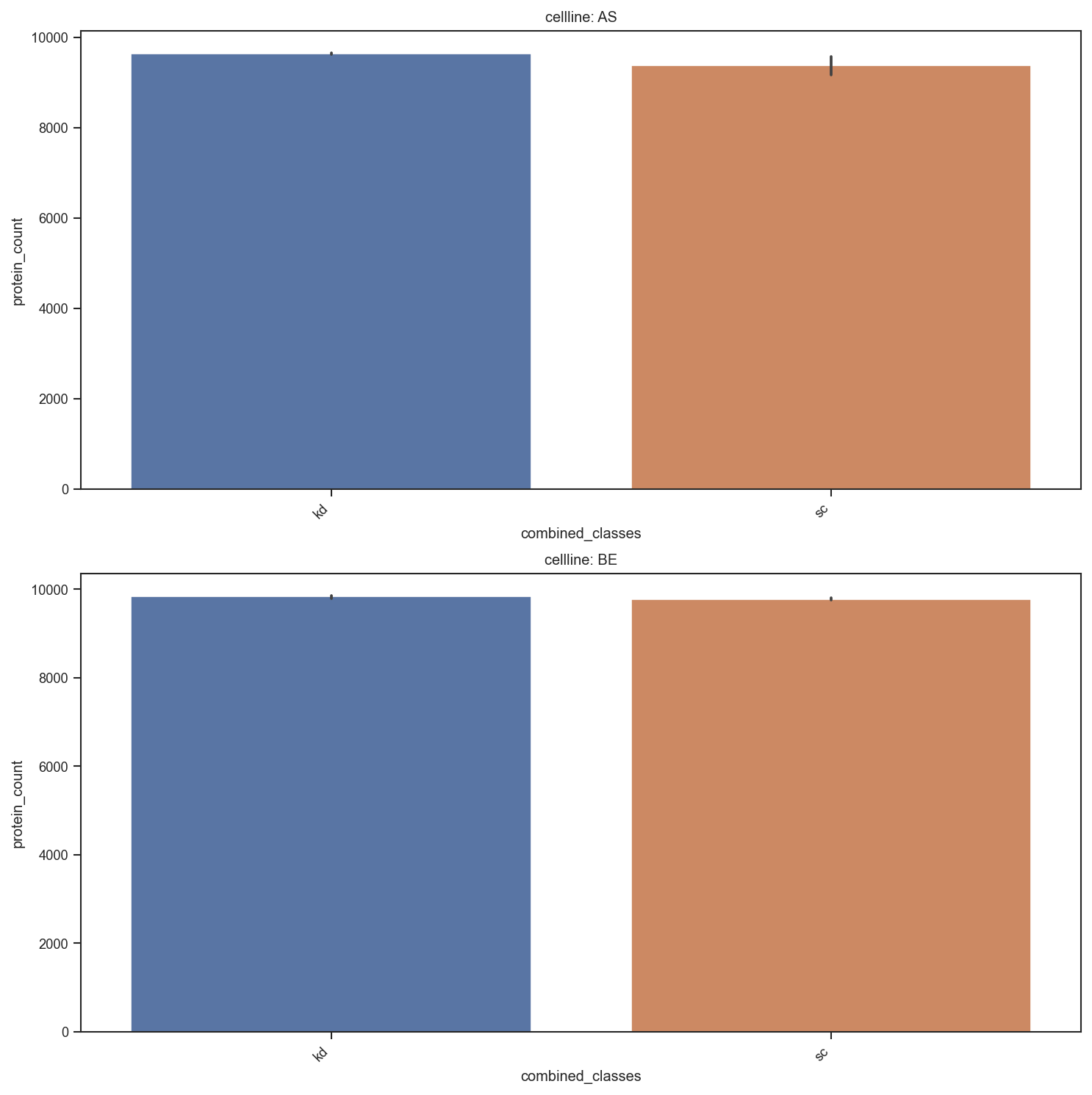
Bar chart of sample-level metadata counts.
-
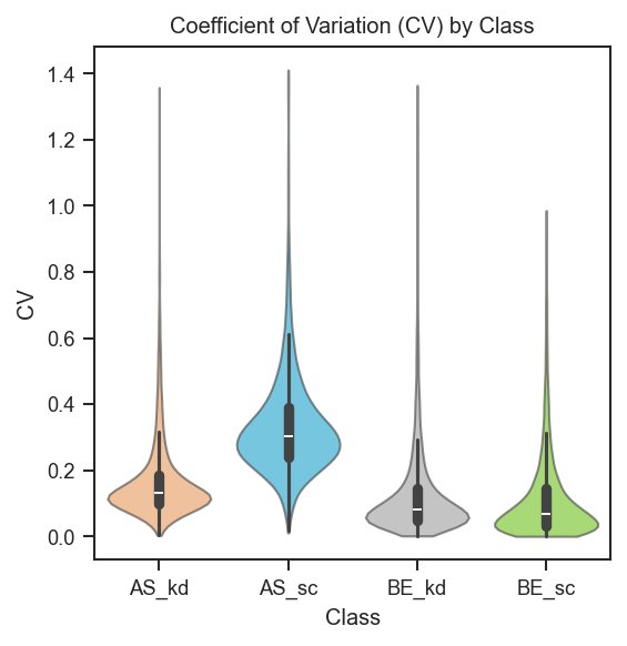
Coefficient of variation distributions per group.
plot_summary
import matplotlib.pyplot as plt
from scpviz import plotting as scplt

fig, ax = plt.subplots(figsize=(5, 3))
scplt.plot_summary(ax, pdata, classes=["cellline", "condition"])
plt.show()
plot_cv
Basic CV violins grouped by cell line and condition:
import matplotlib.pyplot as plt
from scpviz import plotting as scplt

fig, ax = plt.subplots(figsize=(3, 3))
scplt.plot_cv(ax, pdata, classes=["cellline", "condition"])
plt.show()
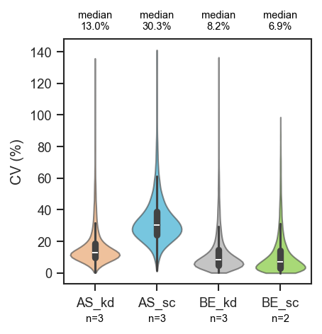
Sample counts below each violin and median CV above the plot:
fig, ax = plt.subplots(figsize=(3, 3))
scplt.plot_cv(
    ax, pdata, classes=["cellline", "condition"],
    show_n=True,
    annotate="median",
    annotate_kwargs={"fontsize": 7},
)
plt.show()
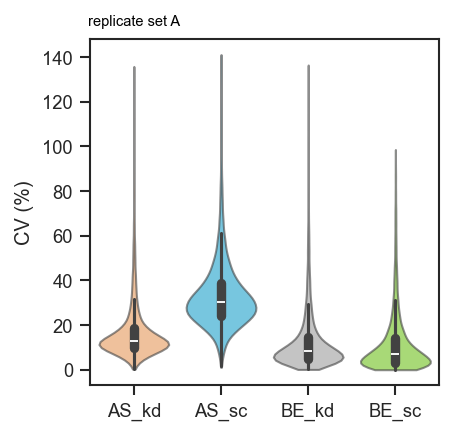
Custom per-group labels:
fig, ax = plt.subplots(figsize=(3, 3))
scplt.plot_cv(
    ax, pdata, classes=["cellline", "condition"],
    annotate={"AS_kd": "replicate set A"},
)
plt.show()
Export the underlying table (CV ratio and CV_pct percent columns):
Abundance
Overview
-
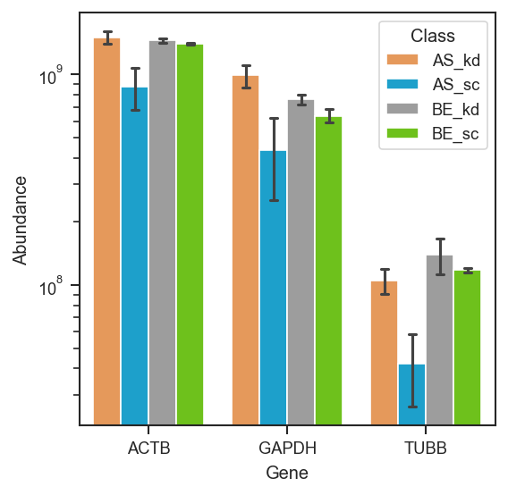
Violin/bar plots for named proteins.
-
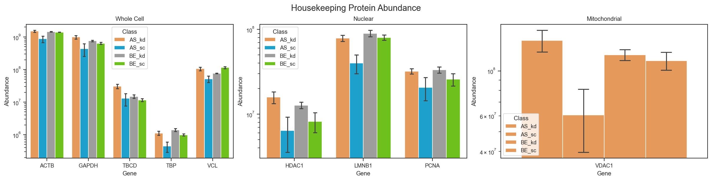
Built-in housekeeping gene panel.
-
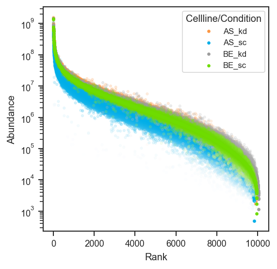
Proteome-wide rank abundance scatter.
-
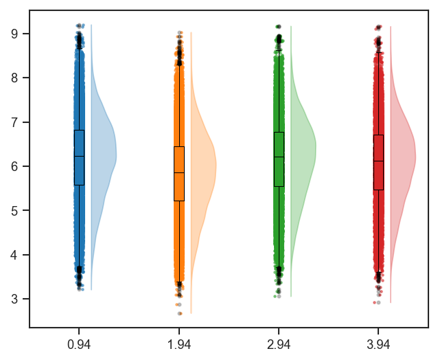
Violin + box + strip combined distribution.
plot_abundance_boxgrid — plot type gallery
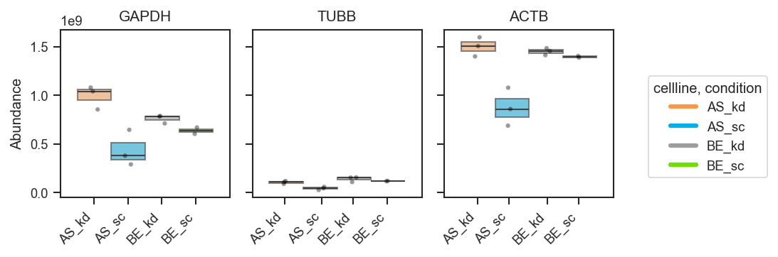
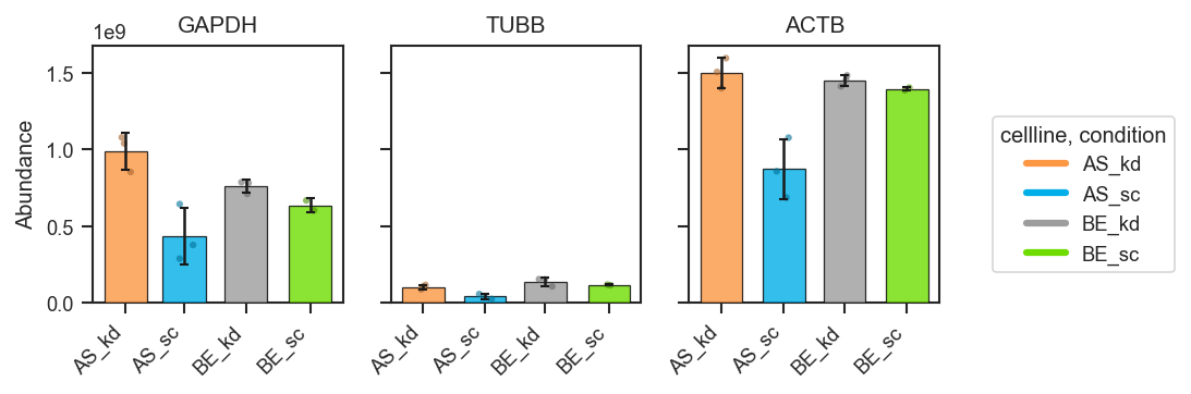
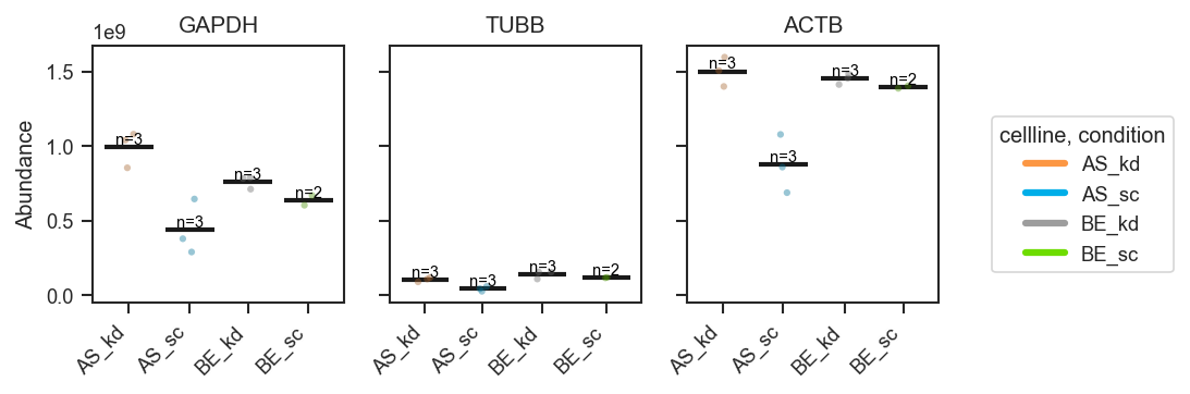
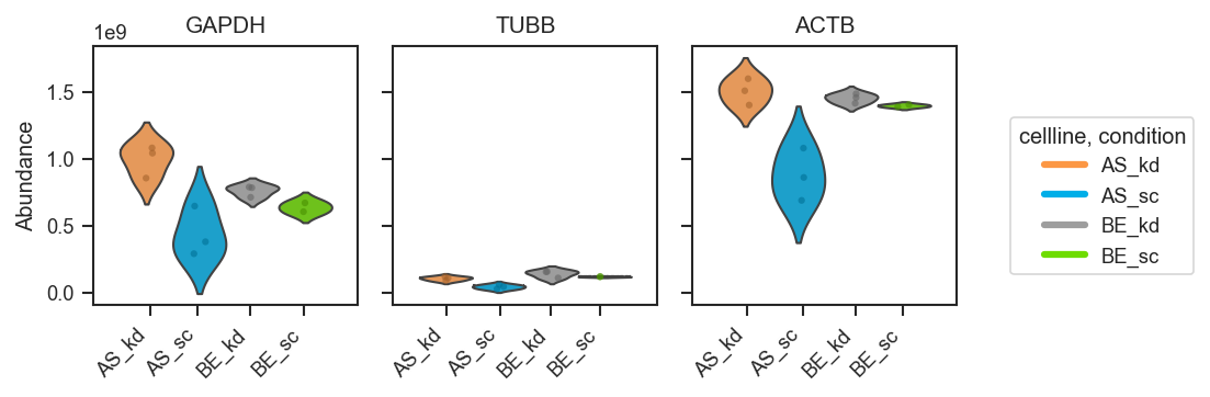
plot_abundance_boxgrid produces per-protein panels with consistent axes. Four plot_type options:
plot_abundance
import matplotlib.pyplot as plt
from scpviz import plotting as scplt

fig, ax = plt.subplots(figsize=(4, 4))
scplt.plot_abundance(ax, pdata, namelist=["GAPDH", "TUBB", "ACTB"], classes=["cellline", "condition"])
plt.show()
plot_abundance_boxgrid
Called as a method on pdata; returns (fig, axes).
Box
fig, axes = pdata.plot_abundance_boxgrid(
    namelist=["GAPDH", "TUBB", "ACTB"],
    classes=["cellline", "condition"],
    plot_type="box",
    figsize=(2, 2.5),
)
plt.show()
Bar
fig, axes = pdata.plot_abundance_boxgrid(
    namelist=["GAPDH", "TUBB", "ACTB"],
    classes=["cellline", "condition"],
    plot_type="bar",
    bar_error="sd",
    figsize=(2, 2.5),
)
plt.show()
Line
fig, axes = pdata.plot_abundance_boxgrid(
    namelist=["GAPDH", "TUBB", "ACTB"],
    classes=["cellline", "condition"],
    plot_type="line",
    show_n=True,
    figsize=(2, 2.5),
)
plt.show()
Violin
fig, axes = pdata.plot_abundance_boxgrid(
    namelist=["GAPDH", "TUBB", "ACTB"],
    classes=["cellline", "condition"],
    plot_type="violin",
    figsize=(2, 2.5),
)
plt.show()
Significance brackets
Pass sig_pairs to run pairwise tests and draw significance bars (same group-spec format as plot_volcano / de()). Use return_df=True to also receive the abundance table and a stats_df of p-values.
Per cell line — compare sc vs kd within BE and within AS:
fig, axes, df, stats = pdata.plot_abundance_boxgrid(
    namelist=["GAPDH", "TUBB", "ACTB"],
    classes=["cellline", "condition"],
    sig_pairs=[
        ({"cellline": "BE", "condition": "sc"}, {"cellline": "BE", "condition": "kd"}),
        ({"cellline": "AS", "condition": "sc"}, {"cellline": "AS", "condition": "kd"}),
    ],
    sig_kwargs={"fontsize": 8},
    return_df=True,
)
plt.show()
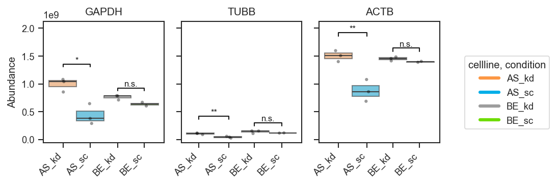
Shared group across pairs — the same group can appear in multiple comparisons (brackets stack vertically):
fig, axes = pdata.plot_abundance_boxgrid(
    namelist=["GAPDH", "TUBB", "ACTB"],
    classes=["cellline", "condition"],
    sig_pairs=[
        ({"cellline": "BE", "condition": "sc"}, {"cellline": "BE", "condition": "kd"}),
        ({"cellline": "BE", "condition": "kd"}, {"cellline": "AS", "condition": "kd"}),
    ],
    sig_kwargs={"fontsize": 8},
)
plt.show()
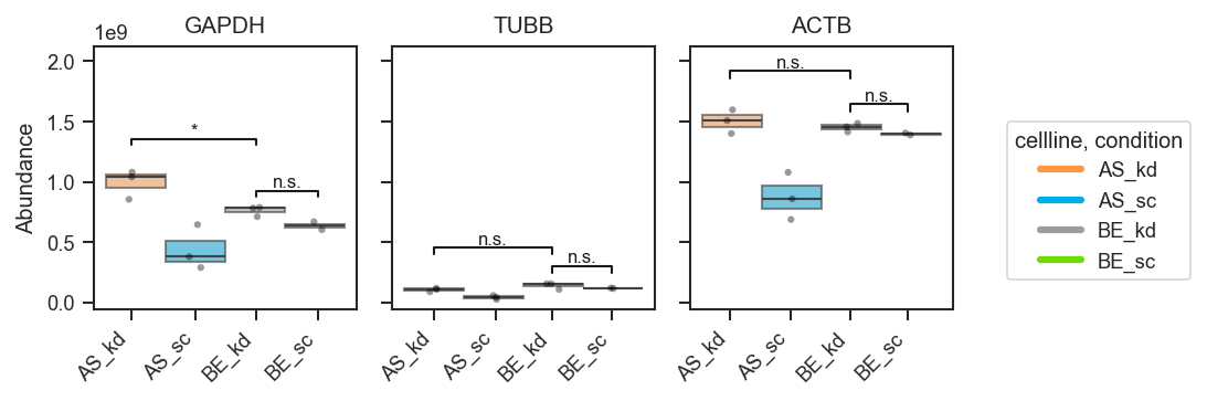
Two groups only — when a single classes column has exactly two levels, use sig_pairs=True:
fig, axes = pdata.plot_abundance_boxgrid(
    namelist=["GAPDH"],
    classes="treatment",
    sig_pairs=True,
)
plt.show()
sig_kwargs defaults include sig_test ("ttest", "mannwhitneyu", or "wilcoxon") and sig_equal_var; remaining keys are passed to plot_significance. Groups with no detectable abundance are labeled ND and skipped for testing. See the API reference for plot_abundance_boxgrid and annotate_abundance_boxgrid_significance.
plot_abundance_housekeeping
A quick normalization sanity check using the built-in housekeeping gene list.
fig, ax = plt.subplots(figsize=(5, 4))
scplt.plot_abundance_housekeeping(ax, pdata, classes=["cellline", "condition"])
plt.show()
plot_rankquant and mark_rankquant
plot_rankquant API ↗ · mark_rankquant API ↗
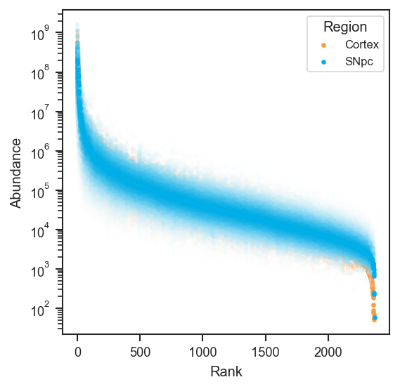
plot_rankquant ranks each protein by mean abundance and shows per-group scatter clouds — useful for comparing proteome coverage and dynamic range across conditions.
import matplotlib.pyplot as plt
from scpviz import plotting as scplt

fig, ax = plt.subplots(figsize=(4, 4))
scplt.plot_rankquant(ax, pdata, classes=["cellline", "condition"])
plt.show()
Works the same on single-cell protein data after directlfq (use whichever .obs column you use for UMAP, e.g. region):
fig, ax = plt.subplots(figsize=(4, 4))
scplt.plot_rankquant(ax, pdata_sc, classes=["region"])
plt.show()
mark_rankquant overlays specific proteins. mark_df requires an accession column and optionally gene_primary:
import pandas as pd
from scpviz import utils as scu

classes_2 = ["cellline", "condition"]
class_list = scu.get_classlist(pdata.prot, classes_2)

acc = list(pdata.prot.var_names[:3])
mark_df = pd.DataFrame({"accession": acc})
if "Genes" in pdata.prot.var.columns:
    mark_df["gene_primary"] = pdata.prot.var.loc[acc, "Genes"].astype(str).values

fig, ax = plt.subplots(figsize=(4, 4))
scplt.plot_rankquant(ax, pdata, classes=classes_2)
scplt.mark_rankquant(
    ax, pdata, mark_df=mark_df,
    class_values=class_list[:4],
    color="black", label_type="gene",
)
plt.show()
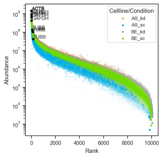
You can also build mark_df from a set-intersection query — see Set operations.
plot_raincloud and mark_raincloud
plot_raincloud API ↗ · mark_raincloud API ↗
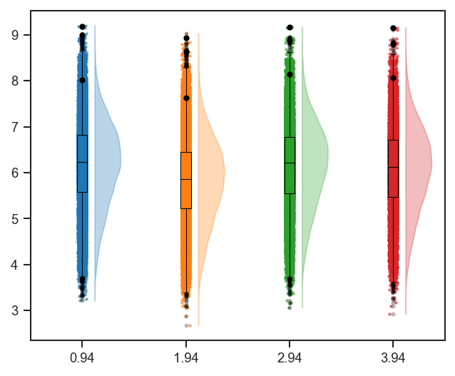
plot_raincloud combines violin, box, and strip in one panel. Pass one color per combined class (the default color=['blue'] is too short when classes has more than one column):
import matplotlib.cm as cm
from scpviz import utils as scu

classes_2 = ["cellline", "condition"]
rain_colors = [cm.tab10(i % 10) for i in range(len(scu.get_classlist(pdata.prot, classes_2)))]

fig, ax = plt.subplots(figsize=(5, 4))
scplt.plot_raincloud(ax, pdata, classes=classes_2, color=rain_colors)
plt.show()
Single-cell version (same pattern; align classes with your UMAP coloring):
classes_sc = ["region"]
rain_colors = [cm.tab10(i % 10) for i in range(len(scu.get_classlist(pdata_sc.prot, classes_sc)))]

fig, ax = plt.subplots(figsize=(5, 4))
scplt.plot_raincloud(ax, pdata_sc, classes=classes_sc, color=rain_colors)
plt.show()
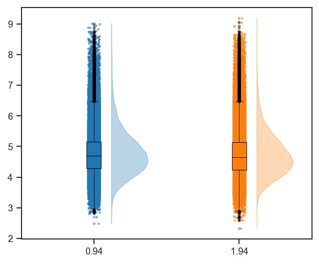
mark_raincloud accepts the same mark_df format as mark_rankquant:
Dimension reduction
Overview
-
PCA scatter with optional ellipses.
-
UMAP projection for single-cell data.
-
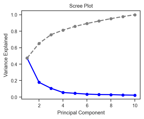
Variance explained per PC.
-
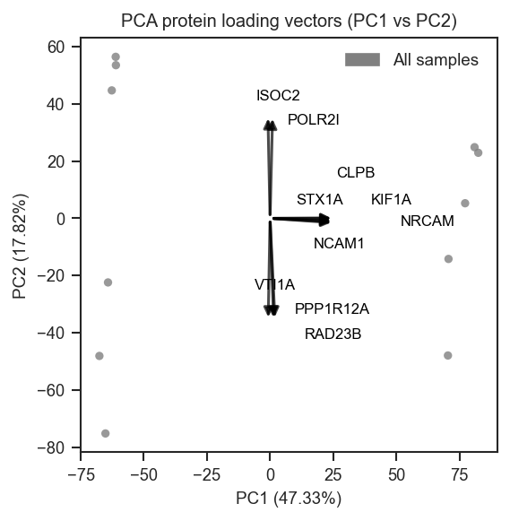
Top protein loadings overlaid on PCA.
plot_pca
plot_pca API ↗ · plot_pca_protein_vectors API ↗
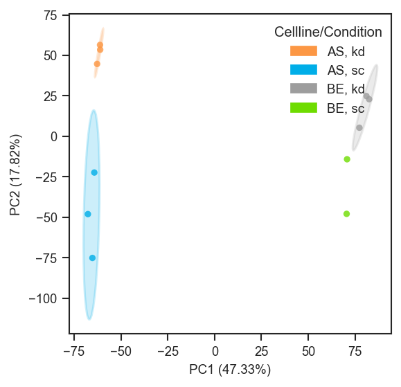
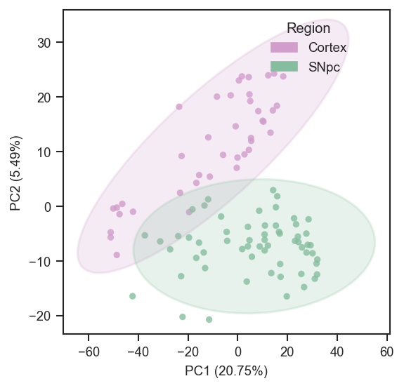
plot_pca runs PCA (or reuses cached results) and renders a scatter. Supports categorical and continuous coloring, edge colors, marker shapes, 3D projections, confidence ellipses, and tuple-key mapping.
import matplotlib.pyplot as plt
from scpviz import plotting as scplt

fig, ax = plt.subplots(figsize=(4, 4))
pdata_norm.pca(on="protein")
scplt.plot_pca(ax, pdata_norm, classes=["cellline", "condition"], add_ellipses=True)
plt.show()
On single-cell data after directlfq:
fig, ax = plt.subplots(figsize=(4, 4))
pdata_sc.pca(on="protein")
scplt.plot_pca(
    ax, pdata_sc,
    color=["region"],
    cmap={"Cortex": "#D19DCB", "SNpc": "#85BE9E"},
    add_ellipses=True,
)
plt.show()
Abundance coloring (colorbar_norm, nan_color)
Pass a gene or protein name to color= for continuous face coloring; a colorbar is added automatically. Cells with zero, NaN, or negative abundances are drawn in nan_color (default lightgrey) beneath the colormap-mapped points.
colorbar_norm controls the scale on strictly positive abundances: None or "linear" uses auto limits; "log10" / "log2" apply log normalization with colorbar ticks at powers of 10 or 2; pass a matplotlib.colors.Normalize subclass (e.g. LogNorm(vmin=, vmax=)) for explicit limits. Override the colorbar title with colorbar_label.
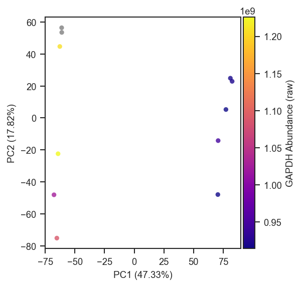
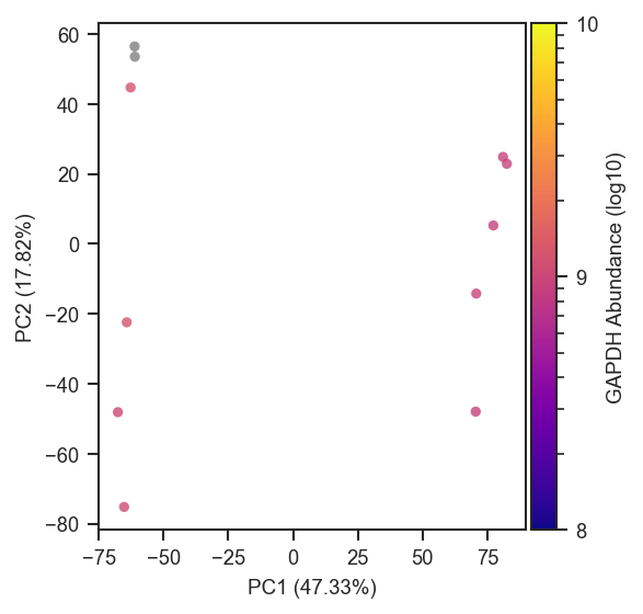
For sparse single-cell data, an explicit LogNorm can stabilize the colorbar (i.e. manually set limits of the colorbar):
import matplotlib.colors as mcolors

scplt.plot_pca(
    ax, pdata_sc,
    color="GAPDH",
    cmap="plasma",
    colorbar_norm=mcolors.LogNorm(vmin=1, vmax=1e7),
    nan_color="black",
)
The same parameters apply to plot_umap.
Tuple-key mapping
For studies with crossed metadata columns, plot_pca (and plot_umap) accept a mapping dict keyed by metadata tuples. This assigns colors, edge colors, and marker shapes to specific combinations without pre-encoding a combined column:
mapping_keys = ["condition", "batch"]
mapping = {
    ("case", "b1"): {"color": "#ffffff", "edge_color": "black"},
    ("case", "b2"): {"color": "#eeeeee", "edge_color": "blue"},
    ("ctrl", "b1"): {"color": "#dddddd", "edge_color": "black"},
    ("ctrl", "b2"): {"color": "#cccccc", "edge_color": "blue"},
}

fig, ax = plt.subplots(figsize=(3, 3))
scplt.plot_pca(ax, pdata, mapping_keys=mapping_keys, mapping=mapping, force=True)
scplt.shift_legend(ax)
plt.show()
mapping_keys = ["condition", "batch"]
mapping = {
    ("case", "b1"): {"edge_color": "black"},
    ("case", "b2"): {"edge_color": "steelblue"},
    ("ctrl", "b1"): {"edge_color": "black"},
    ("ctrl", "b2"): {"edge_color": "steelblue"},
}

fig, ax = plt.subplots(figsize=(3, 3))
scplt.plot_pca(ax, pdata, color="Itgam", cmap="plasma",
               mapping_keys=mapping_keys, mapping=mapping, force=True)
scplt.shift_legend(ax)
plt.show()
Combinations missing from mapping default to grey face with no edge. Pass mapping_on_missing="raise" to require all combinations to be present.
PCA overlays
plot_pca_protein_vectors overlays the top protein loadings as arrows:
fig, ax = plt.subplots(figsize=(4, 4))
pdata_norm.pca(on="protein")
scplt.plot_pca_protein_vectors(ax, pdata_norm, n_vectors=10)
plt.show()
plot_pca_gsea_pathway_vectors, plot_pca_gsea_bubble, and plot_pca_gsea_heatmap overlay GSEA pathway results on PCA space — available after running pdata.gsea_pca().
plot_pca_scree
fig, ax = plt.subplots(figsize=(4, 3))
scplt.plot_pca_scree(ax, pdata_norm.prot.uns["pca"])
plt.show()
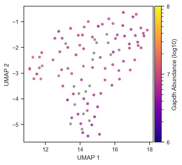
plot_umap
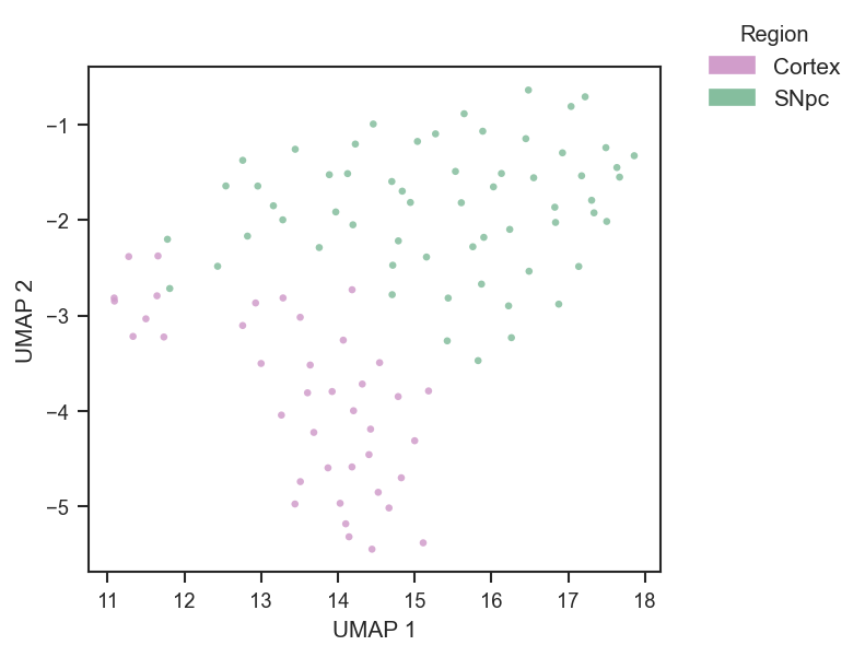
plot_umap mirrors the plot_pca interface. Run pca() first; pass force=True on first call or after changing normalization.
import matplotlib.pyplot as plt
from scpviz import plotting as scplt

fig, ax = plt.subplots(figsize=(4.5, 4))
pdata_sc.pca(on="protein")
scplt.plot_umap(
    ax, pdata_sc,
    color=["region"],
    cmap={"Cortex": "#D19DCB", "SNpc": "#85BE9E"},
    force=True,
    umap_params={"min_dist": 0.3, "n_neighbors": 30, "random_state": 42},
    s=10, alpha=0.85,
)
scplt.shift_legend(ax)
plt.show()
plot_umap accepts the same abundance-coloring options as PCA — see Abundance coloring. On single-cell data after directlfq:
fig, ax = plt.subplots(figsize=(4.5, 4))
pdata_sc.pca(on="protein")
scplt.plot_umap(
    ax, pdata_sc,
    color="Itgam",
    cmap="plasma",
    colorbar_norm="log10",
    nan_color="grey",
    force=True,
    umap_params={"min_dist": 0.3, "n_neighbors": 30, "random_state": 42},
    s=10, alpha=0.85,
)
plt.show()
Correlation and clustering
Overview
-
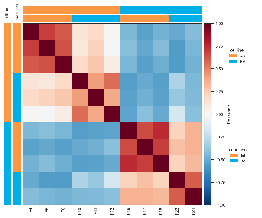
Sample × sample Pearson/Spearman heatmap.
-
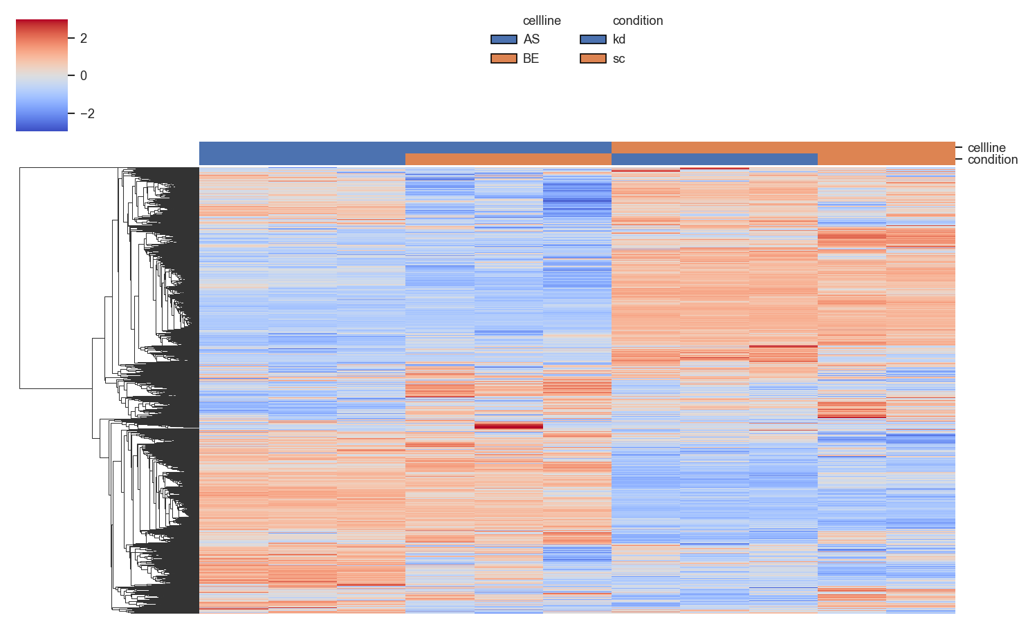
Hierarchically clustered heatmap with annotation bars.
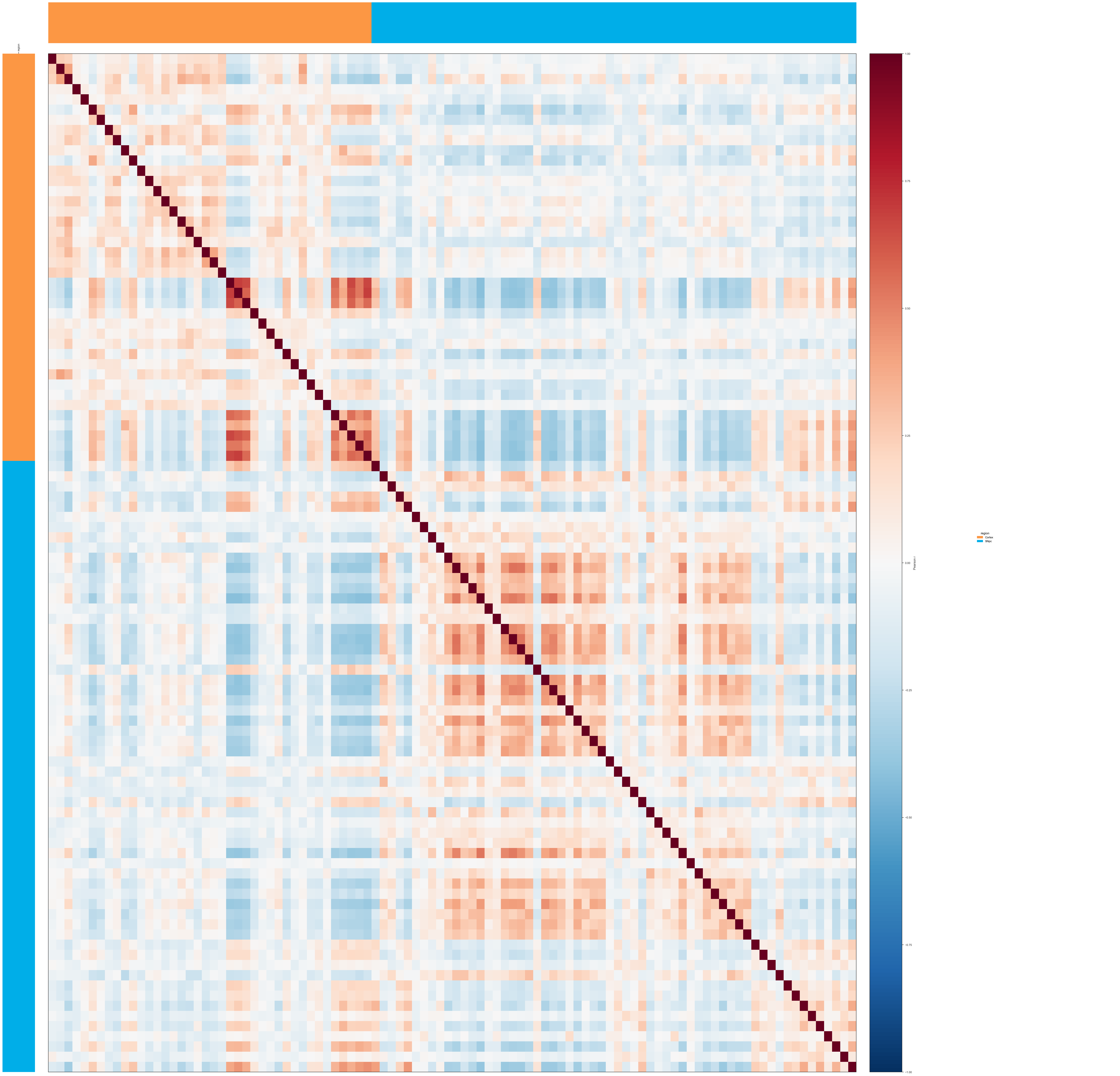
plot_pairwise_correlation
plot_pairwise_correlation generates a sample × sample (or group × group) correlation heatmap. Computing a per-protein z-score layer first produces more interpretable results:
import matplotlib.pyplot as plt
import numpy as np
from scpviz import plotting as scplt
from scpviz import utils as scu

adata = scu.get_adata(pdata_norm, "protein")
X = np.asarray(scu.get_adata_layer(adata, "X"), dtype=float)
mu = np.nanmean(X, axis=0, keepdims=True)
sig = np.nanstd(X, axis=0, keepdims=True)
sig = np.where(np.isfinite(sig) & (sig > 0), sig, 1.0)
adata.layers["X_pw_zscore"] = (X - mu) / sig

fig, ax = scplt.plot_pairwise_correlation(
    pdata_norm,
    classes=["cellline", "condition"],
    method="pearson",
    show_samples=True,
    layer="X_pw_zscore",
    force=True,
)
plt.show()
Same approach on single-cell data (align classes with your UMAP coloring):
plot_clustermap
plot_clustermap returns a seaborn ClusterGrid object (g), not a figure — call g.savefig(...) if saving.
import matplotlib.pyplot as plt
from scpviz import plotting as scplt

fig, ax = plt.subplots(figsize=(1, 1))
g = scplt.plot_clustermap(
    ax, pdata_norm, on="prot",
    classes=["cellline", "condition"],
    force=True, impute="row_min",
    z_score=0, center=0,
    linewidth=0, figsize=(10, 6),
)
plt.show()
Custom annotation colors via a LUT dict:
import seaborn as sns

lut = {
    "cellline": {"AS": "#e41a1c", "BE": "#377eb8"},
    "condition": {"kd": "#4daf4a", "sc": "#984ea3"},
}
scplt.plot_clustermap(ax, pdata, classes=["cellline", "condition"], lut=lut, force=True)
Volcano plots
Overview
-
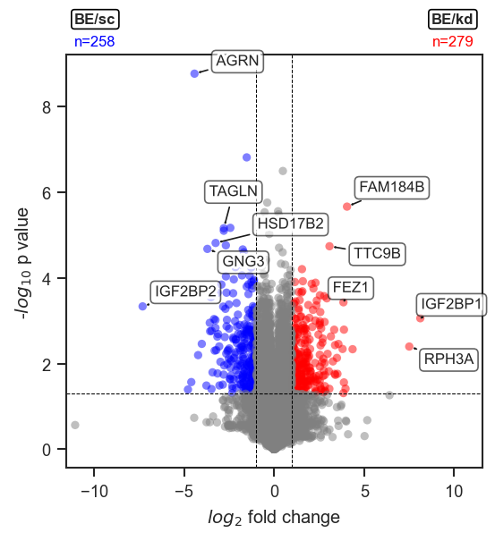
Volcano plot from a pAnnData comparison.
-
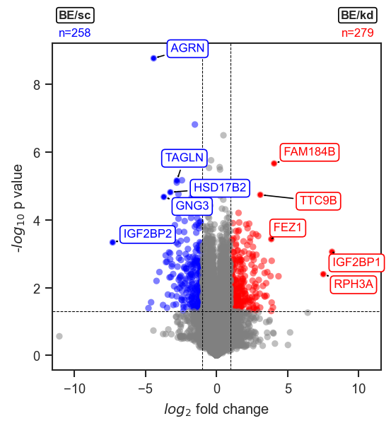
Color-coded highlights by DE direction.
-
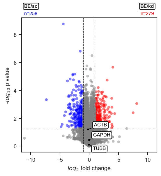
Highlight a fixed list in a single color.
-
volcano_adjust_and_outline_texts
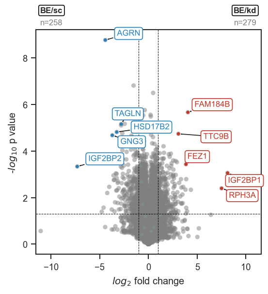
De-overlap text labels after marking.
plot_volcano
Groups are specified as a list of metadata dicts. The function runs DE internally and returns volcano_df when return_df=True:
import matplotlib.pyplot as plt
from scpviz import plotting as scplt

values = [
    {"cellline": "BE", "condition": "kd"},
    {"cellline": "BE", "condition": "sc"},
]

fig, ax = plt.subplots(figsize=(4, 4))
ax, volcano_df = scplt.plot_volcano(ax, pdata_norm, values=values, return_df=True)
plt.show()
Highlighting proteins
mark_volcano API ↗ · mark_volcano_by_significance API ↗ · volcano_adjust_and_outline_texts API ↗
Set no_marks=True to render all points grey, then layer highlights with mark_volcano_by_significance (color by DE direction) and/or mark_volcano (single color). Collect all texts lists and call volcano_adjust_and_outline_texts once at the end:
fig, ax = plt.subplots(figsize=(4, 4))
ax, volcano_df = scplt.plot_volcano(
    ax, pdata_norm, values=values, return_df=True, no_marks=True
)

color_dict = {
    "upregulated": "#E07B6A",
    "downregulated": "#6AB4E0",
    "not_significant": "#FFFFFF6A",
}

texts = []
ax, t = scplt.mark_volcano_by_significance(
    ax, volcano_df,
    label=["GAPDH", "TUBB", "ACTB", "VCP"],
    color=color_dict, return_texts=True,
)
texts.extend(t)

ax, t = scplt.mark_volcano(
    ax, volcano_df, label=["AHNAK"], label_color="orange", return_texts=True
)
texts.extend(t)

scplt.volcano_adjust_and_outline_texts(texts, expand=(1.5, 3))
plt.show()
Customizing group annotations
# Reposition up/down annotations
scplt.plot_volcano(
    ax, pdata_norm, values=values,
    group_annot_kwargs={"pos": {"group1_xy": (0.98, 1.10), "group2_xy": (0.02, 1.10)}},
    up_kwargs={"fontsize": 9},
    down_kwargs={"fontsize": 9},
)

# Remove bbox but keep text
scplt.plot_volcano(ax, pdata_norm, values=values, group_annot_kwargs={"bbox": None})

# Turn off all annotations
scplt.plot_volcano(ax, pdata_norm, values=values, group_annot=False)
add_volcano_legend adds standard up/down/not-significant legend handles to any axis:
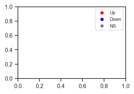
Set operations
Overview
-
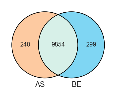
Venn diagram for 2–3 sets.
-
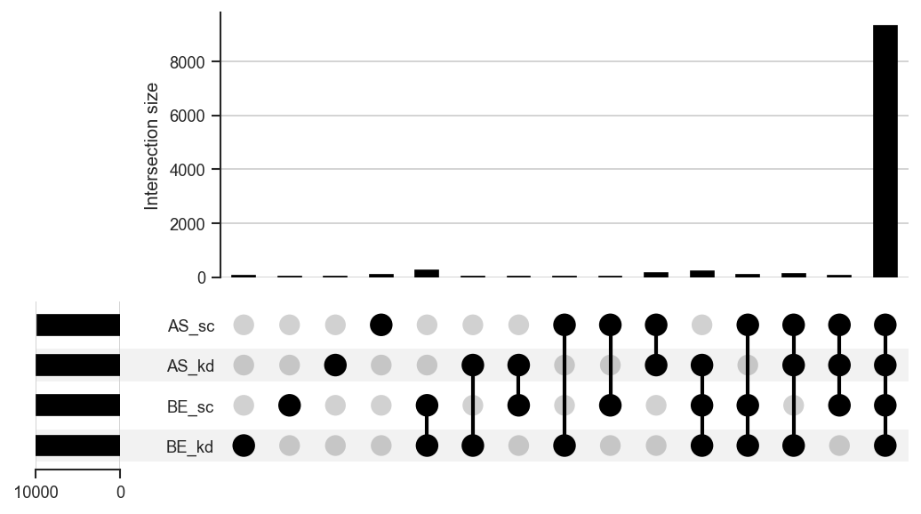
UpSet diagram for any number of sets.
-
plot_upsetstyled
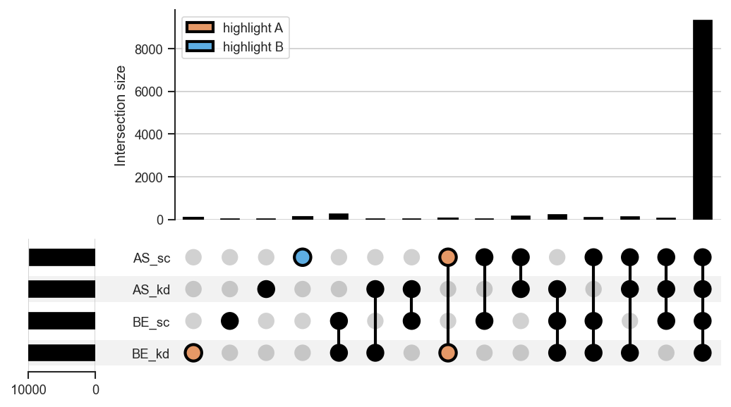
Highlight specific intersections with
style_subsets.
plot_venn
import matplotlib.pyplot as plt
from scpviz import plotting as scplt

fig, ax = plt.subplots(figsize=(3, 3))
scplt.plot_venn(ax, pdata, classes="cellline")
plt.show()
plot_upset
upplot = scplt.plot_upset(pdata, classes=["cellline", "condition"], show_counts=False)
upplot.plot()
plt.show()
Highlighting intersections with style_subsets: resolve category keys from get_upset_contents first, then style the intersections of interest:
from scpviz import utils as scu

contents = scu.get_upset_contents(pdata, classes=["cellline", "condition"], upsetForm=False)
keys = list(contents.keys())  # e.g. ['BE_kd', 'BE_sc', 'AS_kd', 'AS_sc']

upplot = scplt.plot_upset(pdata, classes=["cellline", "condition"], show_counts=False)
upplot.style_subsets(
    present=["BE_kd"], absent=[k for k in keys if k != "BE_kd"],
    edgecolor="black", facecolor="#E59866", linewidth=2, label="BE+kd only",
)
upplot.style_subsets(
    present=["AS_sc"], absent=[k for k in keys if k != "AS_sc"],
    edgecolor="black", facecolor="#5DADE2", linewidth=2, label="AS+sc only",
)
upplot.plot()
plt.show()
get_upset_query converts any intersection into a mark_df for use with mark_rankquant or mark_raincloud. Pass fetch_uniprot explicitly: use False for large sets (reads gene names from pdata only), or True to query UniProt for full metadata.
upset_data = scu.get_upset_contents(pdata, classes=["cellline", "condition"])

# Large intersection — skip UniProt (fast; uses .var gene names when available)
mark_df = scu.get_upset_query(
    upset_data, present=["BE_kd"], absent=["AS_kd", "AS_sc", "BE_sc"],
    fetch_uniprot=False, pdata=pdata,
)

# Small intersection — fetch UniProt metadata (e.g. for gene labels)
mark_df = scu.get_upset_query(
    upset_data, present=["BE_kd"], absent=["AS_kd", "AS_sc", "BE_sc"],
    fetch_uniprot=True,
)
The same workflow applies after plot_venn when return_contents=True: build upset_data with get_upset_contents(..., upsetForm=True) for querying, while the dict from upsetForm=False is only needed to resolve set label names.
Utility functions
shift_legend repositions a legend outside the plot area without resizing the figure:
scplt.shift_legend(ax)                                         # default: right of axes
scplt.shift_legend(ax, loc="upper left", bbox_to_anchor=(1, 1))
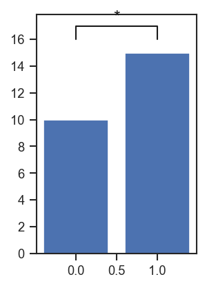
plot_significance adds a significance bracket between two x-positions on any existing axis:
fig, ax = plt.subplots(figsize=(2, 3))
ax.bar([0, 1], [10, 15])
scplt.plot_significance(ax, 16.0, 1.0, x1=0, x2=1, pval="*")
plt.show()
get_color returns colors, colormaps, or palettes from the package defaults: