Quickstart
Working with single-cell proteomics data?
If you are analyzing single-cell proteomics datasets, we recommend starting with the dedicated
Single-cell tutorial instead of this quickstart.
Single-cell datasets typically contain higher sparsity and missing values than bulk proteomics data and often require different preprocessing strategies, such as:
- filtering proteins by detection frequency across cells
- normalization and imputation methods suited for sparse data
- dimensionality reduction workflows tailored for single-cell analysis
The Single-cell tutorial walks through these steps using a real dataset and demonstrates common workflows including PCA, UMAP, differential expression, and Scanpy integration.
This quickstart demonstrates a minimal bulk proteomics workflow using scpviz.
The tutorial covers the following steps:
- Import proteomics data from Proteome Discoverer or DIA-NN reports
- Filter low-quality samples and inspect dataset summaries
- Visualize protein abundances across conditions
- Explore sample relationships using PCA
- Normalize and impute missing values
- Perform differential expression analysis and visualize results with volcano plots
- Run functional enrichment analysis using STRING
Each section introduces the core scpviz functions needed to perform these steps.
First, install scpviz and import the modules:
from scpviz import pAnnData as pAnnData
from scpviz import plotting as scplt
from scpviz import utils as scutils
Import
Proteomics data in scpviz is stored in a pAnnData object, which extends the AnnData structure commonly used in single-cell analysis while adding proteomics-specific metadata, statistics, and helper methods.
scpviz currently supports two data formats: Proteome Discoverer (Thermo Fisher) and DIA-NN reports. We’ve provided sample test files below so you can follow along:
obs_columns = ['Sample','cellline','treatment','condition','duration']
pdata = pAnnData.import_data(
    source_type='pd',
    prot_file = 'pd_prot.txt',
    pep_file='pd32_PeptideSequenceGroups.txt',
    obs_columns=obs_columns)
🧭 [USER] Importing data of type [pd]
--------------------------
Starting import [Proteome Discoverer]

Source file: ../assets/pd32_Proteins.txt / ../assets/pd32_PeptideSequenceGroups.txt
Number of files: 12
Proteins: 10393
Peptides: 167114
    ...
    ✅ [OK] pAnnData object is valid.
    ✅ [OK] Import complete. Use `print(pdata)` to view the object.
--------------------------
obs_columns = ['user', 'date', 'ms', 'acquisition', 'faims', 'column', 'gradient', 'amount', 'region', 'rep']
pdata = pAnnData.import_data(
    source_type='diann',
    report_file = 'diann_report.parquet',
    obs_columns=obs_columns)
🧭 [USER] Importing data of type [diann]
--------------------------
Starting import [DIA-NN]

Source file: ../assets/diann_report.parquet
Number of files: 12
Proteins: 12652
Peptides: 251047
    ...
    ✅ [OK] pAnnData object is valid.
    ✅ [OK] Import complete. Use `print(pdata)` to view the object.
--------------------------
Note
Refer to the Importing Data tutorial for more options, including defining metadata columns.
We can have a quick look at our pdata object by checking pdata.summary:
| Sample | cellline | treatment | condition | duration | ... | protein_count | ... | peptide_count | ... |
|---|---|---|---|---|---|---|---|---|---|
| F4 | AS | RA | kd | d7 | … | 9660 | … | 139793 | … |
| F23 | BE | RA | sc | d7 | … | 1724 | … | 4534 | … |
| F24 | BE | RA | sc | d7 | … | 9748 | … | 133675 | … |
Pre-processing
The following steps work with our PD imported pdata object, but similar steps can be applied to the DIA-NN imported pdata_diann object.
Filtering
File F23 shows a markedly low protein count (~1700) compared to ~9000 in all other samples. This file is an outlier and should be removed prior to downstream analysis.
Two filtering approaches can be used to achieve the same result:
After filtering, the dataset now contains 11 samples.
Note
All filter functions return a copy of the pAnnData object unless inplace=True is specified.
See the Filtering tutorial for more options.
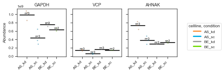
Quick visualization
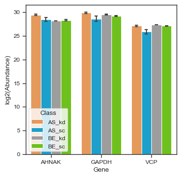
Visualize proteins of interest across samples:
import matplotlib.pyplot as plt

fig, ax = plt.subplots(figsize=(4,4))
pdata_filtered.plot_abundance(ax, namelist=["GAPDH", "VCP", "AHNAK"], classes=["cellline","condition"])
plt.show()
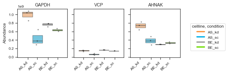
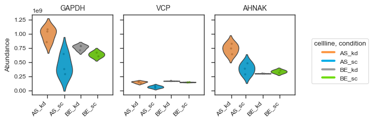
Alternatively, for a more styled visualization, you can use the plot_abundance_boxgrid function. This helper supports box, bar, violin and line plots, and is designed for publication-ready panels. Extensive customization options are available; see the function docstring for details.
figsize = (2, 2.5)

pdata_filtered.plot_abundance_boxgrid(
    namelist=["GAPDH", "VCP", "AHNAK"],
    classes=["cellline", "condition"],
    plot_type="box",
    figsize=figsize,
)
plt.show()
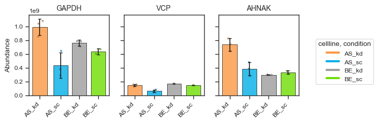
figsize = (2, 2.5)
bar_kwargs = {"width": 0.15}

pdata_filtered.plot_abundance_boxgrid(
    namelist=["GAPDH", "VCP", "AHNAK"],
    classes=["cellline", "condition"],
    plot_type="bar",
    figsize=figsize,
    bar_kwargs=bar_kwargs,
)
plt.show()
You can overlay pairwise significance brackets on boxgrid panels with sig_pairs — the same group definitions as plot_volcano / de(). scpviz runs the test on raw abundances and annotates each comparison with star labels; pass return_df=True to also get a stats_df of p-values.
fig, axes, df, stats = pdata_filtered.plot_abundance_boxgrid(
    namelist=["GAPDH", "VCP"],
    classes=["cellline", "condition"],
    log_scale=True,
    sig_pairs=[
        ({"cellline": "BE", "condition": "sc"}, {"cellline": "BE", "condition": "kd"}),
    ],
    sig_kwargs={"fontsize": 8},
    return_df=True,
)
plt.show()
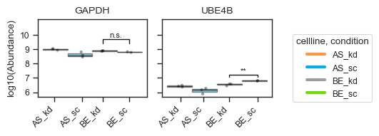
See the Plotting tutorial — Significance brackets for multi-pair comparisons, sig_pairs=True when only two groups exist, and further options.
We can examine the PCA embeddings to obtain an overview of sample clustering. Other dimensionality reduction methods, such as UMAP and t-SNE, are also supported (see the single cell tutorial for examples using sparse single-cell datasets).
fig, ax = plt.subplots(figsize = (4,4))
ax = scplt.plot_pca(ax, pdata_filtered, classes=["cellline","condition"], add_ellipses=True)
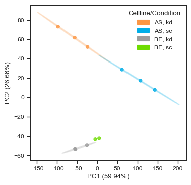
In this dataset, samples cluster by both cell line and condition, indicating good reproducibility and clear biological separation.
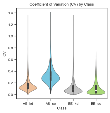
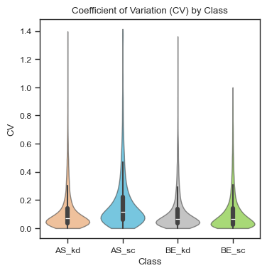
Finally, we can examine the coefficient of variation (CV) of each sample. Here, the samples show overall low variability (median ~10%), with slightly higher CVs observed in the AS_sc group (~35%).
fig, ax = plt.subplots(figsize = (4,4))
ax = scplt.plot_cv(ax, pdata_filtered, classes=["cellline","condition"])
Note
Refer to the plotting tutorial for more advanced plotting options.
Normalization and Imputation
Biological and technical variation across samples (e.g., in the AS_sc group) can arise from sample processing or data acquisition. We can normalize data to reduce variation between samples. scpviz provides a variety of normalization methods, for example, using median scaling.
pdata_norm = pdata_filtered.copy()
pdata_norm.normalize(method="median")
pdata_norm.impute(method="min")
🧭 [USER] Global normalization using 'median'. Layer will be saved as 'X_norm_median'.
     ✅ Normalized all 11 samples.
     ℹ️ Set protein data to layer X_norm_median.
🧭 [USER] Global imputation using 'min'. Layer saved as 'X_impute_min'. Minimum scaled by 1.
     ✅ 8234 values imputed.
     ℹ️ 11 samples fully imputed, 0 samples partially imputed, 0 skipped feature(s) with all missing values.
     ℹ️ Set protein data to layer X_impute_min.
After normalization, CVs for the AS_sc group improve compared to pre-normalized data.
fig, ax = plt.subplots(figsize = (4,4))
ax = scplt.plot_cv(ax, pdata_norm, classes=["cellline","condition"])
Other imputation methods are also available, including KNN, median, and minimum with a scaling factor.
Note
Refer to the Normalization & Imputation tutorial for additional examples and parameter options, such as Harmony or DirectLFQ.
Differential expression
Volcano Plots
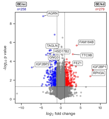
Run a differential expression (DE) analysis, commonly visualized with volcano plots. To start, we define a comparison ratio: for instance, comparing cell line BE under the kd condition against cell line BE under sc.
fig, ax = plt.subplots(figsize=(4,4))
comparison_values=[{'cellline':'BE', 'condition':'kd'},{'cellline':'BE', 'condition':'sc'}]
ax = scplt.plot_volcano(ax, pdata_norm, values=comparison_values)
🧭 [USER] Running differential expression [protein]
   🔸 Comparing groups: [{'cellline': 'BE', 'condition': 'kd'}] vs [{'cellline': 'BE', 'condition': 'sc'}]
   🔸 Group sizes: 3 vs 2 samples
   🔸 Method: ttest | Fold Change: mean | Layer: X
   🔸 P-value threshold: 0.05 | Log2FC threshold: 1
     ✅ DE complete. Results stored in:
       • .stats["[{'cellline': 'BE', 'condition': 'kd'}] vs [{'cellline': 'BE', 'condition': 'sc'}]"]
       • Columns: log2fc, p_value, significance, etc.
       • Upregulated: 279 | Downregulated: 258 | Not significant: 9856
Access the DE results stored in .stats under the key shown in the output.
pdata_norm.stats["[{'cellline': 'BE', 'condition': 'kd'}] vs [{'cellline': 'BE', 'condition': 'sc'}]"].head(8)
| Genes | [{'cellline': 'BE', 'condition': 'kd'}] | [{'cellline': 'BE', 'condition': 'sc'}] | log2fc | p_value | test_statistic | significance_score | significance |
|---|---|---|---|---|---|---|---|
| PPP1R37 | 601891.3155 | 103551.4786 | 2.54 | 0.0118 | 5.51 | 4.90 | upregulated |
| IGSF9B | 438967.4093 | 193638.7087 | 1.18 | 0.0159 | 4.94 | 2.12 | upregulated |
| GPR161 | 126213.0252 | 54380.4809 | 1.21 | 0.0102 | 5.81 | 2.42 | upregulated |
| TIGD5 | 43568.9795 | 9048.0415 | 2.27 | 0.0230 | 4.31 | 3.71 | upregulated |
| TTC9B | 222577.1287 | 26482.7005 | 3.07 | 1.81e-05 | 49.58 | 14.57 | upregulated |
| NMNAT2 | 269130.1753 | 82171.6244 | 1.71 | 0.0046 | 7.69 | 4.01 | upregulated |
| ATXN7L1 | 254803.2800 | 66922.2053 | 1.93 | 0.0123 | 5.42 | 3.68 | upregulated |
| SASS6 | 1765918.661 | 779926.980 | 1.18 | 0.0365 | 3.61 | 1.69 | upregulated |
| … | … | … | … | … | … | … | … |
The table above shows the top DE results (df.head(8)) including log₂ fold change, p-value, and significance score.
STRING enrichment
We can perform STRING enrichment on the sets of up- and downregulated proteins from our DE analysis. First, list the available enrichment keys:
Since we just ran a DE analysis, the key BE_kd vs BE_sc is available. We can run STRING functional enrichment on both up- and downregulated proteins.
🧭 [USER] Running STRING enrichment [DE-based: [{'cellline': 'BE', 'condition': 'kd'}] vs [{'cellline': 'BE', 'condition': 'sc'}]]

🔹 Up-regulated proteins
     ℹ️ Found 0 cached STRING IDs. 150 need lookup.
          ℹ️ Cached 149 STRING IDs from UniProt API xref_string.
          ⚠️ No STRING mappings returned from STRING API.
   🔸 Proteins: 150 → STRING IDs: 149
   🔸 Species: 9606 | Background: None
     ✅ [OK] Enrichment complete (3.92s)
   • Access result: pdata.stats['functional']["BE_kd vs BE_sc_up"]["result"]
   • Plot command : pdata.plot_enrichment_svg("BE_kd vs BE_sc", direction="up")
   • View online  : https://string-db.org/cgi/network?identifiers=9606.ENSP00000351310%0d9606....ENSP00000265018&caller_identity=scpviz&species=9606&show_query_node_labels=1


🔹 Down-regulated proteins
     ℹ️ Found 0 cached STRING IDs. 150 need lookup.
          ℹ️ Cached 149 STRING IDs from UniProt API xref_string.
          ⚠️ No STRING mappings returned from STRING API.
   🔸 Proteins: 150 → STRING IDs: 149
   🔸 Species: 9606 | Background: None
     ✅ [OK] Enrichment complete (2.35s)
   • Access result: pdata.stats['functional']["BE_kd vs BE_sc_down"]["result"]
   • Plot command : pdata.plot_enrichment_svg("BE_kd vs BE_sc", direction="down")
   • View online  : https://string-db.org/cgi/network?identifiers=9606.ENSP00000368678%0d9606.....ENSP00000263512%0d9606.ENSP00000382767%0d9606&caller_identity=scpviz&species=9606&show_query_node_labels=1
Once enrichment is complete, you can visualize the results (defaults shows Gene Ontology (Biological Process) terms). We can check what is enriched in the downregulated proteins:

Note
Refer to the Enrichment tutorial for details on additional STRING features such as PPI networks, GSEA, and combined enrichment-PPI analyses.
Next steps
For a complete workflow — from importing data to enrichment and network analysis — see the Tutorial Index.
- Learn more about data import in Importing Data.
- Explore filtering options in Filtering.
- Explore normalization and imputation options in Normalization & Imputation.
- Learn about differential expression and volcano plots in Differential Expression.
- Perform functional and PPI enrichment in STRING Enrichment.
- See advanced visualization techniques in the Plotting Tutorial.